6.6.1 2D Color Pie Chart of a Population Study
2D-Pie-Chart
Summary
This tutorial will show you how to create and customize a 2D Pie chart.
Minimum Origin Version Required: Origin 2020
What will you learn
This tutorial will show you how to
- Create a 2D Color Pie chart
- Customize the Pie chart with mini toolbar and Plot Details dialog
Steps
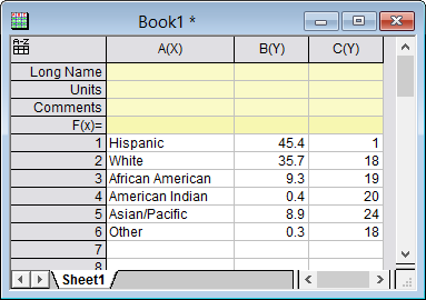
- Create a new worksheet paste the sample data shown here.
- Highlight column B and choose the menu Plot > Basic 2D: 2D Color Pie Chart to plot a 2D pie chart .
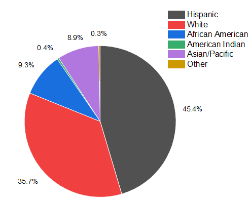
- Right click on the Legend and press Delete key to delete the legend box.
Quick Customization with Mini Toolbar
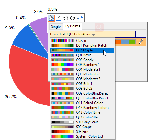
- Click on the pie plot, and in the pop-up mini toolbar, click Fill Color button to expand the Color Chooser to select the color list "D02 Maple" in the By Points tab.
- The color list you selected below will be applied to the slices directly. With the mini toolbar still pop-upped, click the Show Data Labels button to select Categories in the drop-down list.
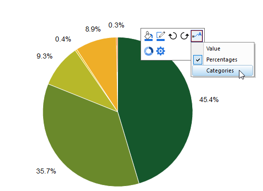
- Now both the percentages and categories are shown as labels for pie slices. Click any withe space to exit the mini toolbar of whole pie plot.
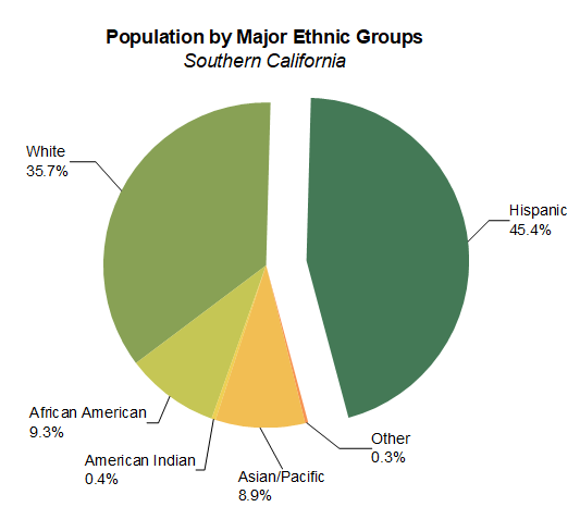
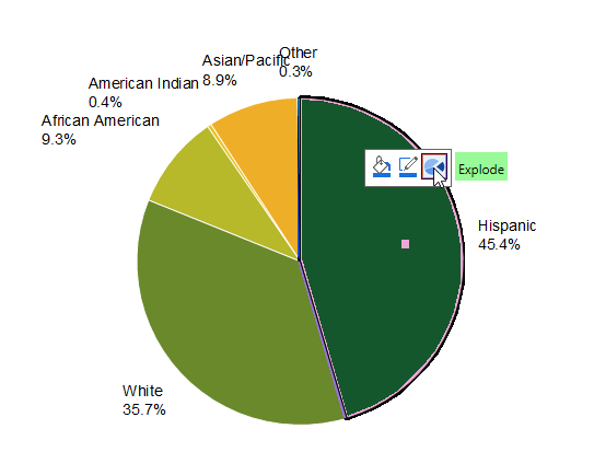
- Click on the slice "Hispanic" twice to select this slice separately, and in the pop-up mini toolbar, click the Explode button to explode this slice from the whole pie.
Further Customization with Plot Details
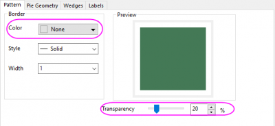
- Double-Click on the pie plot to open the Plot Details dialog. With the plot been selected, go to the Pattern tab, set Border Color to None and Transparency to 20. Click Apply button to apply the settings
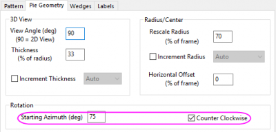
- Go to the Pie Geometry tab, in the Rotation control, set Starting Azimuth(deg) to 75 and check the Counter Clockwise check box.
Please note, you can also use the Rotation Clockwise button  and Rotation Count-Clockwise button
  in the mini toolbar(see the screenshot in step 5) to rotate the pie chart step-by-step. Each click will rotate the pie chart in 10 degrees.
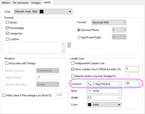
- Go to the Labels tab, under the Leader Lines group, set Connect to 2-Seg Polyline and the percent to 50.
- Click OK button to close the dialog. Drag the labels farther to avoid overlapping. Add a title on the graph to get the finally graph as below:
Sample Data
Open a fresh worksheet and either click this link (https://www.originlab.com/ftp/graph_gallery/data/2D_Pie_Chart.txt) and copy the data from your browser page; or select the data in the table below and copy.
Click on the empty data cell in row 1, column A(X) and paste the copied data.
| A(X)
|
B(Y)
|
C(Y)
|
| Hispanic
|
45.4
|
1
|
| White
|
35.7
|
18
|
| African American
|
9.3
|
19
|
| American Indian
|
0.4
|
20
|
| Asian/Pacific
|
8.9
|
24
|
| Other
|
0.3
|
18
|