17.2.11 Marginal Plot
Marginal-Plot
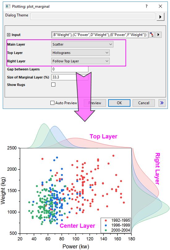
Origin provides a X-Function plot_marginal to plot different kinds of Marginal Plots. With this X-Function, you can customize all three layers for the marginal plots:
Customize the Layers
Main Layer
For the main layer, you can choose one of four supported plot types for it:
- Scatter
- Select this plot type to plot all selected XY dataset as scatter plot(s) into the middle main layer.
- Scatter with Linear Regression
- Select this plot type to plot all selected dataset as scatter plots with individual linear regression curves into the middle main layer.
- With this plot typed selected, another two controls Confidence Band and Confidence Level will appear to let you control the linear regression for all plotted scatter plots. Confidence Band is used to add two-side confidence band for the linear regression curves, and Confidence Level is used to set the confidence level for the confidence band.
- Kernel Density Contour Fill
- Select this plot type to plot all selected dataset as contour-filled kernel density plots.
- With this plot typed selected, another three controls Bandwidth Method, Density Method and Number of Points to Display will appear to let you control the appearance of the Kernel Density plots.
- Kernel Density Contour Line
- Select this plot type to plot all selected dataset as kernel density plots just showing contour lines.
- With this plot typed selected, another three controls Bandwidth Method, Density Method and Number of Points to Display will appear to let you control the appearance of the Kernel Density plots.
Top Layer
For the top layer, you can choose one of 7 supported plot types for it:
- Histograms
- Plot all X dataset in the top layer as a histogram. If there are multiple X dataset, plot them as histograms overlapped.
- Stacked Histograms
- Plot all X dataset in the top layer as a stacked histogram.
- Box Charts
- Plot all X dataset in the top layer as box charts.
- Violins
- Plot all X dataset in the top layer as violin box charts.
- Distribution Curves
- Plot all X dataset in the top layer as distribution curves.
- Distribution Curves with Fill
- Plot all X dataset in the top layer as distribution curves with the area been filled.
- Histogram with Curves
- Plot all X dataset in the top layer as histogram with distribution curve. If there are multiple X dataset, plot them as side-by-side histograms.
Right Layer
For the right layer, you can decide whether to follow the setting of top layer or choose one of 7 supported plot types for it separately:
- Histograms
- Stacked Histograms
- Box Charts
- Violins
- Distribution Curves
- Distribution Curves with Fill
- Histogram with Curves
Gap between Layers
Adjust the gap between the top/right layer and main layer. For the top layer, the gap with main layer is the percentage of the height of main layer; For the right layer, the gap with main layer if the percentage of the width of main layer.
Size of Marginal Layer(%)
Adjust the size of the top and right layer. For the top and right layer, as the layer width is linked with the width and height of main layer, you are only allowed to adjust the height of the layer in the percentage of the height and width of the main layer.
Show Rugs
Specify whether show the axis rugs for the main layer. The rugs will be added between the main and top/right layer.