Last Update: 12/2/2025
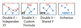
Starting with Origin 2026, you can use one of four built-in double X-axis templates. Access them by selecting Plot > Multi-Panel, Multi-Axis.
The Double X Plot can help to create a Double X Axis plot by selecting from a set of pre-defined templates
To install and use the app
A single layer is comprised of 4 axes: bottom X, top X, left Y and right Y. The graph below is a single layer where both the bottom X axis and the top X axis are displayed. The bottom X axis is wavelength in nanometers as present in the raw data. The top X axis represents energy. Each tick label on top axis is calculated with formula: Energy (ev) = 1240 / Wavelength (nm).

Here are the steps:

When creating a Formula for axis labels, use "x" to refer to the current axis, whether it is an X, Y or Z axis. |
See Also: FAQ-122 How do I format the axis tick labels?
In the example above, top X and bottom X axes use the same settings. Only tick labels on top are calculated using the formula. If you want to control the top X axis independently, such as scale type and tick positions, e.g. show ticks in a reciprocal scale as the image below, you need to add a new linked layer with top axis showing.

Here are the steps.
Note: If you want to change the scale range, please double click bottom axis to change its From and To values. Top axis range will update accordingly.
Continue with A New Layer section, you can even position major or minor ticks at specified locations (therefore, also the grid, if any), such as the image below.

Here are the steps:

You may also wish to view this Quick Help: special ticks
Keywords:link, formula, equation, frequency, wavelength, energy, reciprocal, non-linear, scale, arrhenius