11 Customizing Graphs
Contents
- 1 Introduction
- 2 Dockable Toolbars
- 3 Menus, Dialogs and Buttons Used in Graph Customization
- 4 Quick Editing: Mini Toolbars and Object Manager
- 5 Customizing Page, Layer and Data Plots
- 6 Customizing Graph Axes
- 7 Customizing Data Plot Colors
- 8 Graph Legends
- 9 Annotating Your Graph
- 10 Inserting Images to Graphs
- 11 Working with Map Data
- 12 Arranging Graphs and Layers
- 13 Templates and Themes
- 14 Topics for Further Reading
Introduction
This chapter introduces you to various aspects of graph customization. All Origin graphs start from a graph template. If the graph you are making is fairly standard for its type, the options that were stored in the graph template may be entirely adequate to produce a polished-looking graph. The business of basic graph creation was covered in the last chapter, Graphing.
Sooner or later, however, you are going to want to add annotations, modify axis scales, or change plot colors. Hence, the purpose of this chapter is to introduce you to some key Origin graph customization tools and techniques, as well as to point you toward resources that will help you manage more complex graph customization tasks.
We begin with a discussion of the graph customization-related toolbars, as these toolbars have tools that are commonly used for quick modifications of graph elements.
Dockable Toolbars
Toolbar buttons useful for graph customization tasks, include the following:
| Description | Toolbar (default configuration) |
|---|---|
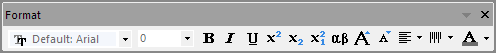
Format toolbar buttons:
|
|
Style toolbar buttons:
|
|
Tools toolbar buttons:
|
|
Graph toolbar buttons:
|
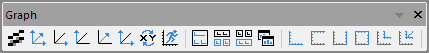
|
Add Object to Graph toolbar buttons:
|
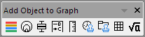
|
Object Edit toolbar buttons:
|
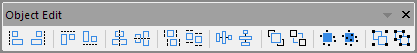
|
Menus, Dialogs and Buttons Used in Graph Customization
Many quick graph customizations can be done using Origin's graphing Mini Toolbars. More complex customization options can be accessed from commands on the Format or Graph menus. The following table lists key menu commands and dialog boxes plus a few toolbar buttons, used in customizing graphs.
| Task | Dialog Name | Method |
|---|---|---|
| Customize the graph Page, Layer, or Data Plot |
Plot Details dialog |
|
| Customize Axes |
Axis Dialog |
|
|
Add a Default Legend |
N/A |
See, Graph Legends |
| Customize the Legend |
(Text Object -) Legend dialog |
|
|
Update Legend dialog |
| |
|
Legends/Titles tab at Page level of Plot Details dialog |
| |
| Add a Color Scale (color-mapped plots) |
N/A |
See, Color Scales |
| Add a Bubble Scale (symbol-size mapped plots) |
N/A |
See Bubble Scale |
| Merge multiple graph windows into one graph window |
Merge Graphs dialog |
See, Merge and Arrange Graphs (tutorial) and The Merge Graph Dialog Box. |
| Adjust multi-layer graphs: resize, move, swap, align, or add layers |
Layer Management dialog |
|
| Simple adjustment of multi-layer graphs: arrange and/or resize layers |
Arrange Layers dialog |
|
| Save settings as graph template |
Save Template As dialog |
|
| Manage graph templates, plot to a template |
Template Library |
|
| Save settings as graph Theme |
Save Format as Theme dialog |
|
| Manage Graph Themes: edit, combine, apply Theme, set as System Theme |
Theme Organizer dialog |
See, Theme Organizer |
Quick Editing: Mini Toolbars and Object Manager
While the dialog boxes listed in the previous section will provide full access to plot properties, settings are sometimes buried and hard to find. Often, the most convenient way to carry out common graph editing tasks is to use Mini Toolbar buttons or Object Manager short-cut menu commands -- or a combination of the two.
Mini Toolbars for Graph Editing
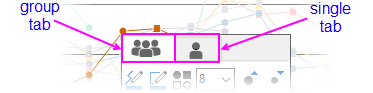
Most Origin graphs support a set of "quick editing" tools for interactively modifying common graph object properties. Tools are context-sensitive so that -- (1) depending on where you click inside the graph window, (2) what the selected object is and (3) whether you have selected an individual plot or a plot group -- you will have a different set of tools available to edit your selection.
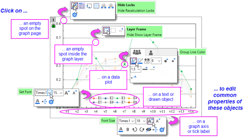
- Workspace display of Mini Toolbars is controlled via View: Mini Toolbars.
- There are five levels -- i.e. five groupings of graph properties -- that can be edited with Mini Toolbars: page, layer, plot, text or drawn objects and graph axes.
- When editing grouped plots, a single click will select a single plot. The Mini Toolbar displays two tabs -- one for the customizing the group, the other for customizing the single plot.
- Most Mini Toolbars have a "properties"
 button that opens a related Origin dialog box where you will find the full range of available controls.
Unless you have changed your selection, you can do a one-time restore of a Mini Toolbar after it has faded by pressing the SHIFT key. |
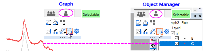
If you disable selection of individual graph layers, plots and graphic objects with the Selectable Mini Toolbar button, these elements remain selectable in the Object Manager (OM). To restore graph window selectability,
|
Controlling Buttons that Increment
Some Mini Toolbar buttons will increase or decrease some property by some increment, each time you click the button (e.g. font size, rotation angle, layer grid spacing). In such cases, you can modify that increment by manipulating the value of a LabTalk system variable.

For information on these LabTalk system variables, see this Appendix in Origin Help.
Manipulating Graphs with the Object Manager
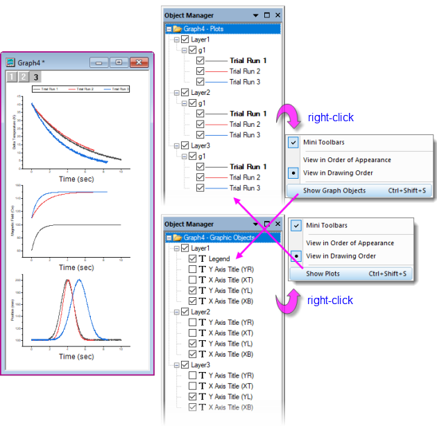
The Object Manager is general tool for managing Origin windows but it is especially useful for manipulating graph windows. When a graph window is active, the Object Manager offers alternate views -- toggled by right-clicking in an empty portion of the Object Manager and choosing Show Plots or Show Graph Objects(Ctrl+Shift+S):
- Show Plots: a collapsible, hierarchical list of plots by layer, plot group, etc.
- Show Graph Objects: a collapsible, hierarchical list of window objects (legends, text objects, images, etc.) by layer.
Object Manager Tips:
- Whether in Show Plots or Show Graph Objects view, right-clicking on an element will open a shortcut menu of relevant actions (ungrouping a set of plots or designating a plot as the first plot in a plot group, for instance).
- Common to both views is a check box beside each element; when checked, the element displays in the graph window, when cleared, the element is hidden.
- Besides openning Plot Details to rename the layer, you can right-click on the layer icon (e.g. Layer1) in Object Manager and choose Rename.
- Additional shortcuts give quick access to source data, to Plot Details, allow you to rearrange plot or object order and to other relevant tasks such as opening an inserted image in an Image window for further editing.
Editing Graphs Using Object Manager and Mini Toolbars
When a graph is active and you select graph elements in the Object Manager, a Mini Toolbar will show (make sure the Mini Toolbars option is checked in the Show Plots/Show Graph Objects shortcut menu as shown in the image above).
With the available buttons, you can make quick customizations to common plot properties such as line color, line thickness, display of labels, etc.
In Object Manager Show Graph Objects view, there is a Select All with Same Name shortcut menu entry. Use in combination with Mini Toolbar buttons (e.g. Font Size) to make quick graph changes. |
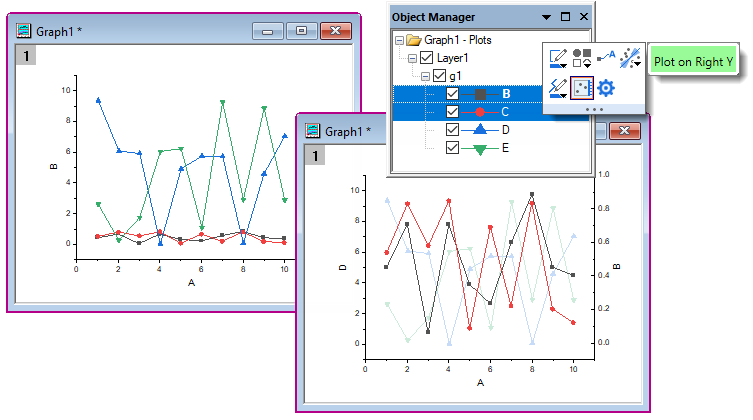
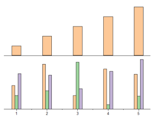
Example: 1 Layer, 2 Y Axes
There is now general support for "Double-Y" graphs in a single layer. Previously, two independent Y axes meant "two layers." Beginning with Origin 2023 the user can create Double-Y graph in single layer using only the basic plot type templates using new GUI controls,.
In the following simple example, the user has plotted four Y datasets against a single X dataset. Because values in two of the Y datasets are of an order of magnitude larger than values in the other two, two plots appear "flat" and seem to show little variation with changes in X. However, using a combination of Object Manager and Mini Toolbars, we can select the "flat" plots and Plot on Right Y. With a more appropriate scale, the plots no longer appear flat.
In addition to the above simple example, you can find an example of a single-layer Double-Y Violin Plot in your Learning Center samples by pressing F11 and searching on "2023". Also, Origin includes some templates for simple cases, see Multi-Panel/Axis section for more information. |
Customizing Page, Layer and Data Plots
A graph window is a collection of objects, organized in a hierarchical structure. As we shall see, there are editable properties at the Page, Layer, Data Plot and Data Point levels.
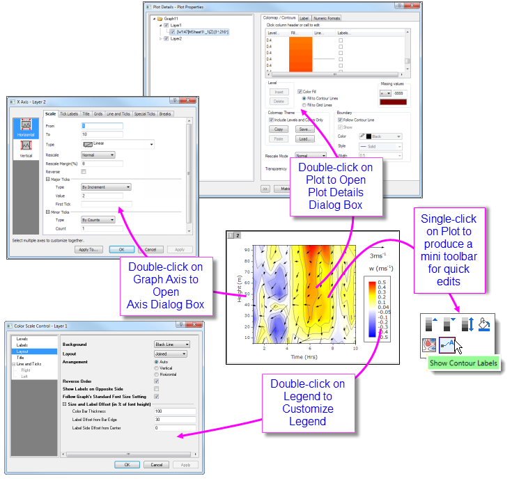
Quick formatting of many plot properties can be done using Mini Toolbar or dockable toolbar buttons, as mentioned above. However, more comprehensive access to plot properties is available from each graph's Plot Details dialog box.
To open Plot Details:
- Double-click on your plot.
- Click the Format menu, then choose Page..., Layer... or Plot..., to open Plot Details at the corresponding level.
The figure below shows an example of the Plot Details dialog box:
- The left panel depicts the Page > Layer > Plot hierarchy as an expandable/collapsible tree.
- The right panel contains controls, organized by tabs, that pertain to the object that is currently selected in the left panel.
- To customize an object, select it in left panel and modify the corresponding properties that appear on the various tabs in the right panel.
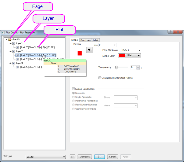
| Selected Left Panel Object | Right Panel, Controls for... |
|---|---|
| Page | Settings that pertain to the whole page -- Print/Dimensions, layer drawing orders, page display color, legends/titles, etc. |
| Layer | Settings that are specific to the graph layer -- Layer background colors, layer size and speed mode settings, layer display settings, stack settings for applicable plot types. Some plot types will include extra tabs/controls specific to the plot type. |
| Plot | Plot-specific properties. The tabs and controls vary by plot type (e.g. Scatter plots have a Symbol tab with controls pertaining to scatter symbols, Line plots a Line tab with controls pertaining to line plots). Anything to do with a particular data plot -- color, fill patterns, colormapping, labeling -- will be found at this level in Plot Details. |
| Data Point | Properties that apply to user-specified "special points". Available for any plot for which plots discrete points (scatter, line + symbol, column/bar, etc.). The tabs and controls are generally similar to those available at the Plot level but any property that you set at the level of a special point, will apply only to that point. |
:
Prevent text and label objects from scaling when resizing layer, by going to the Size tab of Plot Details (Layer level) and setting Fixed Factor to 1. |
Customizing Grouped Plots
Beginning with Origin 2020, there was a change in selection behavior that affects grouped plots. Now, a single-click on a plot selects the plot. A second click (or CTRL+click) selects a single point. SHIFT+click selects the entire group. Note that when using the new mini toolbars, a single click on a plot group displays tools for editing the plot group or the single, selected plot. To revert to the old plot selection behavior, set @GSM=0. |
When you select and plot multiple data ranges to a single graph layer, the plots are grouped in the layer. Generally speaking, plots within a group are automatically differentiated by assigning styles built from one or more customizable "increment lists", one for each plot property (symbol shape, symbol color, line style, etc.).
By default, some properties are configured to increment "by one" (e.g. line color is assigned according to the "Candy" color list and each successive plot is assigned the next color in the list) and some will be configured not to increment (e.g. line style is solid for every plot), though this is ultimately controlled by the user. In any case, the increment lists for each property are saved with the graph template (.oggu) or Theme file (.oth) so that you can easily use them later to create graphs with the same look.
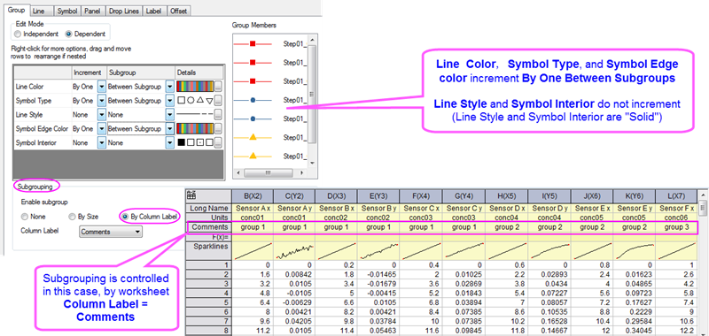
The above image shows the Plot Details Group tab settings for a line + symbol plot in the upper-left. On this Group tab, the first column lists Line Color, Symbol Type, Line Style Symbol Edge Color and Symbol Interior. Properties of Line Color, Symbol Type and Symbol Edge Color are set to increment By One and Between Subgroups (subgrouping occurs using the column Comments), while Line Style and Symbol Interior are set to increment by None (they do not vary).
As previously mentioned, this arrangement is completely customizable and you can save customizations with the graph template:
- To find out more about customizing of grouped and subgrouped plots, see The Plot Details Group Tab Controls.
- To find out more about saving graphs as templates, see Graph Template Basics.
Using Object Manager with Grouped Plots
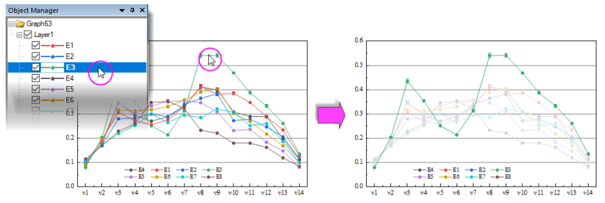
- To highlight a single plot and dim others (grouped or ungrouped) in the layer, click once on the plot in Object Manager. Conversely, clicking once on a plot in the Object Manager, highlights the plot in the graph window, while dimming others.
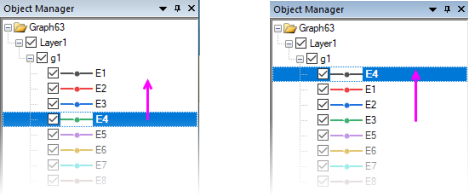
- To reorder plots in the layer, drag a plot icon within the group; or right-click on the plot (in Object Manager) and choose Move Up or Move Down.
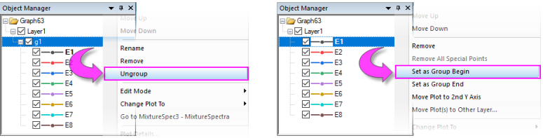
- To group or ungroup data plots in the layer, right-click on the group icon ("gN") and choose Ungroup. To group plots in the layer, right-click on a plot and choose Set as Group Begin.
- To move a plot from one group to another, drag the plot to the other group.
- To move a series of plots out of the group, right-click the last plot that you want to keep in the group and choose Set as Group End.
- To remove a plot from the layer (and the graph), right-click on the plot and choose Remove.
- To move a plot to a second Y axis, or move the plot to another layer, right-click on the plot in Object Manager and choose Move Plot to Second Y Axis or Move Plot(s) to Other Layer ....
Customizing Multi-layer Graphs
The graph layer is a fundamental concept in Origin and it is a primary building-block of most complex Origin graphs (e.g. a graph with both left and right Y axes may be constructed by overlaying one layer on another, and sharing a common X axis between the two layers). While the graph layer is, fundamentally, a self-contained unit it is, at times, desirable to create dependencies between layers:
- One type of dependency is what we call "linking" of layers, which involves establishing spatial relationships or relationships between axis scale values. You can read more about linking graph layers, below.
- Another type of dependency is based on what we call "common display" and this is most useful in a situation where we have multiple similar panels in a graph and we want to do something like change the background color of each graph, or perhaps the change plot colors used in each layer.
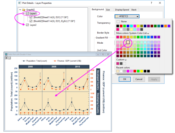
At the graph page level in Plot Details, you will find a Layers tab that has controls that affect all layers within a given graph page. The Common Display controls can be used to enable simultaneous editing of layer, plot and axis properties of multi-layer graphs. For instance, in the following example, we have a two-layer trellis plot -- the two layers being necessitated by there being a left-Y axis and a right-Y axis with two completely different scales -- and as a simple illustration, we have used the Common Display controls to simultaneously add a background color to both layers. We could have accomplished the same thing without using the Common Display controls but this would have required twice the work -- set the background color of layer 1, then set the background color of layer 2.
This was a simple illustration but we can use the Common Display controls for application of more complex mix of layer, plot and axis properties. Some of Origin's built-in multi-layer graph templates have Common Display elements turned on by default. When working with multi-panel graphs, you may want to choose Format: Page, click the Layers tab in Plot Details, and check the Common Display settings. See Common Display for more information.
The Common Display Apply to control supports including or excluding certain layers from common display customizations. For instance, you might have a 4 panel graph, each with an inset layer and using this control, you could apply a common background color to the inset layers without applying the same background color to the 4 primary layers (panels). See Common Display for more information. |
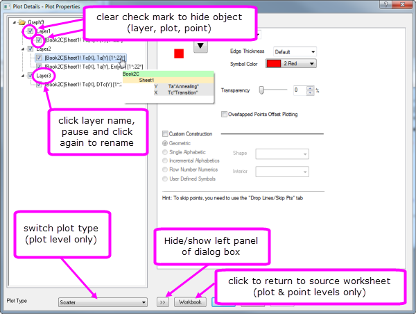
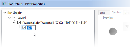
Special Points: Customizing a Single Data Point
For some plot types such as scatter, column or pie, you can modify the display properties of a single data point.
To edit a single point:
- Click twice (slowly) or press CTRL + click on a data point to select it. Use the Mini Toolbars to edit properties of the data point; or click available buttons on the Style or Format toolbars.
- For access to a wider range of customization options, (a) double-click on the selected point or (b) CTRL + double-click on an unselected data point. This opens the Plot Details dialog box with the focus set to edit the data point (identified in the left-panel of Plot Details by its row index number). Then use controls on the tabs in the right panel to modify the appearance of the data point, add drop lines, data label, etc. Changes you make to the special point will not affect the appearance of other points in the same plot.
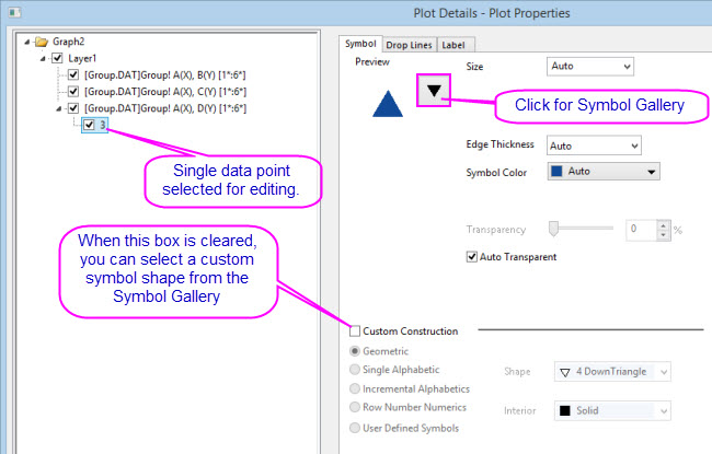
Note:: When the Custom Construction box is checked, you can use these controls to customize the plot symbol of the selected point. Custom Construction can be applied to any plot symbol -- not simply those that are designated as special points. |
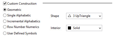
Origin supports adding your own plot symbols. For more information, see User Defined Symbols Grid. |
To remove customizations made to a single data point:
- Right-click the single point in the left panel of the Plot Details dialog and choose Delete.
- In the graph window, click on the single point to select it, then press DELETE on the keyboard.
The point itself is not deleted; only the custom style is removed, with the point reverting to the style of the containing data plot.
Adding a special point at the beginning or end of a plot is not always easy, but there is a simple, foolproof technique:
|
Customizing Graph Axes
Many common edits to axis properties can be done quickly from Mini Toolbar buttons. Click on an element to edit.
For more complex edits of axis properties, open the Axis Dialog:
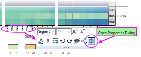
- from the Axis Mini Toolbar > Open Properties Dialog.
- from the Origin menu > Format: Axes.
Customizing Axes with Mini Toolbars
For quick adjustments to axis properties, you can use Origin's axis Mini Toolbars. As with all Mini Toolbars, available tools will vary by plot type and selected object. For instance, note that clicking on a graph axis line brings up a different set of buttons than clicking on the axis tick labels.
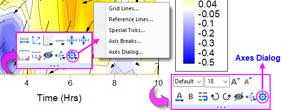
Note that clicking the "gear" button on the axis line Mini Toolbar produces a popup menu with simplified "Mini Dialogs" for axis line elements. For access to all axis settings, click Axes Dialog on either toolbar.
Customizing Axes with the Axes Dialog Box
All graph axis customizations can be made in the Axes Dialog box. Click on the Mini Toolbar "gear" button and choose Axes Dialog; or double-click on the graph axis or tick labels. This will open the Axis Dialog - Layer N dialog box.
This image shows the tab-based axis dialog used by most 2D and 3D graphs.
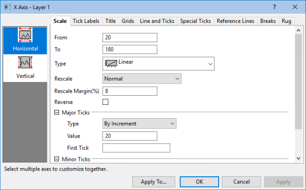
- In the left panel, you can select one or more icons (hold the CTRL key to select multiple icons) to specify the axis or axes to be customized, then select the desired tab and choose your options.
- Click the Apply To... button to apply the axis format settings of the currently selected axis to another axis.
| Tab | Controls for | ||
|---|---|---|---|
| Scale | Scale range of values, scale type, rescale mode and margin, reverse scale, major and minor ticks. | ||
| Tick Labels | Display and Format options for major and minor tick labels, including custom labeling using LabTalk substitution or mathematical expression. For information on custom formatting of numeric data including display of percentages, fractions, pi, and geographic (Lat/Lon) formats, see Origin Custom Formats.
| ||
| Title | Axis title (often set using variable notation) and font options. Note that you can directly edit by double-clicking the text object in the graph. | ||
| Grids | Control display and properties of grid lines at major and minor ticks. | ||
| Line and Ticks | Global axis line and tick display options for all axes. | ||
| Special Ticks | Placement of special tick labels. | ||
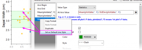
| Reference Lines | Reference lines are optional lines that you add to your graph, either for emphasis or to mark some key statistic. Additionally, they can be paired to add fill color to some portion of your graph (e.g. "recession bars" in plots of financial data).
| ||
| Breaks | Enable line breaks and configure each break. |
| Note: For more information on axis customization and for axis controls for specialized graph types (e.g. polar, ternary, radar chart.etc), refer to:
Help: Origin: Origin Help > Graphing > Graph Axes |
Customizing Data Plot Colors
Origin ships with a number of installed color lists or palettes. If you prefer to create your own color lists or you have a standard set of palettes and want to port them over to Origin, there are a number of tools available in the software for doing that. See the next section, Color Manager, for more information.
Color Manager
Use the Color Manager for importing, creating and organizing the color lists and palettes that you use in Origin:
To open the Color Manager:
- Choose Preference: Color Manager.
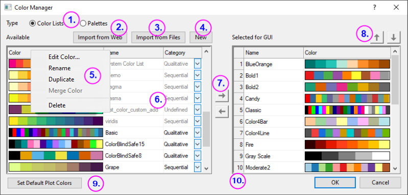
The following list numbers correspond to controls shown in the image above:
- Click these radio buttons to display installed Color Lists or Palettes.
- Click Import from Web to open a dialog where you can specify a URL to install palettes. Support for Scribus (.xml), Office Color Table (.soc), Adobe Color (.aco), Adobe Color Table (.act), Adobe Swatch Exchange (.ase) and JASC PaintShopPro (.pal).
- Click to install locally-stored palettes. Support for Scribus (.xml), Office Color Table (.soc), Adobe Color (.aco), Adobe Color Table (.act), Adobe Swatch Exchange (.ase) and JASC PaintShopPro (.pal).
- Click to open the Build Colors dialog where you can build a color using a number of tools: using standard color controls, direct entry of HTML codes or use an eye-dropper tool to pick onscreen colors. You can read more about the Build Colors dialog in the Origin Help file.
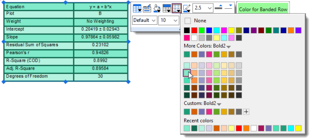
- Right-click on the Available list(s) to:
- Delete or Rename lists (you can also rename by clicking directly on the name). Lists that are dimmed have already been Selected for GUI. Those that are Selected for GUI appear from drop-down lists throughout the user-interface -- in Plot Details, from the Fill Color button
 on the Style toolbar and from the Mini Toolbar Fill Color button
  when a plot or special point is selected.
 - Merge Color two or more Color Lists/Palettes selected in the Color Manager. Note that the total number of colors in selected lists/palettes cannot exceed 256 (i.e. Merge Color will not be available).
- Delete or Rename lists (you can also rename by clicking directly on the name). Lists that are dimmed have already been Selected for GUI. Those that are Selected for GUI appear from drop-down lists throughout the user-interface -- in Plot Details, from the Fill Color button
- Use the list control to set Category = Undefined, Sequential, Diverging or Qualitative.
- Use these controls to add or remove color lists and palettes from the user-interface (GUI).
- Use these controls to move a selected list or palette up or down in the various GUI color lists.
- Click Set Default Plot Colors to open the Theme Organizer's System Increment Lists tab, where you can set default colors for use in your plots.
- Drag list-number icons to rearrange GUI color list order.
Applying Color to Your Graphs
There are many options for applying color to your graphs. We will try and cover the basics here, pointing you to other resources for more in-depth discussion.
List of key topics on the subject of plot color:
- The Color Manager
- Customizing Data Plot Colors
- Using a Dataset to Control Plot Color
- The Plot Details Color Map/Contours Tab Controls for 3D and Contour Plots
Applying Colors Singly
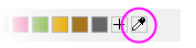
Picking and applying a single custom color has been made easier with the addition of the "eyedropper" tool to the Single tab of the Color Chooser. Previously, the eyedropper tool was buried in the Build Colors dialog. |
Applying colors singly simply means applying a single color to a plot as opposed to applying color from a color list to a series of plots. It is the most basic way to apply color to a single plot or special point. Simply select a color well from anywhere on the Single tab -- from the LabTalk colors at the top, from a selected color list, or from a custom or recently used color.
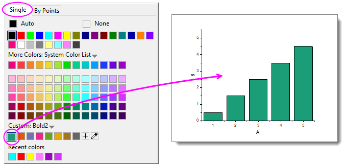
- Select a plot (e.g. scatter plot) and click the Fill Color button on the Mini Toolbar that appears.
- Select a plot and click the Fill Color button on the Style toolbar.
- Double-click on a plot to open the Plot Details dialog box where you can click on a tab to the right side (e.g. Symbol tab for a scatter plot) and set color for the element.
- To create a special point -- i.e. to assign special characteristics to one data point in your plot -- press Ctrl+click to select the point, then use the Mini Toolbar, Style toolbar or Plot Details controls to customize color for that point.
-
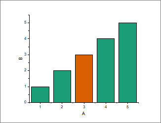
Applying Colors By Points
Applying colors By Points generally means applying a color to each point in a plot by one of several schemes. The simplest involves picking an Increment From color from a predefined color list and assigning colors, in sequence, to each point in the plot.
As in the case of applying a single color, you can apply these settings using controls in Plot Details; or by selecting the plot and using the Fill Color buttons on the floating Mini Toolbar or Style toolbar docked to the top of your workspace.
Other schemes typically make use of a column of values to assign color to points:
- Indexing assigns point color by associating an integer or text string (categorical value) to different colors in a list.
- Direct RGB assigns color using a value derived from columns of RGB values.
- Color Mapping -- used for 2D, Contour and 3D plots -- assigns colors in a list or palette, to values across the range of the plot's Y or Z values.
There are several other schemes which are specific to a certain plot type (or family of plots), but the list above covers most of what you will use. For more information see Using a Dataset to Control Plot Color.
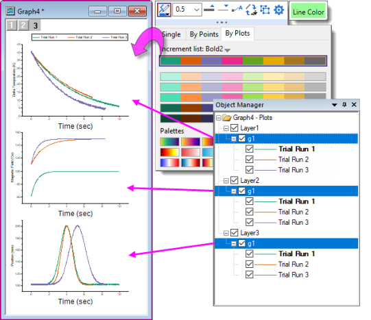
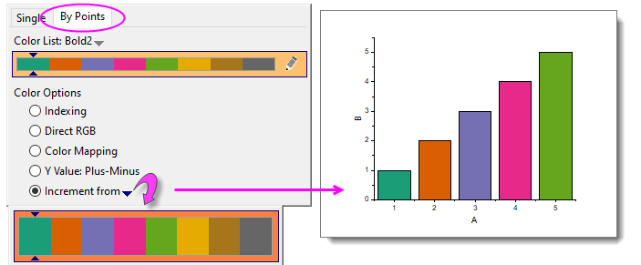
Applying Colors By Plots
You apply color By Plots when you want to assign differentiating colors to a series of plots. Typically, this series of plots comprises a "plot group." In a plot group, plot attributes including color, are assigned to each plot by incrementing through a style list -- color, line-style, symbol shape, etc.
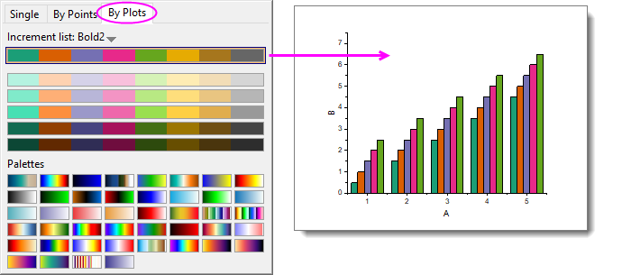
From Origin 2023, a new way to apply a color palette to 3D bar charts is available. The method works best for 3D bars as it allows you to apply a color palette by Z value (this is neither "apply colors by plots" in the above sample graph, nor "applying a colormap" as described below, but something unique to 3D column/bar plots). To find out more about this graph customization, press F11 and on the Learning Center Graph Samples tab, set the drop-down list to 3D Bar Charts and search on "gradient." |
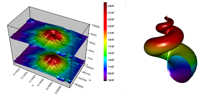
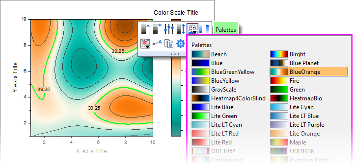
Applying Colormaps to 2D, 3D and Contour Plots
While you can use a color list with a contour or 3D plot, it is probably more common that you will use a color palette. This allows a wider range of color variation and can add realism to 3D surfaces and 3D function plots.
You can add new color palettes to Origin by drag-and-drop. Support for Scribus (.xml), Office Color Table (.soc), Adobe Color (.aco), Adobe Color Table (.act), Adobe Swatch Exchange (.ase) and JASC PaintShopPro (.pal). |
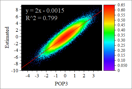
Colormapping can also be applied to 2D plots. This allows you apply a greater range of color variation to data points than would be possible with incrementing or indexing. A good example of applying a color map to a scatter plot would be Origin's Density Dots plot in which, typically, thousands of scatter points are plotted and an algorithm is used to calculate point density and assign color to ranges of point densities.
Applying a colormap to a 3D or contour plot is much the same as applying color singly, by points or by plots. You select a plot -- then using the Palette button on the floating Mini Toolbar or the Style toolbar. You pick a palette.
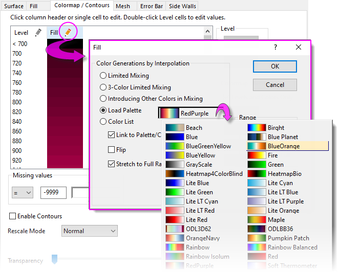
You can also use the controls on the Colormap/Contours tab of Plot Details. This tab gives many more options beyond simply picking and applying a colormap.
For more information on applying color to colormapped plots, including contour and 3D surfaces, see these topics:
- The Plot Details Colormap/Contours Tab
- Tutorial: Contour Plots and Color Mapping
- Colormap Surface Graph
- Symbol Plot with Size and Colormap from Other Columns
- Parametric Surface with Colormap from Data
Graph Legends
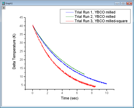
How the Default Legend is Created
A graph legend is automatically created when you plot data. For most 2D and some 3D graph templates, the default legend combines (A) plot style information stored with the graph template, with (B) dataset information stored in the worksheet column label rows, and places the resulting legend object on the graph page.
Note that the default legend object is not created with literal text and plot symbols but instead is created from LabTalk script.
- This allows the legend object to be dynamically linked to plotted data and worksheet metadata, so that the legend can be updated when data or plot metadata change.
- Because construction of the legend object relies on scripting rather than literal information, you can save customizations to a graph template and recreate the graph with its accompanying legend object using new data, as often as is needed.
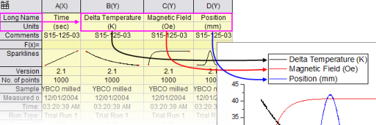
The legend script relies on "substitution notation" to convert variable values to readable symbols and text. You can see this notation when you double-click inside of the legend object (as if to edit it).
- You control which dataset metadata are used in constructing the default legend text by setting the the Translation mode of %(1), %(2) list in the Legends/Titles tab of the Plot Details dialog box (Format: Page...).
- Custom strings can be constructed using LabTalk substitution. Customizations can be saved to the graph template for repeat use.
Origin has a Fit Layers to Page tool that is useful for arranging a graph and a large, text-wrapped legend on the page. |
Adding and Updating the Default Legend
The table below lists tasks associated with adding or updating the graph legend, and where to find editing controls for each legend type. Before proceeding, we should point out that there are two legend refresh modes:
- Updating a legend will preserve any customizations that you might have made to the existing legend, including size and position adjustments and legend symbol and text customizations.
- Reconstructing a legend will overwrite any customizations. When you add or reconstruct the legend, you are creating a copy of the legend that is stored in the graph template.
The legend object occasionally goes missing. If you cannot add or reconstruct your legend, there is a good chance it already exists but is outside of the page and can't be seen. Try clicking Graph: Legend: Reset Legend Position which should restore the legend to its default location. |
In addition, the graph template stores a Legend Update Mode setting that determines how the legend is refreshed when adding or removing data plots from the graph. See Controlling Legend Update, below.
| Task | Method (graph is active) | ||
|---|---|---|---|
| Add or reconstruct legend |
| ||
| Update legend | Open the legendupdate dialog box:
| ||
| Customizing special legends | Right-clicking on these special legends opens a dialog box with customization options specific to each legend type: | ||
| Add color scale | Only available for color-mapped plots (e.g Contour Plots).
| ||
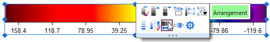
| Control color scale | Available when a color scale object has been added to a graph. To open the Color Scale Control dialog:
| ||
| Add bubble scale | Available for bubble plot, or when symbol size is controlled by a dataset.
| ||
| Control bubble scale |
Available when bubble scale object has been added to a graph. To open the Bubble Scale Control dialog:
|
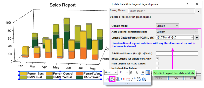
The legendupdate dialog box and the Legend/Titles tab at page level of Plot Details both have an Auto Legend Translation Mode drop-down that determines which worksheet metadata (e.g. column Long Name, Comments, etc.) is used to generate the legend text. For a list of Custom options, see Legend Substitution Notation. |
| Note: For more information on creating and customizing graph legends, see:
Help: Origin: Origin Help > Graphing > Graph Legends and Color Scales |
Controlling Legend Update
When a data plot is added or removed from a graph layer, the default behavior is to update the legend. The Legend/Titles tab at the graph page level in the Plot Details provides a Legend Update Mode drop-down to control this behavior.
The default setting Update when Adding only affects the legend display of data plots that are added or removed. Previous legend customizations to existing plots, such as literal text entered manually, will be maintained.
Tutorial: Customize legend and add data plots
|
Special Legend Types
As mentioned, Origin supports these specialized legends for use with specific graph types. These legends can be customized and updated similarly to the Data Plot legend used by most 2D graph types.
| Legend Type | Menu to Create | Used in situations where ... |
|---|---|---|
| Legend for Categorical Values | Graph:Legend:Categorical Values | At least one plot attribute (e.g. color, symbol shape.etc) is controlled by data indexing. See the Legend for Categorical Values help page. |
| Point by Point Legend | Graph:Legend:Point by Point | The plot symbol style is controlled by data indexing, an increment list, or color mapping. See the Point by Point Legend help page. |
| Legend for Box Chart Components | Graph:Legend:Box Chart Components | The graph is a box chart, or a grouped box chart. See the Legend for Box Chart Components help page. |
Tips for Quick Legend Edits
Many edits to the graph legend can be made from the legend's Mini Toolbars. The default legend for 2D graphs has two Mini Toolbars:
- The Legend toolbar -- available when you select the legend object -- has general controls for font, legend reconstruction, reversing order, etc. Click on the legend object to produce the blue selection handles.
- You also gain quick access to more complex controls such as Data Plot Legend Translation Mode -- identifying the column label row metadata that you wish to use to create your graph legend.
- The Legend Symbol toolbar becomes available when you click on a legend symbol. Use it to change symbol or pattern block height and width, line thickness, etc.
In addition to the Mini Toolbar for the default legend, there are toolbars specifically for Color Scales and Bubble Scales.
To format your legend or scale using a Mini Toolbar:
- Select a legend or legend component (e.g. legend symbol). A Mini Toolbar with context-specific buttons will show.
- If the toolbar fades too quickly, restore it by pressing the Shift key.
To format multiple legend objects on a page using a Mini Toolbar, press Ctrl and select the objects. Release Ctrl to display a Mini Toolbar for editing. Alternately, when the graph window is active, go to Object Manager and right-click on a legend object and choose Select All with Same Name and use the Mini Toolbar that appears in the Object Manager space |
Other Legend Editing Tips
- Apart from the Mini Toolbar buttons, you can also right-click on the legend object, choose Legend and open a shortcut menu with some useful commands such as Text Color Follows Plot, Reverse Order, and Show Legend for Visible Plots Only. The same menu commands are available from Graph: Legend.
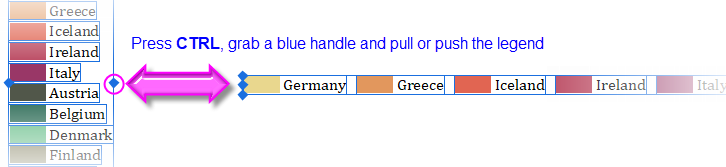
- Both the Mini Toolbar and the shortcut menu have an Arrange in Vertical/Horizontal button/command for changing the legend aspect; or you can modify it interactively by selecting the legend object, then pressing CTRL while dragging a selection handle (e.g. drag horizontally to create a legend that is all on one line).
- You can modify the white space around legend entries in the default 2D legend, by clicking precisely on the legend frame and dragging the selection handles.
- While plot metadata stored in column label rows is an ideal source for legend text, you can simply overwrite the existing legend text with literal text. Either double-click on the legend text to enter in-place edit mode or if that proves to cumbersome, right-click on the legend and choose Properties (taking care not to overwrite the "\l( )" notation that creates the plot symbol). CTRL + double-clicking on the legend will also open the this dialog.
- As discussed above, the default legend is automatically-generated by combining worksheet metadata with customizable plot styles. However, there are times when your auto-generated legend needs some "tweaking":
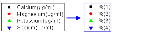
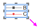
- One common legend customization is to manually add legend symbols and text that are independent of any data plot (you can read about that here). Besides frequently used symbol, you can also add an independent Color Block (1):
- Right-click on the legend object and choose Properties to open the Text Object - Legend dialog.
- Click the Add Legend Symbol button
 .
. - Enable Color Block, customize the block and click Add.
- Manually add text at the end of the string that is used to generate the block before closing Properties.
- Another desirable adjustment is to add some white space between legend entries. This is done using the Separator button
 on the Text Object - Legend toolbar (2).
- In the upper panel of the Text Object - Legend dialog, place the cursor at the end of the line preceding where you want to place the separator, then click the Separator button (hint: separator thickness can be controlled by editing the numeric portion of the inserted syntax \sep:50).
- In the upper panel of the Text Object - Legend dialog, place the cursor at the end of the line preceding where you want to place the separator, then click the Separator button
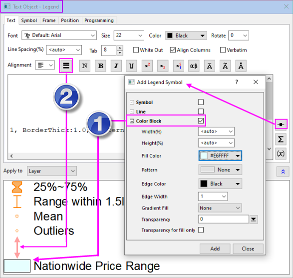
- If you are adding special characters to the legend manually, there is a simplified Symbol Map dialog for doing that. Most-used symbols are arranged on tabs for easy access. To access the full Symbol Map dialog, click the Advanced button.
- Double-click a legend symbol to open the Plot Details dialog box.
- Any changes that you make to the legend can be saved with the graph template (File: Save Template As) If you do not want a legend object added to your graph each time you create the graph, delete the legend object and re-save the graph template.
Annotating Your Graph
When we speak of "annotating" a graph, we are talking about adding text or drawing objects to the graph. Generally, these "annotations" help to enhance the graph in some way -- add a page title, add an arrow to draw attention to some graph feature, label data points, add a date-time stamp to note the time of graph creation, etc.
Annotating a graph can be as simple as adding a static text object and formatting it with Mini Toolbar buttons. Or you might add a more complex object that is dynamically linked to a variable value or to some LabTalk script that is executed whenever some user-specified event occurs.
The following table lists some common graph annotation tasks and available tools for accomplishing those tasks:
| Task | Method |
|---|---|
| Label Data Points and Plots |
|
| Add Text Objects |
|
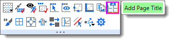
| Add Page Title |
|
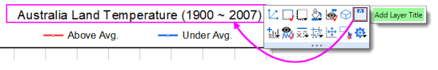
| Add Layer Title |
|
| Add Vertical/Horizontal Line |
|
| Annotate a Data Point |
|
| Add Drawing Objects | Use the corresponding toolbar buttons on Tools toolbar. Origin supports:
|
| Insert Equation, Word Object, Excel Object, Other OLE Object |
|
| Insert Worksheet, Insert Graph |
|
| Insert Image |
|
| Add Table |
|
| Insert Date & Time Stamp |
|
| Insert Project Path |
|
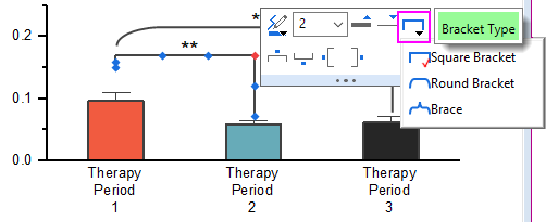
| Add Bracket with Asterisk |
|
| Add XY Scale | This is useful when using a nonlinear xy scale.
|
Tips for Editing Your Graph Annotations
Beginning with Origin 2021, use Alt+Enter when creating multi-line text objects. To revert to using Ctrl+Enter to insert a line break, set @FCA=1. |
- Pressing CTRL when drawing with the Rectangle
 or Circle
  tools, will draw a square or circle (as opposed to a rectangle or ellipse).
 - Use Mini Toolbar buttons for quick edits to selected objects. For more complex edits, right-click an object and choose Properties to edit object properties and set defaults.
- For text objects, including the axis titles and graph legends, you can edit text objects directly in "In-place Edit" mode. Double-click on a text object to edit. Use the Format toolbar buttons to add superscript, subscript, and Greek characters.
- You can enable text wrapping for text objects, including legend objects. Open the object's Properties dialog, click the Frame tab and enable Wrap Text, Adjust Height; or select the object and click the Wrap Text Mini Toolbar button.
- NEW: By default, there is an 80 character limit (with spaces) to in-place editing of wrapped text. Below this threshold, double-clicking on the object will put you into in-place edit mode; above the threshold, double-clicking will open the Properties dialog. You can adjust this threshold using system variable @TLIP.
- NEW: When long text objects are not wrapped, you can use system variable @TLIPN (default = 60) to determine the character threshold for entering in-place edit mode or to open the Properties dialog, upon double-clicking.
- Note that while manual editing of axis titles and legends may be the best "quick solution", in most cases, you are better off using worksheet column metadata to automatically create axis title and legend text.
- Do NOT set font size while in "In-place Edit Mode" unless you need to mix font sizes within a single text object. The correct way to change font size is to click the text object once so that the green selection handles appear, then select font size from the Format toolbar. If you set while in In-place Edit mode, Origin will not indicate the proper font size when you hover on the text object.
- When you are in In-place Edit mode, you can right-click and choose Symbol Map to insert special characters into your text object.
- You can insert data from of a worksheet cell into a text object by copying and pasting the cell contents. While in In-place Edit mode in the text object, right-click and choose Paste or Paste Link. Data added by Paste is static; Paste Link is dynamic and thus, the text object will update if the data in the linked cell changes.
- Also, when in In-place Edit mode, you can right-click and choose Insert Info. Variable... to insert project variables into the text object. Since the pasted information is linked to a LabTalk variable value, the inserted data updates if the variable value changes.
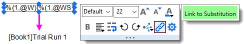
- You can insert variable values into a text object using the LabTalk %, and $ substitution notation by setting the Link to (%,$), Substitution Level to 1 in the text object's Properties dialog box, Programming tab. Right-click on the text object and choose Properties from the shortcut menu. Alternately, you can use the Link to Substitution Mini Toolbar button, saving you from having to open the Properties dialog.
- You can use controls on the Programming tab of Properties to associate your LabTalk script with a text or drawing object (for instance, see Linking Text Labels to Data and Variables). Enter your script in the text box and specify a Script, Run After condition for running the script. Use the Apply to drop-down to set the scope for the script.
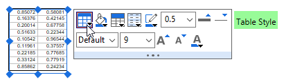
- You can copy a range (of cells) from a workbook and paste it into a graph as a table object. Table content is (a) edited by double-clicking on the object and (b) can be formatted using Mini Toolbar buttons.
You can add text formatting (e.g. super-/subscripting) to non-consecutive characters via the text object's Properties dialog:
|
Simple Symbol Map
The Simple Symbol Map is a "settings" menu to assist in managing symbols.
- To insert a symbol, highlight the symbol and click Insert.
- For help with Advanced or other dialog settings, see the Origin Help file.
From the "gear" icon...
- Add: Enter space-separated Unicode 4-character sequence. Symbols will be appended to the current tab.
- Delete: Enter space-separated Unicode 4-character sequence. Symbols will be removed from the current tab; or click Select to pick symbols to remove.
- Reorder: Drag to reorder, click Done to apply changes.
- Reset to Factory Default: Resets to default symbol set for current tab.
- Append from Factory Default: Restores previously-deleted default symbols to current tab (does not affect user symbols).
For more information, see the Origin Help file page Adding Unicode and ANSI Characters in Text Labels.
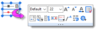
Grouping, Aligning and Arranging with the Object Edit Toolbar
You can group text labels and drawn objects so that they move or resize as a unit:
- To select objects, press SHIFT + click; or drag out a box around objects using the Pointer
 tool.
tool. - To group the selected objects, click the Group button
 on the Object Edit toolbar.
 - To ungroup objects, click the Ungroup button
 on the Object Edit toolbar.
You can align multiple text labels and/or drawn objects with one another using the tools on the same Object Edit toolbar:
- Select objects to be aligned by holding the SHIFT key while selecting (or drag out a selection box using the Pointer tool), then click one of the align objects buttons on the toolbar. Note that objects will be aligned with respect to the first-selected object.
You can bring overlapping objects to the front or send them to the back:
- Select the objects that you want to move to the front or the back.
- Click the Front button
 or the Back button
  on the Object Edit toolbar.
| Note: For more information on graph annotations, see your Origin User Guide:
Help: Origin: Origin Help > Graphing > Adding Text and Drawing Objects |
You can also use the Object Edit Toolbar to manipulate graph layers. Use buttons to align and set a uniform size for multiple graph layers or to swap layer order. |
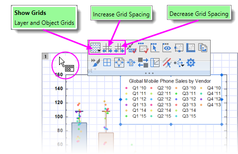
Using Page or Layer Grids to Place Objects
For manually placing objects -- graph layers, text objects, legends, etc. -- you can turn on a non-printing, non-exporting page or layer grid:
- With the graph active, choose View: Show: Page Grid/Layer Grid (displays only one at a time).
- Alternately, you can turn on grids by clicking near the page margin and clicking the Mini Toolbar Show Grids button. In addition, you'll find buttons for increasing or decreasing grid size by increments.
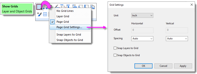
Control of the Grid
Grid display and related grid settings are found by clicking on the Show Grids button.
- Click Show Grids, then click Page Grid Settings.
Object Attachment and Scaling in Graphs
There are two settings that you should know something about, particularly if you subsequently modify axis scales or resize the graph layer after adding annotations: One is the object's Attach to method, the other is the layer's Scale Elements behavior.
Object Attachment
When you add a text or drawing object to an Origin graph window, the object becomes part of the active graph layer. Thus, if you resize or delete that graph layer, you will resize or delete the added object.
In addition to being part of the graph layer that was active at the time of object creation, note also that objects are attached to the graph in one of three ways, depending upon the type of object and where it is created on the page.
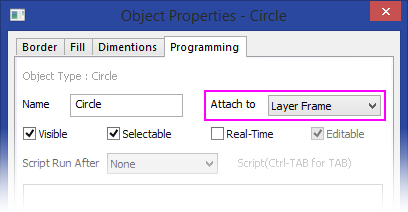
To view the "Attach to" setting for any object:
- Right-click on a text or drawing object and choose Properties....
- Click on the Programming tab and note the object's Attach to setting.
Though objects remain a part of the layer that was active at the time of their creation, you can manage some object behaviors by changing the object attachment method. An object is attached in one of three ways:
- Page. When attached to the page, objects are not affected by moving or resizing the graph layer, nor are they affected by a change in axis scales. These objects are still associated with a particular graph layer and they will be hidden or deleted if the layer is hidden or deleted.
- Layer Frame. Objects that are attached to the layer frame, are resized and moved with respect to the layer frame. However, they are not tied to axis scales and are not affected by changes in the layer's axis scale values. Objects are hidden or deleted if the associated layer is hidden or deleted.
- Layer and Scales. Objects are linked to a particular range of axis scale values. If you resize the layer, the object is resized accordingly. If you rescale the axes, the object moves in relation to the visible scale and will disappear from view if the linked axis scale range is not displayed. These objects are hidden or deleted if the associated layer is hidden or deleted.
To briefly illustrate why object attachment is important, let's look at the following graph. After the graph was created, arrows and text objects that point to their respective data plots, were added to the graph. Both arrows and text objects are attached to the graph Layer Frame.
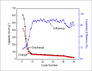
Now, consider what happens to these objects when we modify the graph's X axis scale (recall that objects attached to the Layer Frame "are unaffected by changes in the layer's axis scale values"). Note that by changing the axis scale display range, we have shifted the data plots but the text objects and arrows did not move with them.
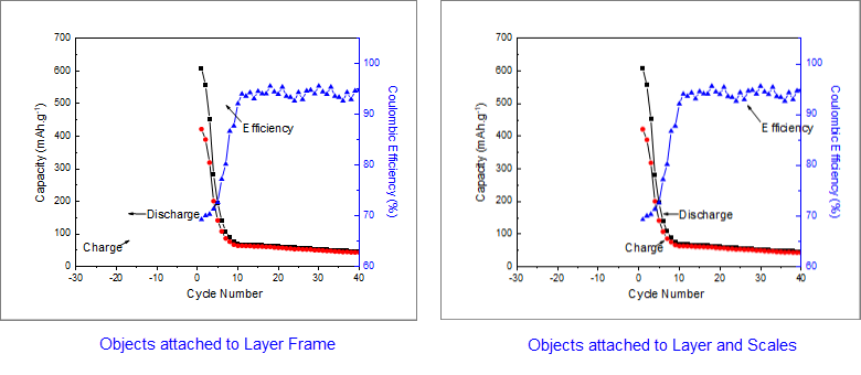
The remedy for this is to change the text and drawing objects' Attach to method to be Layer and Scales because "if you rescale the axes, the object moves in relation to the visible scale." Sometimes we may want an object to move with scale changes; at other times we may not. You can force either behavior if you keep in mind the Attach to setting.
Object Scaling
Object scaling often comes up when manually resizing the graph layer or when merging separate graphs into a single multi-panel graph (Graph: Merge Graph Windows). By default, added objects are set to Scale with Layer Frame -- that is, when the graph layer is resized, associated objects such as text objects, axis lines and ticks, and axis titles -- will be scaled proportionally. In the case where you merge four single layer graphs into a single, four layer multi-panel graph, these objects will be scaled down with the reduction in size of the layer frame.
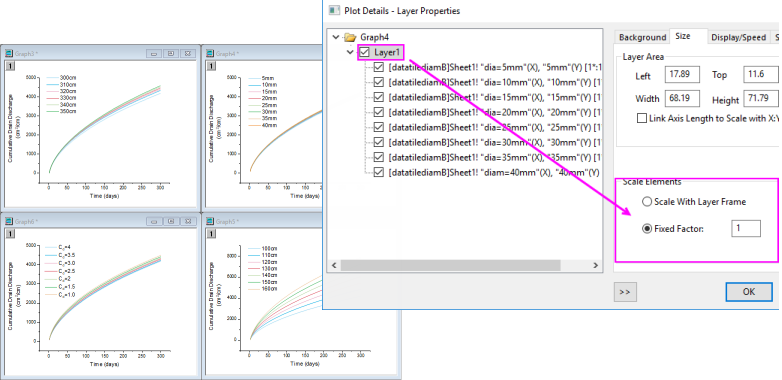
However, this is another default behavior that you may want to change (e.g. you have set your font size to 10 pt. and you want to preserve that size), and you can do this using the Scale Elements control on the Size tab (Layer level) of Plot Details. If our goal is to keep objects at their current size when merging graphs, for instance, we can open the Plot Details dialog box and at the layer level (Format: Layer...), click on the Size tab, choose the Fixed Factor radio button and set the scaling factor to 1.
If you have resized the graph layer, either by merging multiple graphs into a single graph or by manually resizing the layer, you will find that the font sizes do not display at their "correct" size (i.e. if you select a text object, the Font Size list on the Format toolbar shows the original font size). Further, if select a text object, the Status bar will report two font size numbers -- "size" and "actual". You can reset font size so that they are shown as actual size, not scaled size, by choosing Graph: Fix Scale Factors. For more information, see FAQ-441 How do I export graphs with exact size and resolution as specified by publishers? |
Inserting Images to Graphs
There are two general approaches to adding images to graph windows:
- Insert the images as floating or background images.
- Insert images within a text object.
Floating or Background Images
- Images can be inserted to graphs from file or from Image Windows.
- Images can be inserted as floating images or as a layer background.
- Double-click on a graph image to open the image in an Image Window.
- Once opened in the Image Window, define a region-of-interest (ROI) and Clip the image (graph image clipped to ROI) or Crop the image (image is cropped in Image Window and graph).
- Use the Image Window to Set (image) Scale or Set (image) Coordinates of the inserted image.
- Images may be saved with the project or linked to an external file (Link File) to control project size.
Prior to Origin 2022b, images linked to an external file had to be manually reimported on project open. Now, linked images are automatically reimported, including modified source images. Disable or modify auto import with system variables @LFAU and @LFC. |
Inserting Image from File
You can insert an insert an image into graph page, with the option of inserting it as a background image that is linked to layer and scales.
- With the graph layer active, choose Insert: Image from File. The image is inserted as a floating image.
- To convert the image to a background image, double-click to open it in an Image Window.
- Right-click on the Image Window image and choose Set as Layer Background.
- Click the Close button
 on the Image Window.
Inserting Image from Image Window
You can also insert images to graphs from an Image Window:
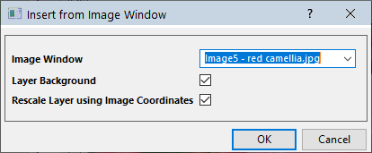
- With the graph window active, choose Insert: Image from Image Window. The Insert from Image Window dialog opens.
- Set the Image Window drop-down to the desired image.
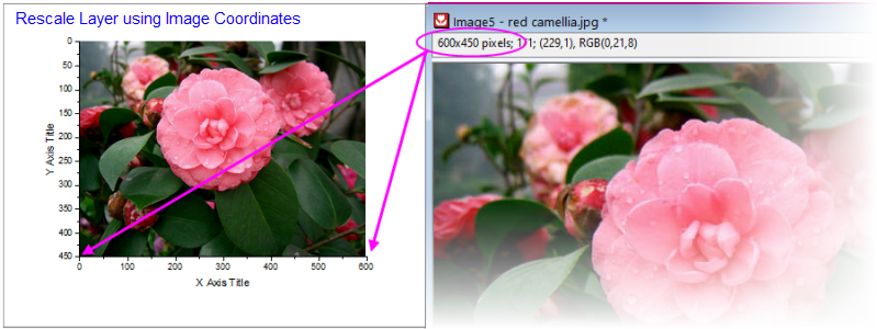
- Optionally, choose to insert the image as Layer Background and to Rescale Layer using Image Coordinates (Layer Background only).
Manipulating Images with the Image Window
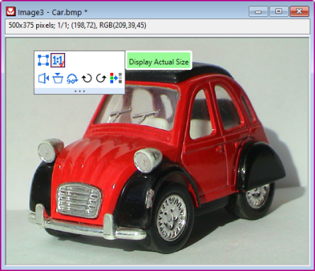
Mini Toolbar
Clicking on an Image Window image produces a Mini Toolbar with buttons for simple image manipulations (flip, rotate, convert to gray scale, etc.).
Region-of-Interest (ROI)
Placing an ROI object on the Image Window image allows you to perform certain image editing operations.
Add an ROI to the image by one of the following:
- Click the Add ROI button
 on the Mini Toolbar.
 - Right-click on the image and choose Add ROI.
- Click the Rectangle Tool
 on the Tools toolbar.
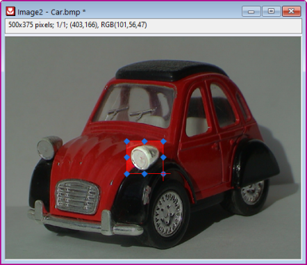
Once added, the ROI can be resized (by dragging handles) or moved. Additionally, various operations can be performed on the ROI, including:
- Clip graph image to ROI, Crop image to ROI or Copy ROI as image to graph.
- Copy Positions/Paste Positions for copying ROI dimensions to a second ROI on another Image Window.
- Export ROI or Import ROI to save or apply previously-saved ROI dimensions.
For more information on the Image Window, see the Origin Help File.
Inserting Images into a Text Object
Images can also be inserted as part (or the entirety) of a text object. Source images can be from:
- Local image file or Web image URL
- Worksheet cell
Local Image or Web URL
When you insert an Image from File or Image from Web using the following methods, the image is linked and not stored in the Origin project file. This helps control project file size.
- On the Tools toolbar, click the Text tool
 and click once on the graph to enter "in-place" edit mode.
 - Enter text if needed and when ready to insert image, right-click and choose Insert: Image from File or Image from Web:
- When inserting an image from file, browse to your local image file and click Open.
- When inserting an image from Web, you'll need a URL (hint: locate your Web image, then right-click and copy the address (Copy Image Address, Copy Image Link, etc, depending upon browser).
To examine (or modify) the syntax used for inserting an image, you can select the inserted object and choose Properties. In the Text Object dialog, you should see something like these examples:
Examples:
\img(file://"C:/Program Files/OriginLab/Origin2023/Samples/Image Processing and Analysis/white camellia.jpg",w=200)
\img(https://www.originlab.com/images/header_logo.png, w=200)
... where option "w=" is the default width in pixels, of the inserted image. Width is user-modifiable by editing the "w=" value in Properties or -- if no width is specified -- by simply dragging the object's selection handles.
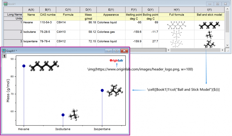
Worksheet Cell
You can also insert an image from a worksheet cell into a text object, but you'll need to make use of a special syntax. The syntax is not complicated and combines a \cell( ) escape sequence with a cell reference -- either a range reference (e.g. [Book1]Sheet1!col(C)[1] ) or a named range reference.
- On the Tools toolbar, click the Text tool and click once on the graph to enter "in-place" edit mode; or right-click and choose Add Text from the shortcut menu.
- Enter your string into the text object using the examples below as a guide:
- If you are copying and pasting a string (e.g.
\cell([Book1]Sheet1!B[1])), click outside the text object to leave edit mode. Your cell image should display in the text object. - If you are typing directly into the text object in "in-place" mode, enter your syntax (e.g.
\cell([Book1]Sheet1!B[1])) and when finished, right-click on the object, choose Properties and on the Text tab, remove one of the leading "\" characters from your cell reference (Origin automatically "protects" "\" characters entered into text objects which is why you'll need to remove one "\". See Escape Sequences). - If you are typing directly into the Text Object (Properties) dialog, enter your syntax (e.g.
\cell([Book1]Sheet1!B[1])) directly to display the cell image.
- If you are copying and pasting a string (e.g.
Examples:
\cell([Book1]1!col(C)[2]) // Book1, Sheet1, col C, row2, size = current font height
\cell(alpha,200) // named range "alpha", width=200 logical pixels
\cell(alpha,h=300) // named range "alpha", height=300 logical pixels
Working with Map Data
You can overlay geopolitical boundaries on graphs or Image Plots of NetCDF data from the Insert menu.
- Insert: World Map will apply boundaries within the graphs current Lat and Lon ranges.
- Depending upon the graph's Lat and Lon ranges, other options may be available (e.g. Continental USA Map, Map of China, etc.).
Importing Shapefiles
You can also import locally-stored shapefiles using Origin's Shapefile Connector:
- With a workbook active, choose Data: Connect to File: Shapefile.
Map-related Apps
There are at least two add-on Apps for inserting geographic data:
- OriginLab's free Google Map Import App lets you place a Google Map as background on the graph page using specified coordinates.
- Maps Online is another free OriginLab App that lets you connect to one of several map databases.
You can find and install these Apps by pressing F10 and searching on maps. For information on App installation, see Where Do I Find Apps?
Arranging Graphs and Layers
| Task | Method | ||||
|---|---|---|---|---|---|
| Merge multiple graph windows into a single graph window. |
or
| ||||
| Extract data plots in one layer to multiple layers. |
| ||||
| Extract multiple layers in a single graph to multiple graph windows |
or
All layers are extracted to individual graph windows, even if a layer is linked to another layer. By default, the layextract dialog box has Extracted Layers set to 1:0, which specifies that all layers be extracted. To extract only certain layers, clear Auto and use the layextract X-Function's comma/colon notation to control which layers are extracted. The notation 1:0 means starting with layer 1, extract all layers to graphs (0 denotes all). Specifying 1,3:4, for example, tells Origin to extract only the first, third and the fourth layer. Note that you can enable Keep Source Graph to preserve the original graph. | ||||
| Add, arrange, resize, position, swap, align, or link layers |
| ||||
| Simple arrangement of layers |
| ||||
| Link graph layers |
When linking layers, the child layer must have a higher layer number than the parent layer. Linked layers can be moved and resized together. You can link layers' axis scale values to be Straight (1:1) or you can specify a Custom mathematical relationship.
| ||||
| Reorder layers |
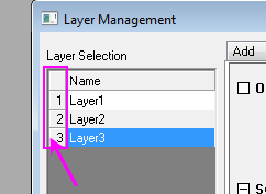
There are several ways to reorder graph layers (reassign Layer number for each Layer). Learn more about reassigning layer numbers in the mini tutorial below this table.
For more information, see the Layer Management tool.
The command changes the nth Layer to the mth Layer.
| ||||
| Exchange X-Y Axes |
| ||||
| Move a plot(s) to another layer |
|
In a multi-layer graph, layer order determines drawing order. The 1st layer is plotted and then 2nd layer is plotted on top of it, and so on. The layer with higher number is drawn on top of the layer with lower number. This is important when plots in one layer overlay plots in another layer. When necessary, you can change layer order to change plot drawing order. This mini tutorial shows you how layer reassignment works. Use the preview window to see how layer number reassignment affects your graph.
|
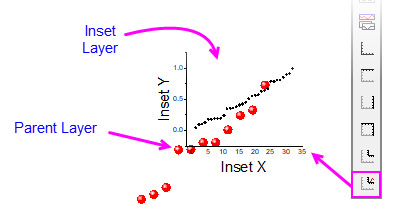
You can easily add an inset layer with data by clicking the Add Inset Graph With Data button |
You can copy a layer from one graph window to another graph window. Click to select the layer first (a frame shows around the layer). Then press Ctrl+C or right-click and choose Copy. Click on the target graph window, then right-click to Paste. |
| Note: For more information on merging graphs, see your Origin User Guide:
Help: Origin: Tutorials > Graphing > Layers > Merging and Arranging Graph Layers Help: Origin : Origin Help > Graphing > Reference > The Merge Graph Dialog Box |
Templates and Themes
Origin's flexible Page > Layer > Plot hierarchy, plus an extensive list of editable object properties makes it easy to customize and save your graph settings for repeat use. You can preserve your custom settings in a couple of ways -- either with templates or with Themes. These concepts are introduced below.
| Note: For detailed information please refer to Origin Help file, see:
Help: Origin: Origin Help > Graphing > Creating Graphs from Graph Templates Help: Origin: Origin Help > Customizing Your Graph > Graph Formats and Themes |
Templates
A new Origin installation lists close to 240 plot types, each one backed by an Origin graph template file (*.otp or *.otpu). For most users, a Plot menu graph is the starting point for customizing and saving your own custom graph templates. The basic process goes like this:
- Plot your worksheet or matrixsheet data using the Plot menu (or equivalent graphing toolbar button).
- Customize the graph's default settings.
- Save the graph as a graph template file (*otp or *.otpu) by choosing File: Save Template As and filling in the requisite information. By default, custom templates are saved to your User Files Folder (hint: easily find this folder by clicking Help: Open Folder: User Files Folder).
A few things to note:
- The Plot menu is the definitive list of built-in plot types. At one time, a graphing toolbar button was created for each new plot type but in recent versions, few toolbar buttons have been added as toolbar space has become limited.
- In a fresh Origin installation, each one of Origin's 240 built-in graph types uses a specific "system" template when creating a particular graph type. When you click on a Plot menu graph or graphing toolbar button (e.g. Area
 ), one of these system templates is used to plot the selected data.
 - System templates are installed to the Origin Program Folder. They are completely customizable but as the Program folder is write-protected, you cannot overwrite the original system template file (see next).
- Instead, when you customize and save a system template, it is saved by default to your User Files Folder (UFF). If you save the customized template to the same system template name, the customized template replaces the system template as the template associated with the Plot menu command or corresponding toolbar button used to create that plot type. Additionally, the customized template is added to the user's Template Library.
- To view your custom graph templates, click Plot (workbook or matrix should be active) and click Category = MyTemplates.
- You can save a graph template anywhere (and with any name) that you like -- it does not need to be saved to your UFF. However, by saving customized templates to your UFF, they will be collected in one, easily-remembered place and they will be readily available when you upgrade your Origin software (since Origin 2018, all Origin versions have shared a common User Files Folder).
- For an overview of graph templates, see Graph Template Basics.
- For information on the Template Library, see The Graph Template Library.
- For information on "cloneable" templates, see Cloneable Templates.
The Template Library
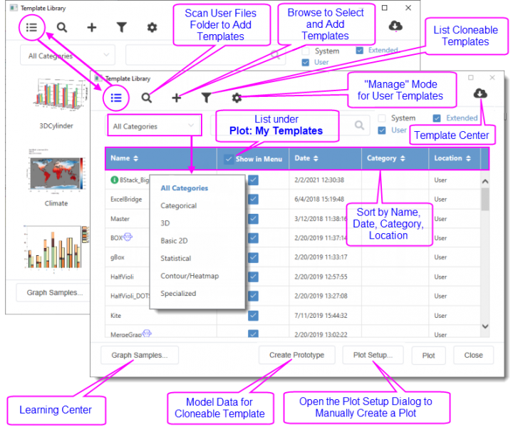
Summary of Features:
- Toggle between list and thumbnail view modes. Thumbnails images are automatically generated when you save a template.
- In either mode, you can hover on the template to preview, read template location, comments, etc.
- In list mode you can sort; or opt to list a User or Extended template under Plot: My Templates.
- Templates are listed as System, Extended or User. System templates are Origin's default templates for creating Plot menu graphs. They can be plotted to and customized but cannot be overwritten. Extended templates are add-on templates that are installed with Origin. User templates are those that you specifically customize then save using File: Save Template As; or which you add using the Library's Add or Scan functions. Note that User templates can include customized System templates that you have saved to \User Files.
- To scan your User Files folder (UFF) for custom templates, click the Scan User Template icon. To browse and add a template file to the Library, click the Add Template icon.
- Click the List Cloneable Templates icon to show only cloneable templates.
- Click the Manage Mode icon to delete, show or hide a given template. Hiding a template removes it from My Templates but does not remove it from the Template Library (note that you can also remove a template from My Templates simply by clearing Show in Menu). Deleting a template removes it from the Library and moves the template to User Files\DeletedTemplates.
- Click the Template Center icon to open a dialog and search the OriginLab site for additional graph templates.
You can search for Template Center templates and install them directly from the Start menu. |
Themes and Copy/Paste Format
An Origin Theme is a file containing a set of object properties. There are four kinds of Theme files in Origin: graph Themes, worksheet Themes, dialog Themes and function plot Themes.
Graph Themes are a collection of properties of different elements in a graph window. A graph Theme can be very simple (e.g. graph axis major and minor tick direction settings) or it could be something more complex (e.g. a combination of page dimensions, layer background, axis scales, and color palettes). Whether simple or complex, the purpose of graph Themes is to allow you to quickly change one or more object properties in an existing graph, or to apply a consistent set of properties to a selection of graph windows, without having to recreate a suite of settings, or to apply those settings one-by-one to individual graph windows.
All graph objects have a customizable set of properties that are specific to the object type. Therefore, it follows that the properties that can be saved as a Theme differ depending upon the selected object. You can (1) copy a Theme from one object and "paste" it to another object of the same type or (2) you can save a Theme from one object as a named Theme and apply that named Theme to other like objects at a later time.
- Right-click on an object in a graph window (e.g. a plot) and choose Copy Format. Depending on what you click on, there may be sub-menu items under the Copy Format shortcut menu, which give you the option as to what exact format to copy.
- To apply the copied formats to a single object, right-click on your target graph and choose Paste Format To. Again, this shortcut menu might has some sub-items that limit what to paste. In this way, the formatting option(s) from your source object should be applied to your target object.
- To apply the copied formats to multiple windows in the project, keep the source graph window active and select Edit:Paste Format(Advanced)... from the Origin menu. This opens the Apply Formats dialog box. Here you have the option of editing or selectively applying formats to one or more graph windows in the Origin Project.
- If you would prefer to save formats to a named Theme file that you can re-apply at a later time, choose the Save Format As a Theme... shortcut menu item, then use Preferences: Theme Organizer to apply the Theme when needed.
Theme Organizer
Use the Theme Organizer (Preferences: Theme Organizer) to organize and apply Themes to graphs. With this dialog box you can apply a graph Theme simultaneously to multiple graphs in the Origin project file.
To combine multiple Themes in the Theme Organizer dialog box:
- Press the CTRL key while selecting multiple Themes, then right-click and choose Combine from the shortcut menu. The shortcut menu in the tool provides an option for editing a Theme, allowing the user to add/delete properties from an existing Theme.
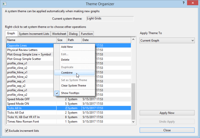
- The Theme Organizer has separate tabs for managing graph, increment list, worksheet, dialog boxes and plotted mathematical function Themes.
- If you right-click on a graph Theme and save it as your System Theme, then each time you plot a new graph, this System Theme will be applied regardless of the settings that were saved with the graph template†.
- Use the System Increment Lists tab to manage increment lists and selectively apply them to project graphs.
- You can load a graph Theme in the Export Graph dialog and the Theme will be applied to the exported image file.
† If you don't want a System Theme to be applied automatically to the graph, save the graph as a template (File: Save Template As) and clear the Apply System Theme to Override check box. |
Topics for Further Reading
- Plot Details: Customizing Graph Page Elements
- Plot Details: Customizing Graph Layer Elements
- Plot Details: Customizing Plot Elements
- The Preferences: Options: Axis tab Settings
- The Preferences: Options: Graph tab Settings
- Graph Axes
- Controlling the Graph Axis Display Range
- Graph Legends
- Color Scales
- Customizing Data Plot Colors
- Using a Dataset to Control Plot Color
- Using a Dataset to Control Plot Attributes
- Labeling Data Points
- Adding Text and Drawing Objects
- Adding Unicode and ANSI Characters in Text Labels
- Linking Text Labels to Data and Variables
- Associating Script with an Object
- Hiding Labels, Data and Layers
- Working with Maps
- Graph Template Basics
- Graph Template Library
- System Templates
- System Themes