6.8.1 XYZ Contour
XYZ-Contour
Summary
This tutorial will show you how to create a contour from XYZ data, and add the X and Y boundary.
Minimum Origin Version Required: 2020
 | Prior to Origin 2018 SR0, the application of a custom boundary sometimes generated an imperfect fill at boundary margins. This has been improved in 2018. The user can restore the previous contour-fill behavior using system variable @TCSM.
|
What will you learn
This tutorial will show you how to
- Create a Contour Plot from XYZ data
- Customize levels, lines, and color mapping
- Use a Custom Boundary
- Customize the Color Scale
- Customize the axes of the plot
Steps
This tutorial is associated with the built-in graph sample Contour Plots - XYZ Contour.
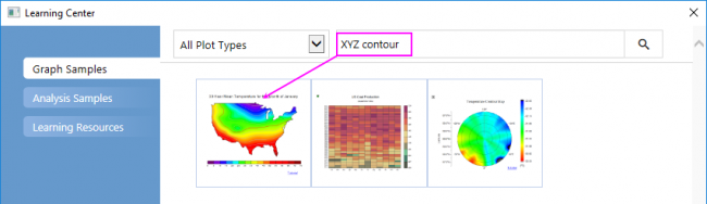
- Select Help: Learning Center to open the Learning Center. Select Graph Samples tab in the left panel of Learning Center and then enter the keywords "XYZ Contour" to search the sample. You will got the sample listed as below:
- Activate the workbook and highlight column D and then select Plot > Contour : Contour - Color Fill menu to create a color-filled contour plot.
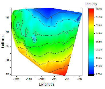
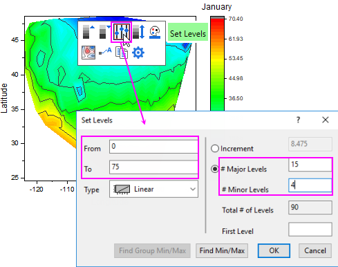
- Click on the plot, and in the pop-up mini toolbar, click the Set Levels button to open the Set Levels dialog. In this dialog, set From and To to 0 and 75 and Major Levels and Minor Levels to 15 and 4.Click OK button to close the dialog.
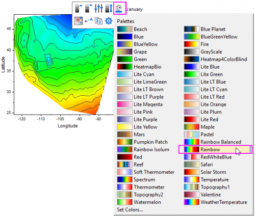
- Click on the plot again, and in the pop-up mini toolbar, click the Palette button to select Rainbow from the Palette list.
- Click on X axis, and in the pop-up min toolbar, click the Axis Scale button to open the Axis Scale dialog. In the dialog, set From, To equal to -127, -65. Click OK button.
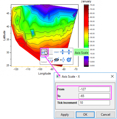
- Do the same operation on Y axis, and set From=23, To=50 for it.
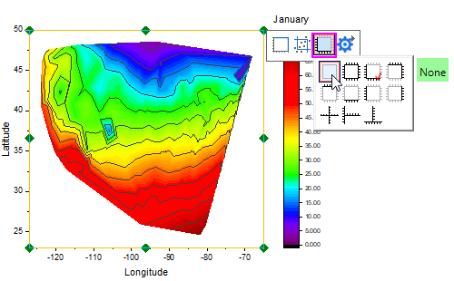
- Click on any white space inside the layer frame to select the layer, and in the pop-up mini toolbar, click the Axis Arrangement button to select None button under the pop-up list to hide all axes for this plot.
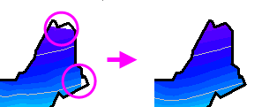
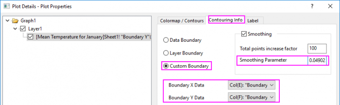
- Double-click on the contour plot to bring up Plot Details dialog. Go to the Contouring Info tab , select Custom Boundary radio box, and select Col(E):"Boundary X" as Boundary X Data and Col(F):"Boundary X" as Boundary Y Data. Then, set Smoothing Parameter to 0.0490234.
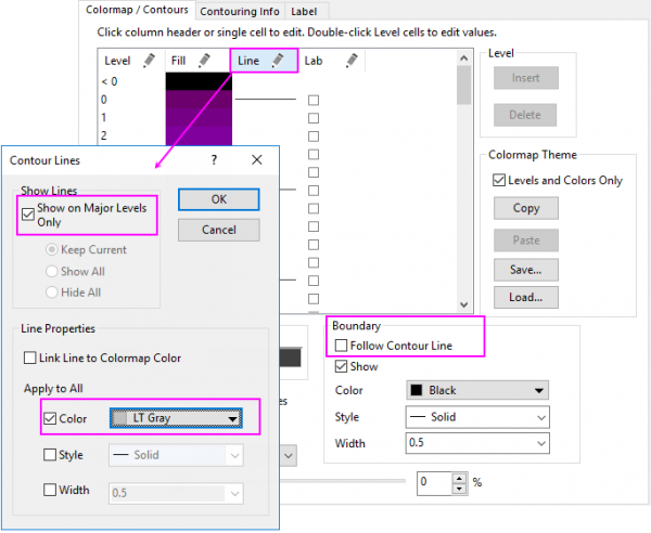
- Go to the Colormap / Contours tab, clear the check box Follow Contour Line under Boundary so that the boundary line could have separate style. Click the Lines heading, make sure that Show on Major Levels Only is selected. Select the Color check box under Apply to All and choose LT Gray from the drop-down list as contour line color. Click OK to close dialog.
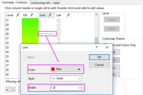
- Click on the line at value 30 to customize it separately and click OK to close dialog.
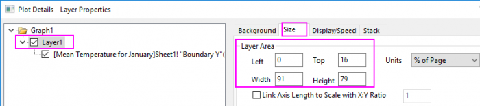
- Now we are going to change the layer size/aspect ratio. Select Layer1 in the left panel, go to the Size tab and change the values in Layer Area as below:
- Click OK to close the Plot Details dialog. With the graph window activated, select Graph : Fit Page to Layers... menu to open the Fit Page to Layers dialog, accept the default dialog settings and click OK to make all elements visible.
- Now we will customize the color scale object. Double-click on the color scale to bring up the Color Scale Control dialog. Then do the following settings:
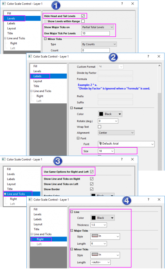
- Click OK to apply the settings and close the Color Scale Control dialog.
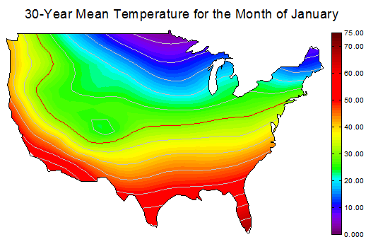
- Right-click above the contour plot and select Add Text to add a graph title 30-Year Mean Temperature for the Month of January. Use the Format toolbar and/or double-click on the completed text label to update the font, font size, etc. The graph should look like