6.5.7 Symbol Plot with Color Transparency
Contents

|

|
Summary
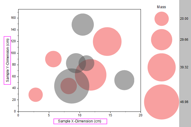
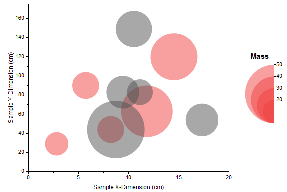
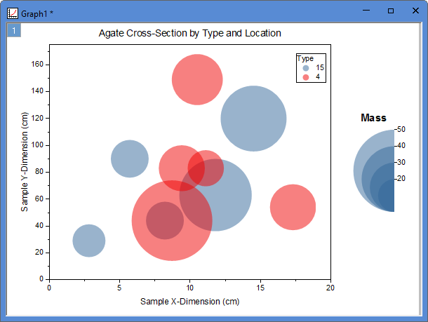
This tutorial will show you how to create a symbol plot with color transparency, categorical legend and bubble scale. This graph displays a symbol plot of XY data where the size of the symbol and its color have been mapped to two other data columns in the worksheet: Mass and Type. The categorical legend can be utilized to identify Type via color and the bubble scale can be used to check Mass via symbol size. Color transparency has been applied to the plot so that overlapping data points are visible.
Minimum Origin Version Required: Origin 2015 SR0
What you will learn
This tutorial will show you how to:
- How to control the size and color of plot symbols using values in worksheet columns.
- How to add a legend from categorical values
- How to add a bubble scale and customize it
- How to set the transparency to the symbol plot
- How to add a frame to the graph
Steps
This tutorial is associated with <Origin EXE Folder>\Samples\Tutorial Data.opj.
Also, you can refer to this graph in Learning Center. (Select Help: Learning Center menu or press F11 key , and then open Graph Sample: Line and Symbol)
- Open Tutorial Data.opj and browse to the Bubble with Transparency folder in Project Explorer (PE).
- Go to Book2G, highlight Col(A)~Col(C) in the worksheet and select Plot > Basic 2D : Bubble from the main menu.
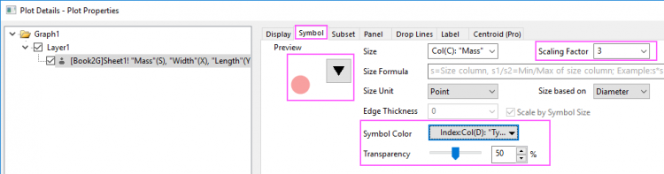
- Select Format: Plot... in the main menu to open the Plot Details dialog. Then go to the Symbol tab and set the symbol format as in the following:
- Set Scaling Factor to 3.
- Click the down arrow next to the Preview box to open the symbol gallery and select the filled circle symbol.
- In the Symbol Color drop-down list, select Indexing: Col(D)"Type"
- Set Transparency to 50%.
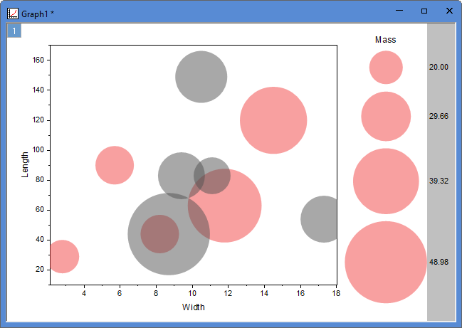
- Click OK to save settings and close the dialog. The graph should now look like this:
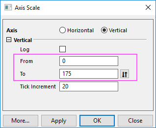
- To update the axes scales, click on the X axis, on the popup mini toolbar, click Axis Scale button to open the Axis Scale dialog box. Modify the following settings:
- In the Scale tab for X Axis, choose the following setting:
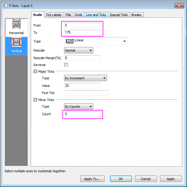
- Choose Vertical box and set the following:
- Click OK button to close the dialog. Double-click on the axis title, change Y axis title as Sample Y-Dimension (cm) and X axis title as Sample X-Dimension (cm).
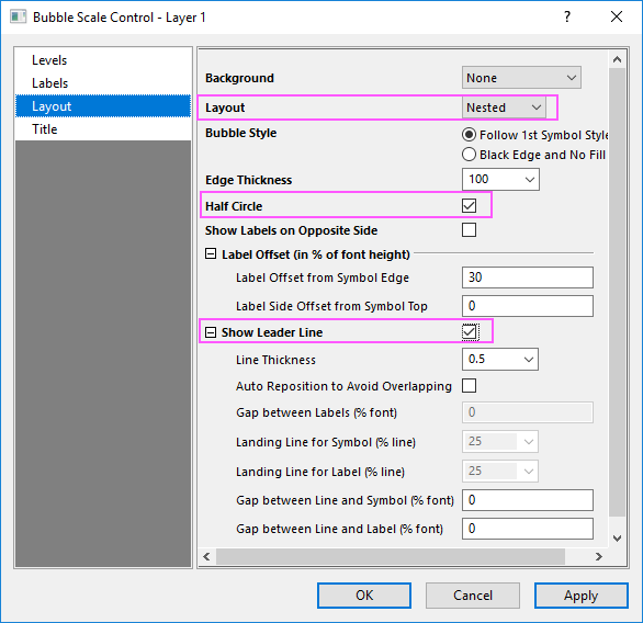
- Double click on the bubble scale to bring up Bubble Scale Control dialog. Select Nested from Layout drop-down list and check Half Circle and Show Leader Line boxes and click Apply as shown in following:
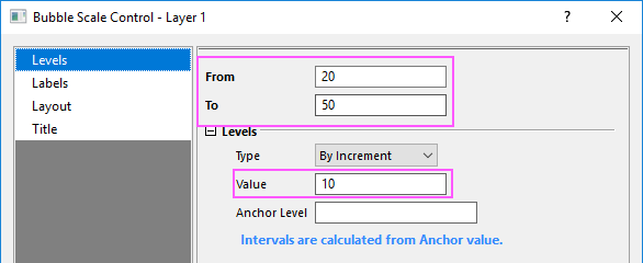
- Click on the left panel to go to Levels page, set From as 20 and To as 50 and change increment Value to 10 as shown in following:
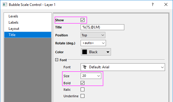
- Click Title on the left panel, check Show box, set the Size to be 20 and check Bold box. Click OK to close dialog as shown in following:
- The graph is as following now:
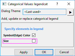
- Go to Graph:Legend:Categorical Values... to bring up Categorical Values:legendcat dialog. Uncheck Size box and click OK to close the dialog and move the generated legend to a proper position in top-left corner.
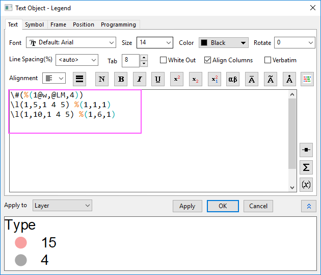
- Right click on the legend and select Properties from shortcut menu, customize the text as shown in the following:
- Click OK to close dialog.
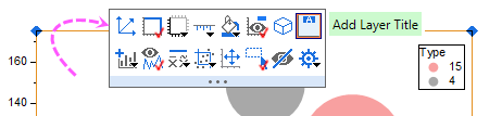
- Click on the empty space of layer, on the popup dialog, click Add Layer Title button, enter Agate Cross-Section by Type and Location. Customize the font. Select and re-position the text object as needed.
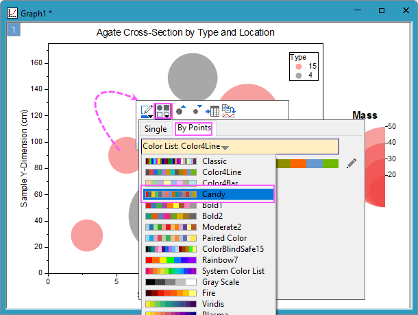
- Change the color list to make the graph look better.<>
The final graph should look something like this: