6.6.4 Stack Column With Labels
StackColumn-Labels
Summary
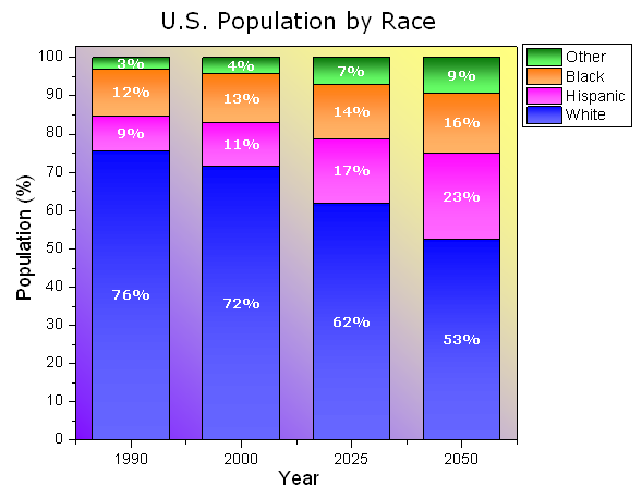
This graph displays a stack column plot. Each data point in each column has been labelled using the associated data value, and custom formatting applied to column fills and labels.
Minimum Origin Version Required: 2015 SR0
What will you learn
This tutorial will show you how to
- Create a stack column plot
- Add labels for columns
- Customize the column graph
Steps
This tutorial is associated with <Origin EXE Folder>\Samples\Tutorial Data.opj.
- Open Tutorial Data.opj and browse to the Stack Column With Labels folder in Project Explorer (PE).
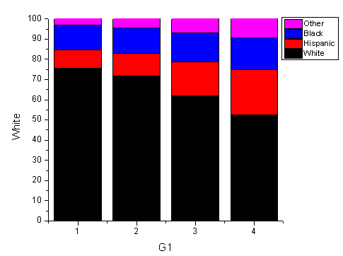
- Activate the worksheet and select columns B through E. In the main menu, select Plot > Bar, Pie, Area : Stacked Column. Alternatively, you can click the Stacked Column button on the 2D Graph toolbar.
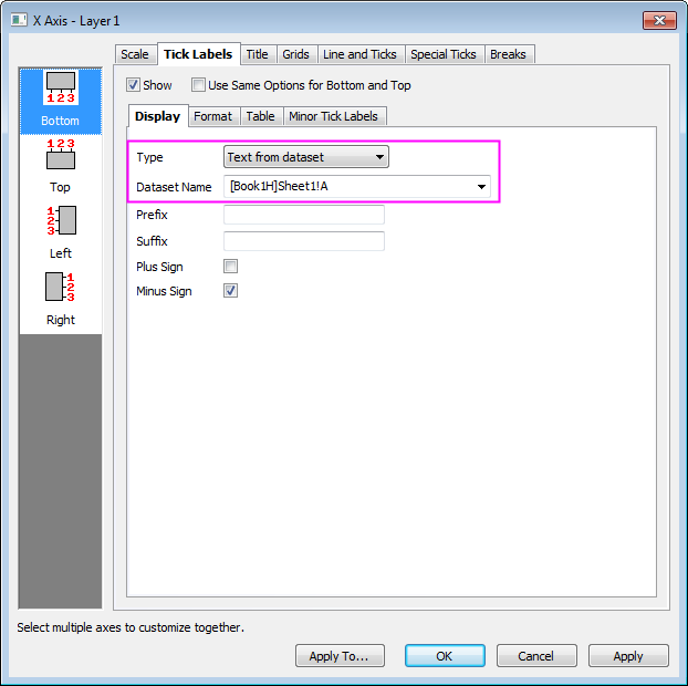
- Double-click the X axis tick labels to open the Axis dialog box. Go to Tick Labels tab and set the X axis tick labels as following:
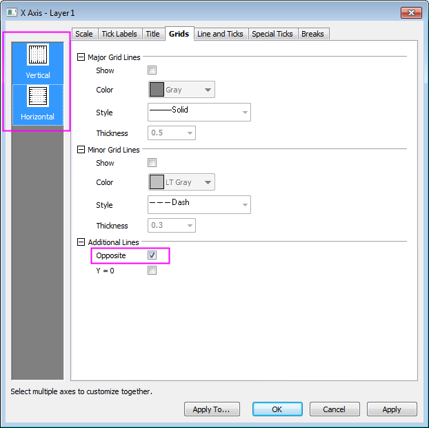
- Select the Grids tab and hold Ctrl key to select Horizontal icon in left panel to simultaneously apply changes to the Y Axis. , Check the Opposite box to add lines opposite both the X and Y axes:
- Go to the Scale tab and click Vertical icon on the left panel to set the value of To to 102 for Y axis and click OK to apply settings and close the Axis dialog box.
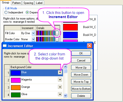
- Double-click the plot to open the Plot Details dialog box. On the Group tab, set the Fill Color as shown below:
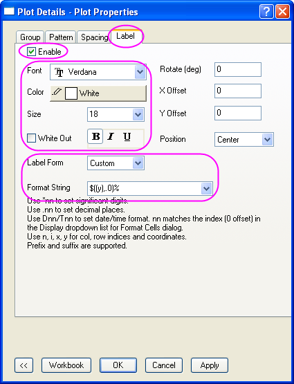
- On the Label tab, select Enable. Set the Font, Color, and Size to Verdana, white, and 18. Set Label Form to Custom and enter "$((y),.0)%" for the Format String.
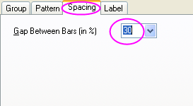
- On the Spacing tab, set Gap Between Bars(in %) to 30.
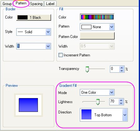
- On the Pattern tab, set Gradient Fill as shown below:
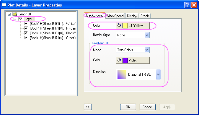
- In the left panel, select Layer1. On the Background tab, set Color and Gradient Fill as shown below:
- Click OK to close the dialog box. To complete the graph, change the X and Y axis labels to "Year" and "Population (%)", then add the graph title “U.S. Population by Race.”