6.6.7 Stack Column Plot with Different Positive and Negative Y Scale
stack-column-custom-Y-scales
Summary
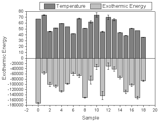
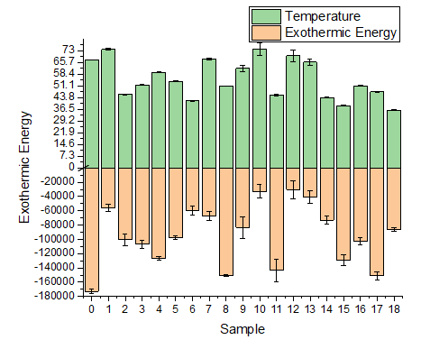
We will show how you can use axis break without a gap to produce this graph, that has much larger Y scale range for the negative bars.
Minimum Origin Version Required: 2015 SR0
What You Will Learn
This tutorial will show you how to:
- create a stacked column plot with error bars.
- enable an axis break without a gap.
- divide one axis into several segments and set scales separately.
Steps to Add Axis Break with No Gap
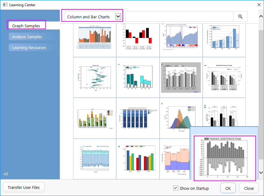
- Select Help: Learning Center menu or press F11 key to open Learning Center. Select Graph Sample tab and then select Column and Bar Charts from the "Category" drop-down list. Double-click on the graph sample below to open the sample "Column and Bar Charts - Zero Length Break to Change Axis Scale".
Note: This tutorial is associated with the folder Custom Axis Scale to Show Different Scale of the "Tutorial Data" project:<Origin EXE Folder>\Samples\Tutorial Data.opju.
- Activate the workbook "Temperature & Exothermic Energy". select all the columns in sheet 1 and choose Plot > Bar, Pie, Area :Stacked Column to create a stacked column plot with error bars.
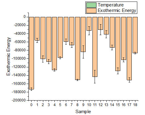
- Positive columns cannot be seen since their absolute values are too small comparing to those of negative columns.
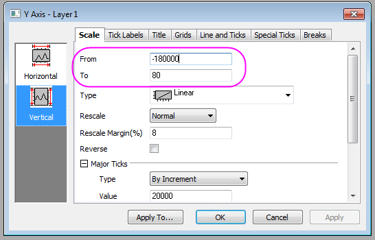
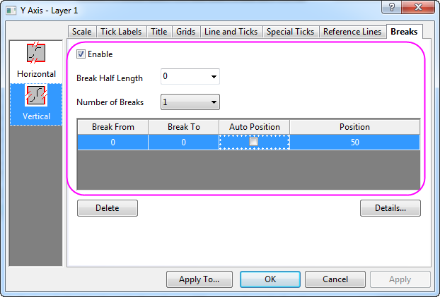
- We can break the Y axis at Y=0 and use different axis scale for those two segments. First double click on the Y axis to open the Axis dialog and set Y Range (in Vertical icon) to be from -180000 to 80
- Then go to the Breaks tab with Vertical icon active, and enable 1 axis break. Also set the Break Half Length to 0 so the break indicator will not show. Set both the Break From and the Break To to 0 so the axis will break at 0 and no break gap shows. Uncheck Auto Postion and enter 50 for the Position cell.
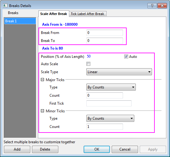
- Set Custom Scale for the region after break (Y>0)by clicking Details:
- Click Apply to apply the settings and view the updated graph, you can see the axis scales are different for the regions above or below the Y=0 line and the columns for positive values can also be seen in the graph.
More Customization Steps
The following steps can further customize the graph to be exactly the same as the image in Summary.
- Set the X scale to be from -2 to 20, Major tick by increment 2.
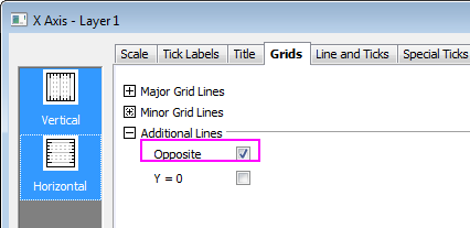
- Go to the Grids tab and select both Vertical and Horizontal icons, select the Opposite check box so the grid lines opposite to both X and Y axes will show.
- Click OK to apply the settings and close the Axis dialog.
- To change the positive and negative column colors to light gray and gray, click on the columns, in the popup mini toolbar, go to the Single tab
 and click the Fill Color button
  , in the expanded Color Chooser, set the color of positive columns to be gray.

Click on the negative columns to change the color to be light gray just as shown above.
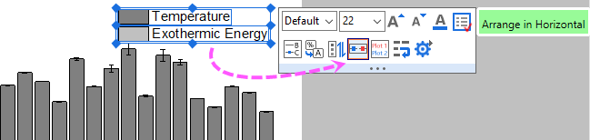
- To customize the legend, click on the legend object, in the popup mini toolbar, click the Arrange in Horizontal button
 to arrange two legend entries to be in the same row.
Then you will get the final graph you desired.