6.8.7 Contour plot in Sphere Surface Projections
Sphere-Surface-Projections-NetCDF
Summary
When you import global NetCDF data, for example global temperature data, you can create a Contour plot in a Sphere Surface Projection.
Minimum Origin Version Required: 2021b SR0
Steps
Create NetCDF data-based plot on a Sphere Surface Projection
- Open this project file with a NetCDF data matrix.
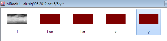
- Activate the matrix and add four new matrix objects in the same MatrixSheet.

- Double click on the Image Selector to rename these matrix object to: Lon, Lat, x and y.
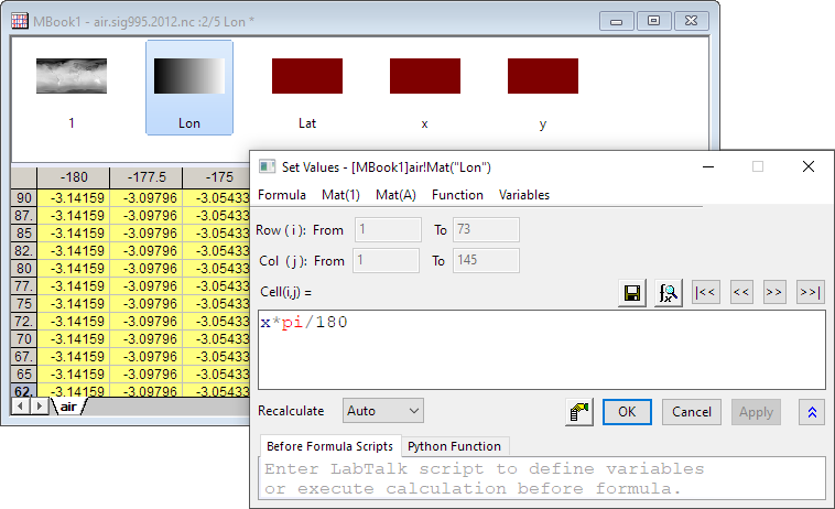
- Activate each matrix, click on the Properties button on the pop-up mini toolbar, and select Set Value.
In the Set Value dialog, enter the following formulas respectively:
//Lon object
x*pi/180
//Lat object
y*pi/180
//x object
3*Mat(2)/2 * sqrt(1.0/3 - (Mat(3)/pi)^2)
//y object
Mat(3)
- Select the first matrix in MBook1 and choose Plot > Contour : Contour - Color Fill from the main menu.

- Double-click on the graph to open the Plot Details dialog. Navigate to the Contouring Info tab, select [MBook1]air!4"x"] and [MBook1]air!5"y"] in the X Coordinates and y Coordinates drop-down list.

- Select Layer1 in the left panel, and go to Display/Speed tab. Uncheck X Axes and Y Axes check boxes under Show Elements section. Click OK to save the settings.

- Click the Rescale button
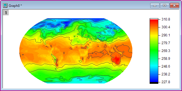
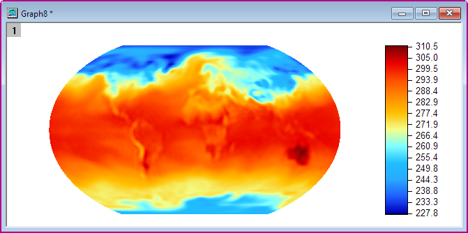
- Delete the Axes Title and Color Scale Title. Then you will have the graph as displayed below:
Customize Levels, Lines and Color Map
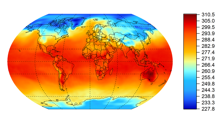
- Click on the Contour plot, and then click on the Contour Style button on the pop-up Mini Toolbars, select Color Scale without Contour Line

- Click on the Set Levels button on the pop-up mini toolbar. In the Set Levels dialog, set Major Levels to 16 and Minor Levels to 16. Click the OK button.

- Click on the Contour plot, and then click on the Palettes button on the pop-up mini toolbar. Then select the Surface palette from the drop-down.

Then you will get the contour plot similar to the graph below:
Add Map Lines and Grid line
There is longitude and latitude data as well as grid lines data in the workbook. First, we need to convert them to Spherical Surface.
- Insert two columns as Column C and D, then in the formula column label row F(x) enter 3 * A * pi / 180 / 2 * sqrt(1/3 - (B / 180)^2) for Col(C), and then enter B * pi / 180 for Col(D).
-
Add two columns as Column G and H, then in in the formula column label row F(x) enter 3 * E * pi / 180 / 2 * sqrt(1/3 - (F / 180)^2) for Col(G), and then enter F * pi / 180 for Col(H).
-
Set Col(C) and Col(G) to X.

- Highlight Col(D) and Col(H), and drag and drop into contour plot. Double click on the graph to open the Plot Details dialog and set the Style of Grid lines to Dash.

- Remove the legend for the lines. Then you will get the contour plot similar to the graph below: