6.10.7 Q-Q Plot
Q-Q-Plot
Summary
The Q-Q plot is a graphic method that tests whether or not a dataset follows a given distribution. The Q-Q plot has independent values on the X axis, and dependent values on the Y axis. If all the plotted points are close to the reference line, then we conclude that the dataset follows the given distribution.
Minimum Origin Version Required: Origin 2016 SR0
What You Will Learn
- How to create a Q-Q plot
- How to mask a suspected outlier in the source data and recalculate the Q-Q plot
Create a Q-Q Plot
You can refer to this graph in Learning Center. (Select Help: Learning Center menu or press F11 key , and then open Graph Sample: Statistical Graphs)
-
Click the
 button to import the Q-Q plot.dat file under <Origin EXE folder>\Samples\Graphing\ path.
- In the QQplot workbook, activate the Q-Q plot worksheet, highlight column B, right click, and from the context menu, select Plot > Statistical: Q-Q Plot.... In the Plotting:plot_prob dialog, make sure that the Score Method drop-down is set to Benard. Click OK.

- Double-click on the Lower Percentiles line to open the Plot Details dialog. Go to the Line tab, set Color to Red, Transparency to 80%, then check Fill Area Under Curve check box and select Fill to next data plot - One Color in the below drop-down list.

- Go to Pattern tab, set Fill Color to Red. And make sure the Follow line transparency is checked.

- Go to the Line tab of Upper Percentiles line set Color to Red, Transparency to 80%. Click OK to apply the setting and close the dialog.

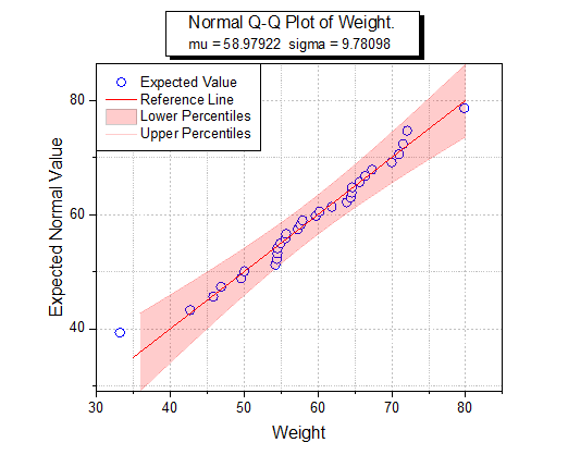
Your graph should look as shown below.

Mask a Suspected Outlier
- Click on the green lock icon to make sure the Recalculate Mode is Auto.

- Click on the Data Reader tool and click to select the suspected data point in the Q-Q Plot.


The Data Info window shows the value of the outlier point.
- Activate the Q-Q plot worksheet and highlight column B.

- From the Menu Bar, click on Window:Command Window and at the prompt, enter the script shown below.
colmask cond:=eq val:=x;
The outlier point will be shown in red in the Q-Q plot worksheet, and it will not be included in the graph.