6.11.1 Polar Contour

Contents


Video Image.png Video Text Image.png Website blog icon circle.png Blog Image 33x33px.png

Summary

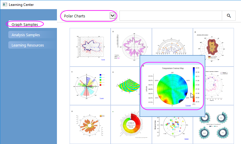
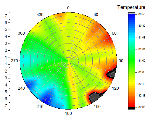
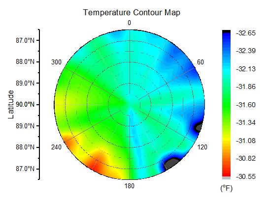
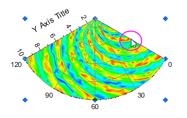
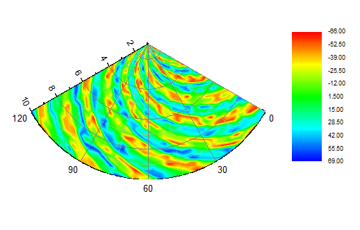
This tutorial will show you how to create a Polar Contour graph from both XYZ worksheet data and matrix data.

What will you learn

Steps

Plot Polar Contour from XYZ data

  1. Select Help: Learning Center menu or press F11 key to open Learning Center. Select Graph Sample tab and then select Polar Charts from the "Category" drop-down list. Double-click on the graph sample below to open the sample "Polar Chart - Polar Contour".
    Polar Contour from XYZ data 00.png
    Note: This tutorial is associated with the folder Polar Contour of the "Tutorial Data" project:<Origin EXE Folder>\Samples\Tutorial Data.opj.
  2. Activate the first worksheet of the workbook Temperature and Location containing the temperature and location data and select column C. Select Plot > Contour : Polar Contour theta(X) r(Y) from the menu to create a polar contour graph. The graph should look like this:
    Polar Contour from XYZ data 01.png
  3. Next, we will customize the contour graph using the Mini Toolbars. Click on the contour plot, and in the pop up mini toolbar, click the Flip Colormap button Popup Flip Colormap.png to reverse the color order of the colormap.
    Polar Contour from XYZ data 02.png
  4. Click on the angular axis(the circular arc edge of the polar), and in the popup Mini Toolbar, click the Axis Scale button Popup Axis Scale.png to open Axis Scale dialog. In this dialog, with Angular Axis selected, set Tick Increment to 60; with Radial Axis selected, set From and To to 0 and 7, Tick Increment to 2.
    Polar Contour from XYZ data 04.png
  5. Next, let us open the Axis dialog to do further customization for the axes and axes labels. Double-click on the Radial axis to open the Axis dialog. Go to Tick Labels tab. Pressing Ctrl key and select both Radial - Outer 1 and Radial - Outer 2 in the left panel. In the right panel, go to Display tab, select Tick-indexed datasetin Type drop-down list, then select [Book2]Sheet2!A"Latitude" from the Dataset Name drop-down list.
    Polar Contour from XYZ data 07.png
    Select Angular - Outer in the left panel. In the right panel, go to Display tab, select Tick-indexed dataset in Type drop-down list and then select [Book2]Sheet2!B"Longitude" from the Dataset Name drop-down list.
    Polar Contour from XYZ data 05.png
  6. Click Apply button. Go to Grids tab, and make sure Radial is selected in the left panel. Edit the dialog box settings as in the following image. Click OK to close the Axis dialog box.
    Polar Contour from XYZ data 08.png
  7. Double-click on the Color Scale to open the Color Scale Control dialog box and edit settings as follows
    Polar Contour from XYZ data 09.png
    Polar Contour from XYZ data 10.png
    Polar Contour from XYZ data 11.png
    Polar Contour from XYZ data 12.png

    Note: The text used for Title is (\+(o)F), which is supposed to be displayed as (oF) as the unit for temperature.
  8. Add the graph title Temperature Contour Map, axis title Latitude to the graph. The graph should look like this:
    Polar Contour from XYZ data 13.png

Plot Polar Contour from Matrix data

  1. Select Help: Learning Center menu or press F11 key to open Learning Center. Select Graph Sample tab and then select Polar Charts from the "Category" drop-down list. Double-click on the graph sample below to open the sample "Polar Chart - Polar Contour from Matrix".
    Polar Contour from Matrix 00.png
    Note: This tutorial is associated with the folder Polar Contour of the "Tutorial Data" project:<Origin EXE Folder>\Samples\Tutorial Data.opj.
  2. Activate MBook1. Select Plot > Contour : Polar Contour theta(X) r(Y) from the menu or click the Polar Contour theta(X) r(Y) button on the 3D and Contour Graphs toolbar.
    Polar Contour from Matrix 01.png
  3. Double click the axes to open the Axis dialog, we also can customize the Radial Axes and Angular Axesfor this polar graph.
  4. Click on the contour area, and in the popup Mini Toolbar, click the Set Levels button Popup Set Levels.png to open the Set Levels dialog to do settings as below:
    Polar Contour from Matrix 05.png
  5. Click the right edge of this sector to select the graph layer as below. Drag and drop the sector up to the center of the graph window.
    Polar Contour from Matrix 06.png
  6. Double-click on the Color Scale object to open the Color Scale Control dialog.
  7. Click on the Color Scale object and use the anchor points to resize it from vertical direction. The resulting graph should look like this:
    Polar Contour from Matrix 12.png

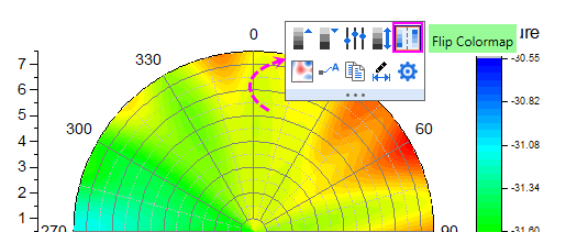
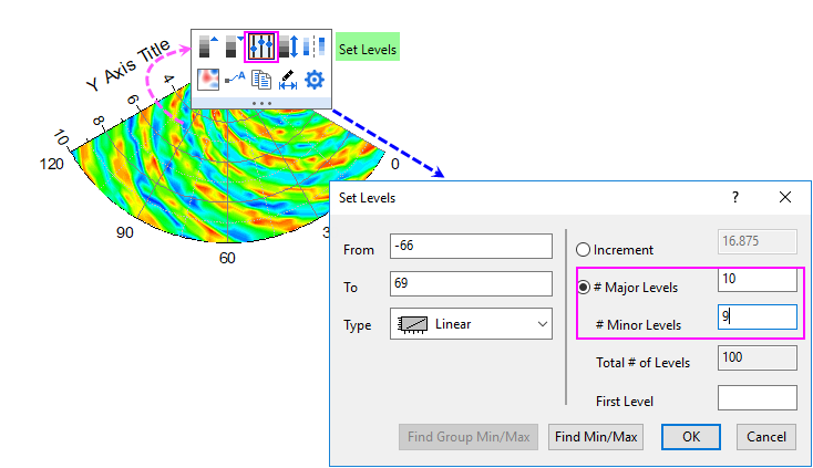
Polar contour graphs from matrix data support filling color to contour lines or to the matrix grid. For more information, see these two topics: