提示:此部分只提供英文原文,敬请谅解!
6.5.6 Line Graph with Masked Data
Contents

|

|
Summary
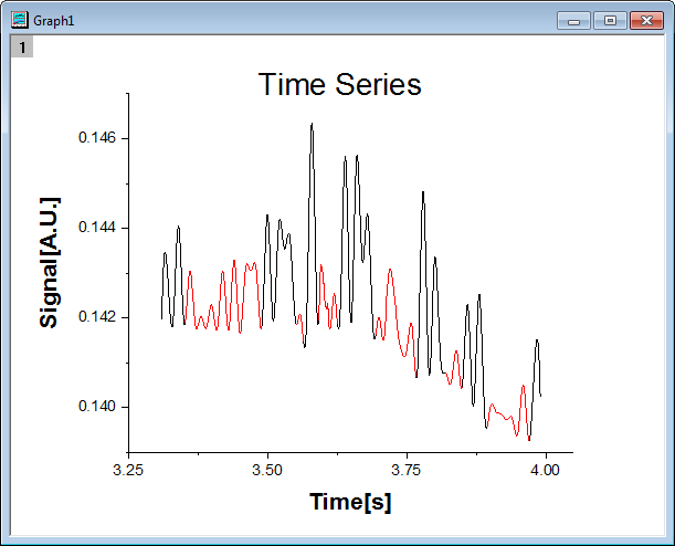
You can masking subranges of data graphically. In this tutorial, a line graph is created first, then the masking tool is used to mask the low peaks on the graph.
Minimum Origin Version Required: Origin 2015 SR0
What you will learn
- Plot a line graph
- Set the scales of axes
- Mask data on the line graph
Steps
- Start with an empty workbook. Select Help: Open Folder: Sample Folder... to open the "Samples" folder. In this folder, open the Graphing subfolder and find the file Line_Graph_with_Masked_Data.txt. Drag-and-drop this file into the empty worksheet to import it.
- Highlight both columns in the worksheet and select Plot > Basic 2D : Line from the Origin main menu to plot a line graph.
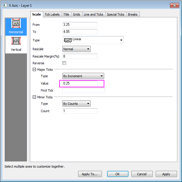
- Double click on the X axis to open the Axis dialog box. Set the increment value to 0.25 as in the image below:
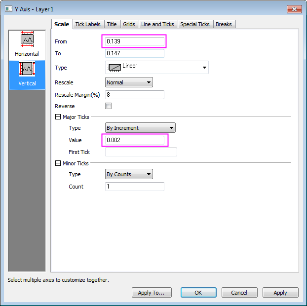
- Click the Vertical icon on the left panel to set the Y axis scale as in the following image:
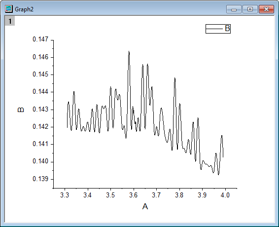
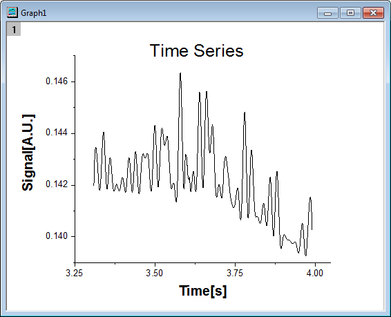
- Click OK to close the Axis dialog and delete the graph legend. Change the X label to Time[s] and the Y label to Signal[A.U.], and bold both text labels and set the font size as 28. Create a title by adding a text object that says Time Series. Bold the title and set the font size of the title to 36.
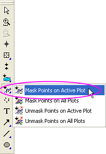
- Activate this graph, then click and hold the Regional Mask Tool button on the Tools toolbar until a menu appears. Select Mask Points on Active Plot to enter masking mode.
- Click an appropriate place on the graph and drag out a rectangle to select the low peaks and, at the same time, mask them. Drag out additional rectangles until all low peaks are masked. Then click the Pointer button on the Tool toolbar to exit masking mode.
Beginning with Origin 2021, there is a change to data point selection mode of the masking tools:
|