6.6.6 Grouped Stacked Column
GroupedStackedColumn
Summary
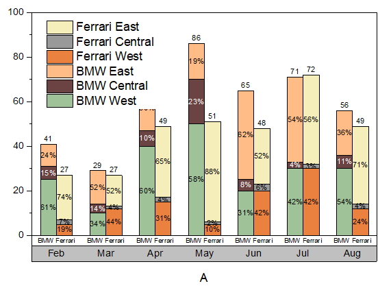
In Origin, multiple datasets can be plotted as a stacked column graph. Usually these datasets are grouped together by default. In addition, subgrouping is possible for stacked column graphs such as the one shown below with 2 subgroups:
Minimum Origin Version Required: 2021 SR0
What will you learn
This tutorial will show you how to:
- Plot a grouped stacked column graph with Online template
- Subgroup a general stacked column to get a grouped stacked column
- Add labels for columns
- Create and customize an X axis table for the graph
Create a Grouped Stacked Column Plot
This tutorial is associated with the Grouped Stacked Column folder in the project <Origin EXE Folder>\Samples\Tutorial Data.opj.
Note: You can also access this sample graph by double-clicking on its thumbnail under the Column and Bar graph sample in the Learning Center dialog(Help: Learning Center menu or press F11) .
There are two methods to create s grouped stacked column plot:
- Since Origin 2021, Origin provides a lot of online templates, you can download the template "Side-by-side Stacked Columns" from Template Center and use it to plot a grouped staked column directly.
- Of course, you can still make a grouped staked column starting from a general stacked column graph.
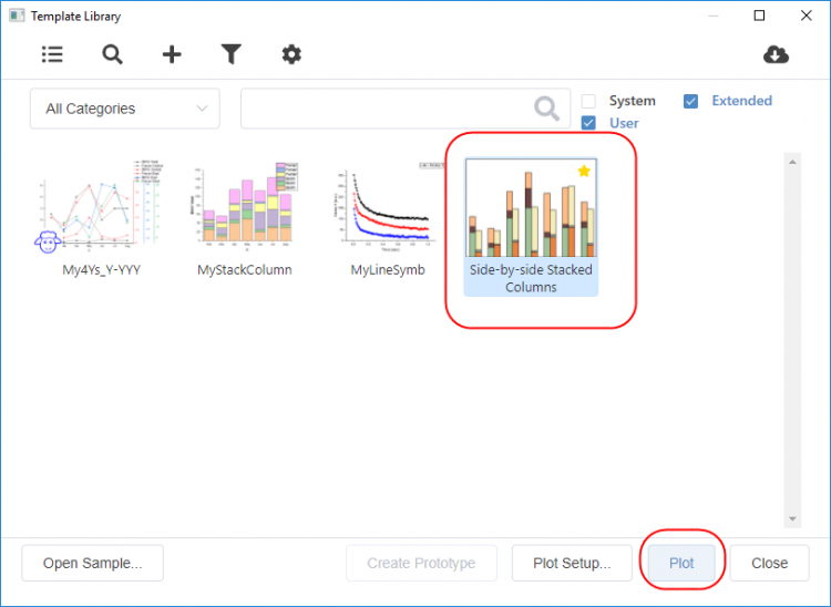
Method 1: Using the Online Template
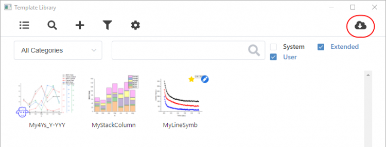
- Highlight col(B)~col(G) , choose menu Plot: Template Library to open Template Library. Click the Open Template Center button in the upper-right corner.
- The Template Center will be opened. Search the online template "Side-by-side Stacked Columns" and download it.
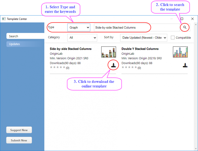
- After the template is downloaded, close the Template Center. This template will be listed in the Template Library. Select it and click Plot Button to plot the graph.
- You will get the graph as below:
Method 2: Subgroup the Stacked Columns
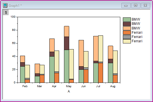
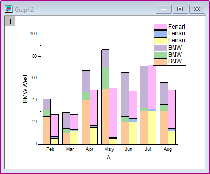
- Activate the worksheet Sheet1, highlight col(B)~col(G) and select Plot > Bar, Pie, Area: Stacked Column from the menu to create a stacked column graph:
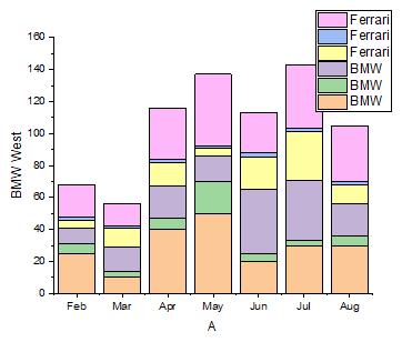
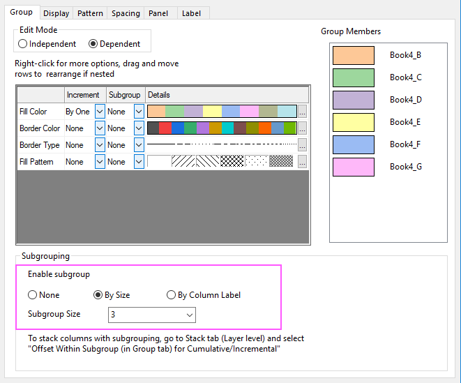
- Double-click on the column plot to open the Plot Details dialog. On the Group tab, select By Size for Enable subgroup and set Subgroup Size to 3.
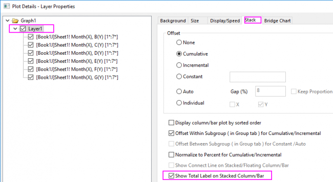
- Select Layer1 in left panel of Plot Details dialog and click the Stack tab. Check the Offset Within Subgroup(in Group tab) for Cumulative/Incremental check box. Click the Apply button.
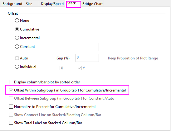
- Click OK to close the dialog. Select Graph: Rescale to Show All from the main menu to rescale the layer. You will get the graph as below:
Add Lables for Columns
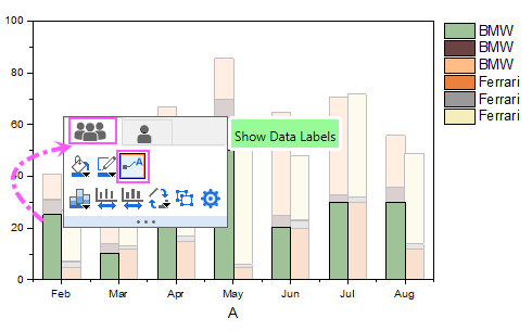
- Click on the column, and in the popup mini toolbar, click the Show Data Labels under the Group tab to show the data labels on the columns.
- Click on the label, and in the popup mini toolbar, click the Label Source button and select Percent from the dropdown list.
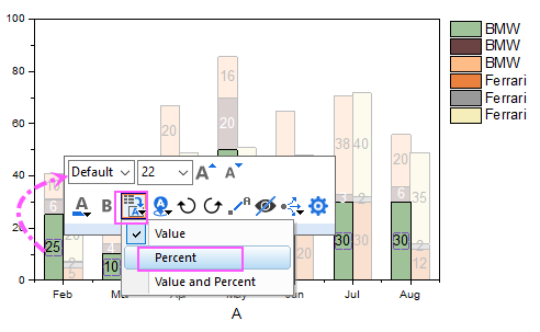
- Please note, to change the labels of all columns together with mini toolbar, you need select the first plot in current layer group. In this stacked column graph, the bottom one within the first subgroup should be the first plot.
- Double-click on graph layer to open the Plot Details dialog. Select Layer1 in left panel of Plot Details dialog and click the Stack tab. Check the Show Total Label on Stacked Column/Bar.
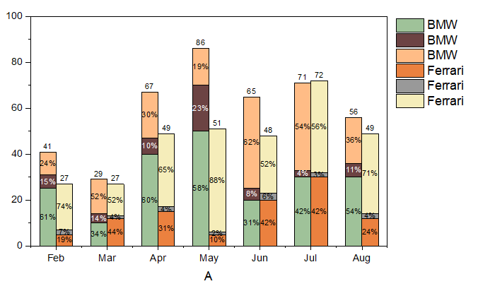
- You will get the graph with labels as below:
Create a Tick Label Table for X Axis
- To create two rows of tick labels for the X axis, double-click on the X axis tick labels to open the Axis dialog.
- Go to Bottom icon with Tick Labels tab selected.
- Under Format tab, change Font Size to 16
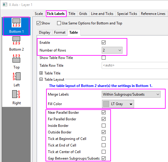
- Under Table tab, check the Enable checkbox and set Number of Rows to 2. Bottom icon will change into Bottom 1 and Bottom 2 on the left panel.
- Set the Table layout as shown below:
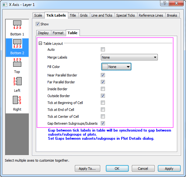
- Select the Bottom 2 icon and set Dataset Name to [Book4]Sheet1!H in Display tab, and set the Font size to 12 in the Format tab. This will change the tick label row to the car names from the worksheet label (Y) column.
- Set the table layout as the dialog below:
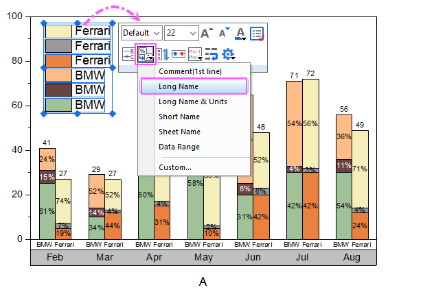
- Click OK button to close the dialog. Move the Legend box inside the layer. Click on the legend box, and in the popup minitoolbar, click on the button Data Plot Legend Translation Mode to select Long Name from the drop-down list.
- You will get the graph as below:
Customize Column Colors
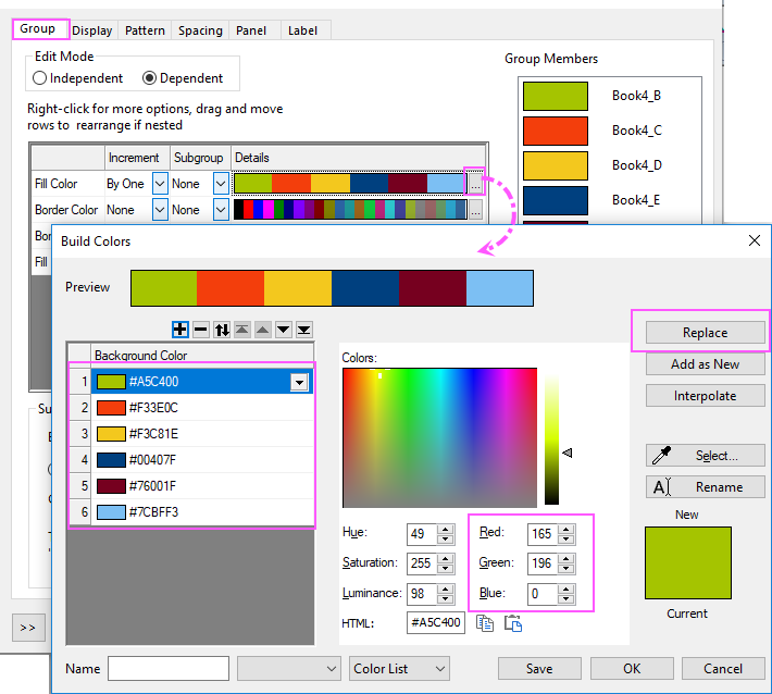
- Double-click on the column plot to open the Plot Details dialog. On Group tab, click the
 button in the Details column of the Fill Color row. Build Colors dialog opens.
- Select the first color, set Red, Green and Blue values to 165, 196 and 0, then click Replace button to add this color to the color list.
- Create five more custom colors using these RGB values: (243, 62, 12), (243, 200, 30), (0, 64, 127) (119, 0, 31), and (124, 191, 243).
- Select all colors under color(6), click Delete button to remove these colors so that you have just the six custom colors that you just created. Click OK to close the Build Colors.
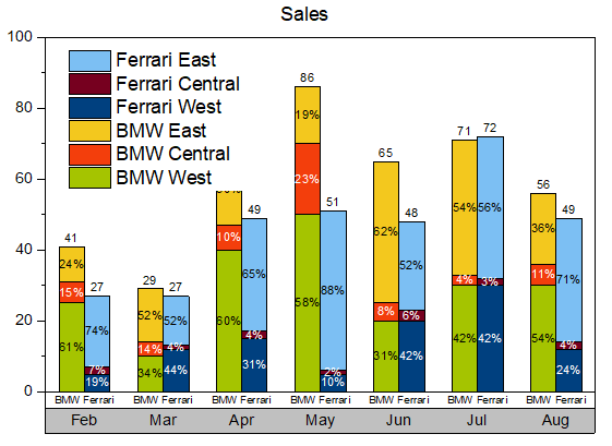
- Right-click on en empty portion of the graph window and select Add/Modify Layer Title from the context menu. Type Sales as a layer title.
- Resize as needed, using the green selection handles. Finally, you will get the graph as the Summary shows.