6.10.2 Grouped Box Chart with Color Indexed Data Points
Contents

|

|
Summary
Origin can be used to create grouped box plots from raw data with data points and distribution curves.
Minimum Origin Version Required: 2015 SR0
What you will learn
This tutorial will demonstrate how to:
- Create a grouped box plot from raw data
- Add a data plot with indexed symbol color
- Add and customize a distribution curve
- Customize the table-axes
Steps
Creating the Box Plot from Raw Data
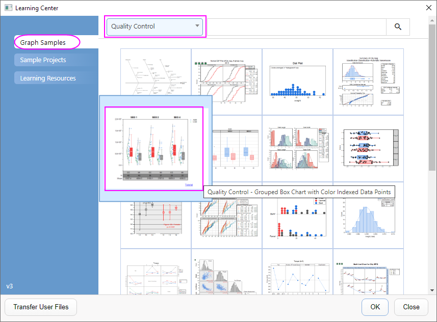
- Select Help: Learning Center menu or press F11 key to open Learning Center. Select Graph Sample tab and then select Box Charts from the "Category" drop-down list. Double-click on the graph sample below to open the sample "Box Charts - Grouped Box Chart with Color Indexed Data Points".
Note: This tutorial is associated with the folder Grouped Box with Index Color DataPoint of the "Tutorial Data" project:<Origin EXE Folder>\Samples\Tutorial Data.opj. - Activate the workbook Book11. Highlight col(C) - col(H), select Plot > Categorical: Grouped Box Charts - Raw Data.
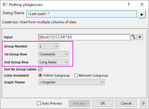
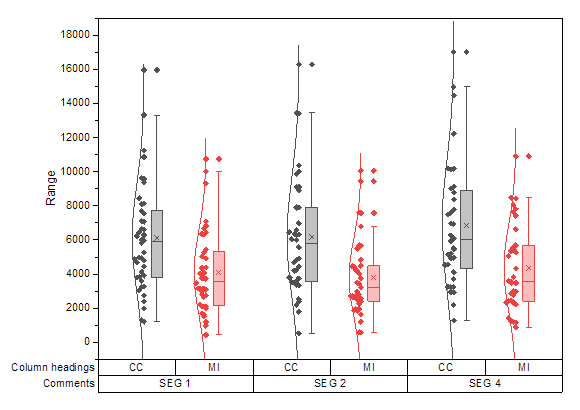
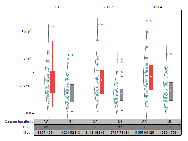
- In the opened Plotting: plotgboxraw dialog, set the Group Number to 2, the 1st Group Row to Comments and the 2nd Group Row to Long Name. This will create a box chart with the column data arranged in three groups of two, with X axis row names derived from the Comments and the Long Names on the worksheet:
- Click the OK button. The grouped box chart from raw data is created with two grouping levels as shown below:

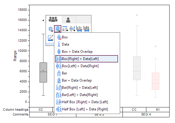
- Click on the box, and in Mini Toolbar click the Box Type button to select Box[Right] + Data [Left].
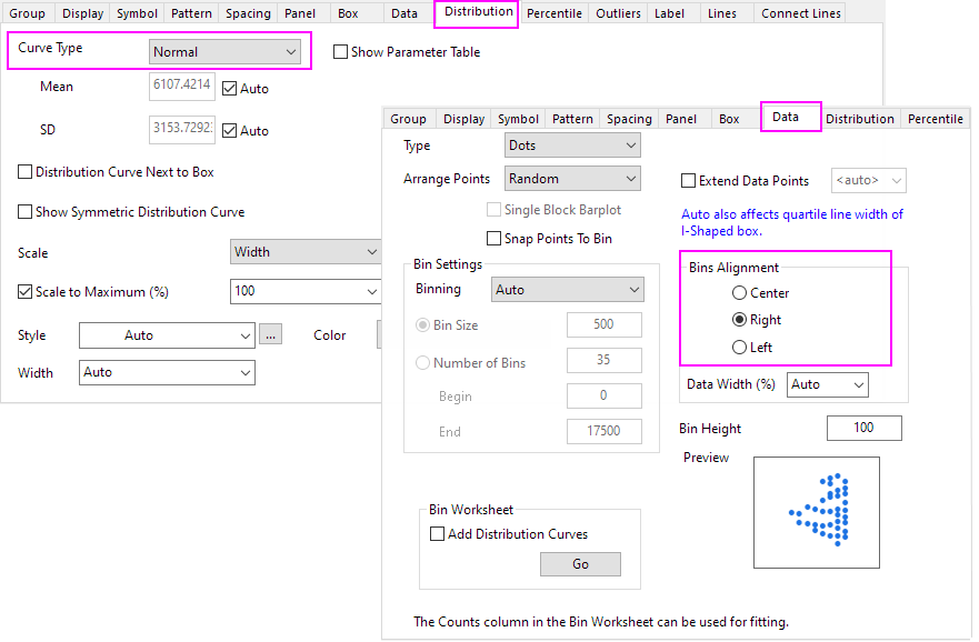
- To add distribution curves into the graph, double click the plot to open the Plot Details dialog. Expand the Layer1 option on the left panel and select the first plot under it.
- To add a Distribution Curve, on the Distribution tab, set Curve Type to Normal. Go to Data tab, set Bins Alignment to Right to orient the curve.
- Click the OK button. The data points and distribution curves will appear on the graph as shown below:
Customizing the Boxes and Statistical Markers
- Double click on the any one of the boxes to re-open the Plot Details dialog.
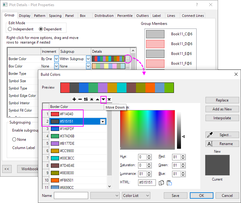
- On the Group tab, click the
 button on the Details section of Border Color. In the Build Color dialog that opens, use move button to exchange the first color and the second color. Click OK.
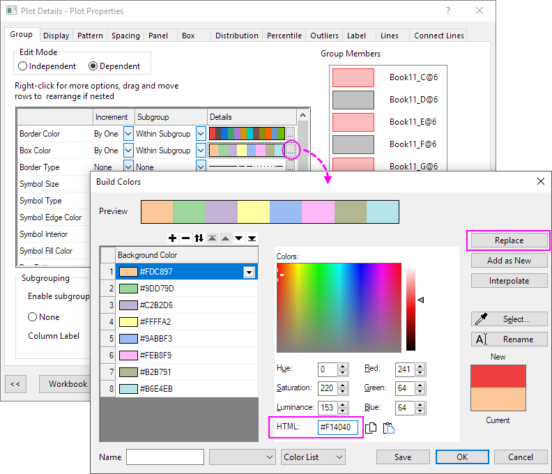
- For Box Color, set Increment to By One and set Subgroup to Within Subgroup. Then click the button on the Details section to open the Build Color dialog. And then
customize the first color HTML=#F14040 and click replace button. Do the same for the 2nd color to set HTML=#8D8D8D. Click OK.
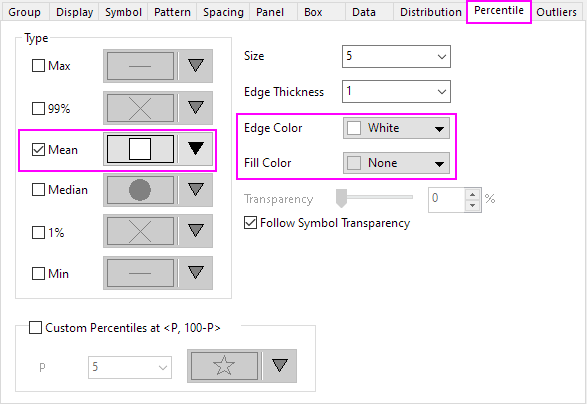
- This step is to customize the descriptive statistic markers whether to show on the plot such as the 99%, 1%, Max and Min marks.
Go to Percentile tab, change Mean symbol style, set Edge Color to White and Fill Color to None . - On the Lines tab, set Line Color of Median Line to White.
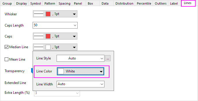
Click OK. The plot should appear as shown below:
Customizing Data Symbols and Distribution Curves
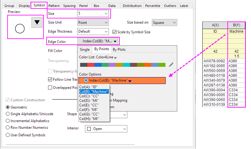
- Double click any box in the graph to open the Plot Details dialog.
- On the Symbol tab. Set the Size to 5, the Shape to 2 Circle and the Interior to Open.
- Click the Edge Color button, go to By Points sub-tab, under Color Options radio box, select Col(B): "Machines" under the Indexing dropdown list. The symbol's edge colors will be indexed to column B. All symbols with Machine value A386 will be one color and the ones with C334will be a different color:
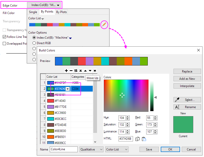
- Reopen the Color Chooser again for Edge Color, the edge color has been indexed to Col(B), click the yellow pen after selected Color List to open the Build Color dialog. In this dialog, move up the third and fourth color to the first two. Click OK button to close dialog and click Apply bottom to apply the symbol color.
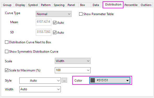
- To customize the distribution curve color, on the Distribution tab, set the Distribution Curve Color HTML=#515151.
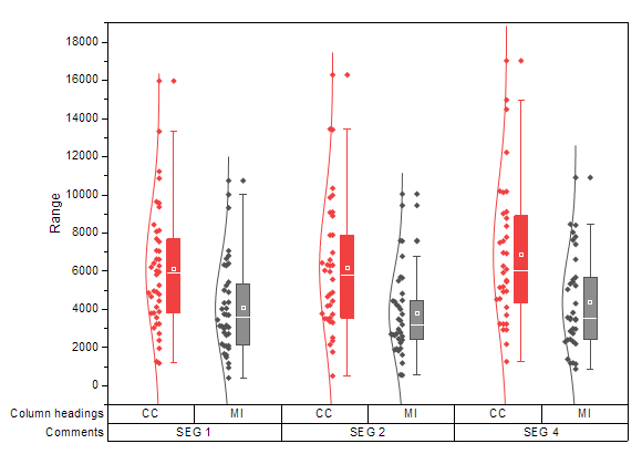
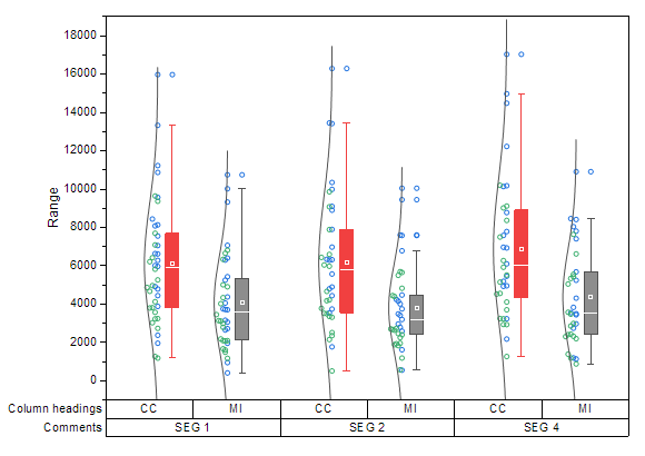
- Click OK to close the dialog. The grouped box chart shows as below:
Customizing the Axes
For grouped plots support multi-row tick label tables. The corresponding axis icons in the Tick Labels tab of Axis dialog starts from the last table row, e.g. Bottom 1, Bottom 2, ..., Bottom N. This means the first row from the bottom will correspond to Bottom1 and so forth.
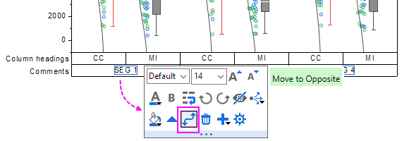
- To move the tick label row with SEG 1, SEG 2 and SEG 4 to the top X axis, click on the labels in this row, then click the Move to Opposite button in the Mini Toolbar to move this row to the top.
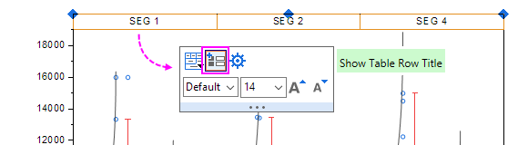
- Click on the whole top X Axis uncheck the Show Table Row Title button in the Mini Toolbar to hide the table row title.
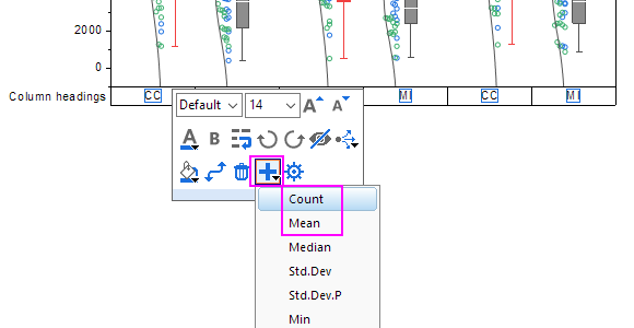
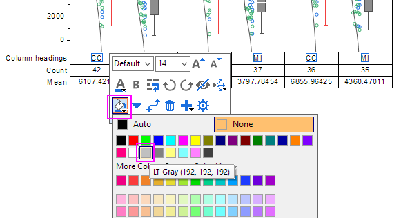
- Click on axis labels in the bottom axis table, and in the Mini Toolbar, click on the Add Row button to select Count. Click the Add Row button again and select Mean. Now, there are 3 table rows at bottom axis.
- Click the first bottom label row, and in the Mini Toolbar, set Fill Color to LT Gray; Click on the second bottom label row, set its color to Gray with the mini toolbar; Click on the third bottom label row to set its color to LT Gray; click on the top axis label row to set its color to LT Gray.
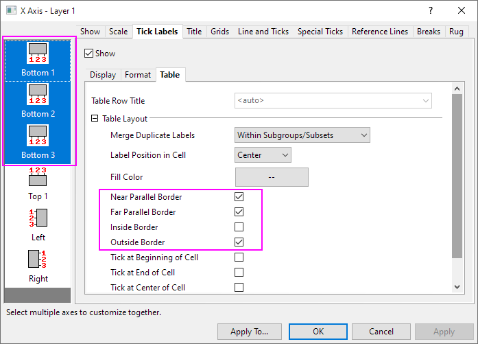
- Double-click on a bottom table row to open the Axis dialog. With Ctrl key been pressed, select Bottom 1, Bottom 2, Bottom 3 in the left panel and go to Table sub-tab, clear the Inside Border box as below.
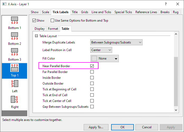
- Click the Apply button. Select Top 1 in the left panel and go to Table sub-tab, clear all boxes except the Near Parallel Border box.
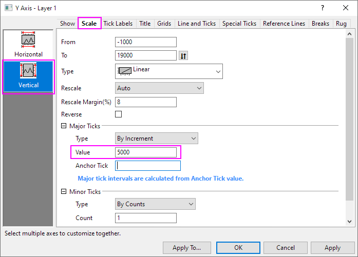
- Go to Scale tab and select Vertical icon. Set Increment to 5000.
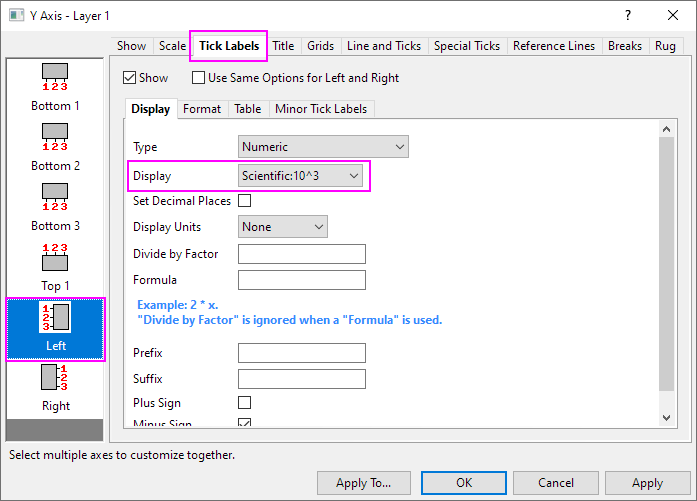
- Go to Tick Labels tab. Under the Display sub-tab, Set Display to Scientific 10^3. Click OK to close the dialog.
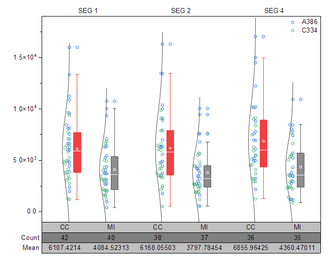
- Select Y axis title Range and press the Delete key to remove it. The final graph should appear as shown below:
Updating the Legend Object
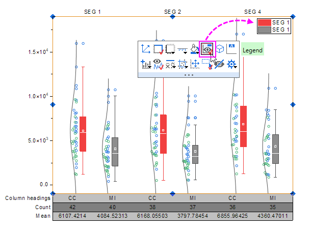
- Click on the graph layer and click the Legend button in the Mini Toolbar to show the legend of this graph.
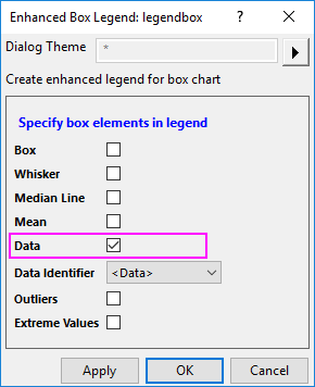
- Right click the box chart legend and select Legend: Box Chart Components... to open the Enhanced Box Legend: legendbox dialog. Deselect all the components except for Data:
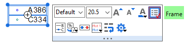
- Click the OK button. The legend will show only the data symbols. Double click the legend text to go into in-place edit mode. Delete the first row of the legend. Select and drag to move the legend object to a better location.
- To remove the black line around the legend, click the legend object, and in the popup mini toolbar, click Frame button to remove the frame.