6.10.4 Grouped Box Plot
Contents

|

|
Summary
In Origin, a grouped box chart can be created from either indexed data or raw data. The indexed data is arranged as one data column and one or more group columns, while the raw data is arranged as multiple data columns grouped according to the column label row(s).
Once a grouped box plot has been created there are many options to customize the box plots and the axes. The customization options are the same for grouped box plots created from raw data as well as those created using indexed data.
Minimum Origin Version Required: 2015 SR0
What You Will Learn
This tutorial will show you how to:
- Create a grouped box plot from indexed data
- Create a grouped box plot from raw data
- Customize the box plot using the Plot Details dialog
- Customize the table-style axis tick labels
Steps
Create Grouped Box Plot from Indexed Data
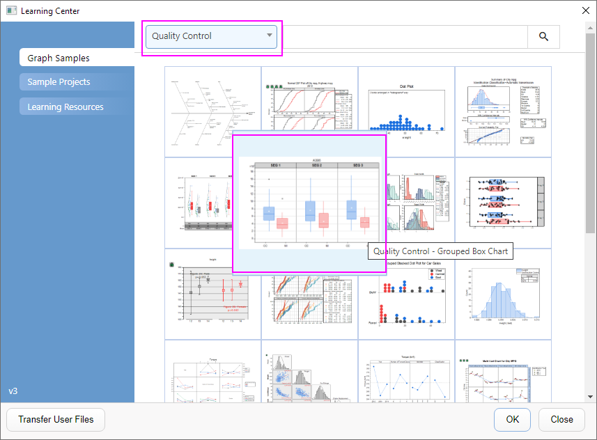
- Select Help: Learning Center menu or press F11 key to open Learning Center. Select Graph Sample tab and then select Quality Control from the "Category" drop-down list. Double-click on the graph sample below to open the sample "Quality Control - Grouped Box Chart".
- Note: This tutorial is associated with the folder Grouped Box Plot and Axis Tick Table of the "Tutorial Data" project:<Origin EXE Folder>\Samples\Tutorial Data.opj.
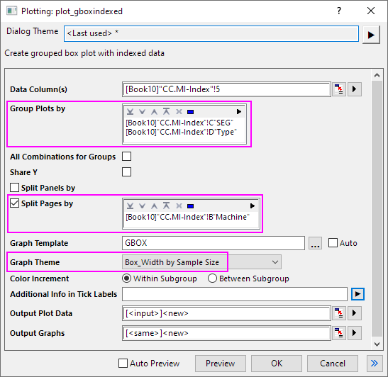
- In the workbook Book10, the data in the CC.MI-Index worksheet is indexed data. Column E is the data column and columns C and D can be used as grouping columns. Highlight column E and select Plot > Categorical : Grouped Box Charts - Indexed Data to open the plot_gboxindexed dialog.
- In this dialog, click the triangle button at the top of Group Plots by box to select columns C and D.
- Check the Split Pages by check box. Then click the triangle button at the top of Split Pages by box to select columns B.
- Select Box_Width by Sample Size in the Graph Theme drop-down list.
- Click OK to create a grouped box plot. Two Grouped Box plots are embedded in a new output worksheet as below. And another new output sheet will be added into the workbook too.
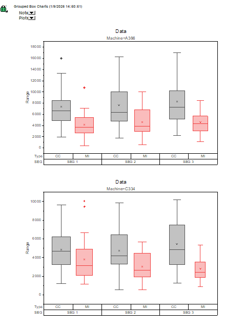
For another short tutorial on creating grouped box plots from indexed data, see Example 2. |
Customization by Plot Details Dialog
- Double-click on the white space of the first graph to open the graph window.
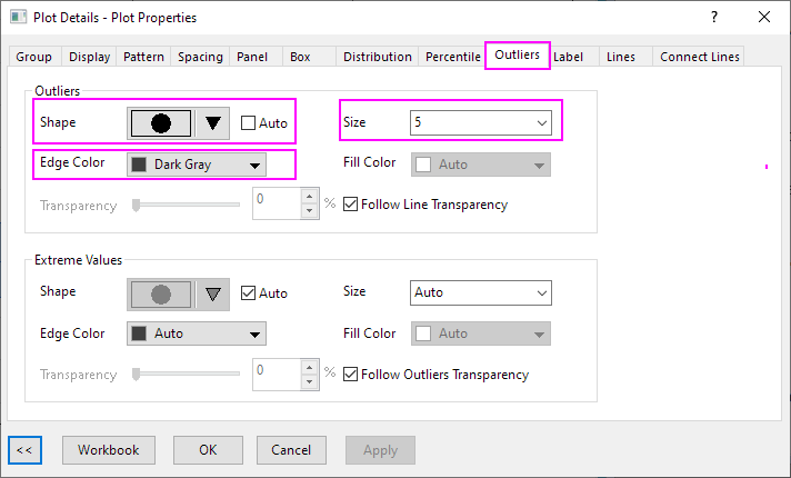
- Select Format: Plot to open the Plot Details dialog. To customize Symbol style, select the Outlies tab and set the following:
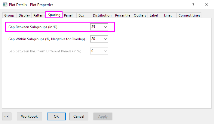
- On the Spacing tab, change Gap Between Subgroups (in %) to 35.
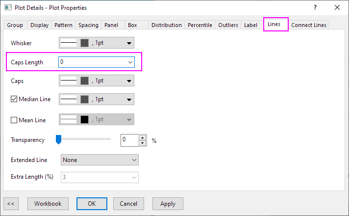
- On the Lines tab, change Caps Length to 0.
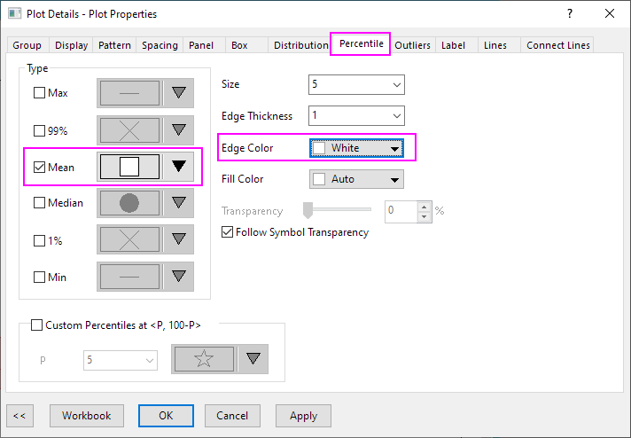
- On the Percentile tab, change Mean symbol style and change Edge Color to White.
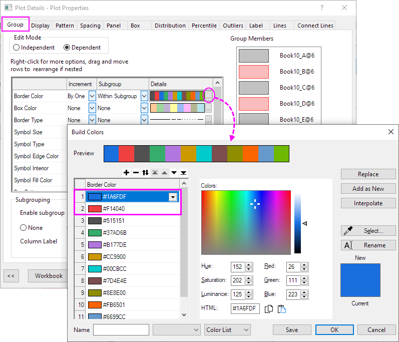
- On the Group tab, click the ... button on the right end of the Details column for Border Color row. The Build Color dialog is open. Then move the color order as shown below:
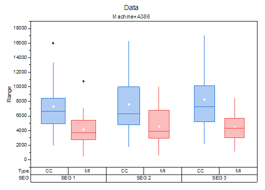
- Click OK to apply all the previous settings and close the Plot Details dialog. Finally, the graph should resemble the image below:
Customization by Axis Dialog
Continue with the graph from the previous section.
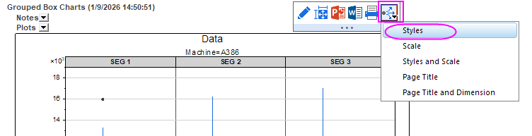
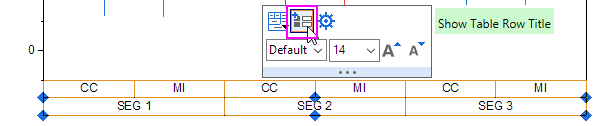
- Click on the whole bottom X Axis uncheck the Show Table Row Title button in the Mini Toolbar to hide the table row title of bottom axis.
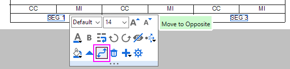
- Click SEG 1 on the bottom table row of the X axis, in the popup Mini Toolbar, click Move to Opposite button to move it to the top axis.
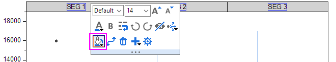
- Click the SEG 1 and update the Fill Color and font size on the Mini Toolbar.
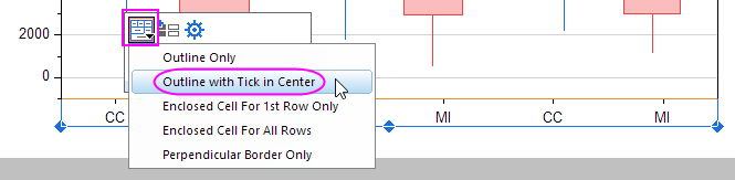
- Click on the whole row of CC, MI... and select Outline with Tick in Center from the Table Style button on Mini Toolbar.
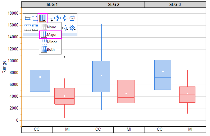
- Click on the Y axis and select Major from the Show Gridlines button on Mini Toolbar.
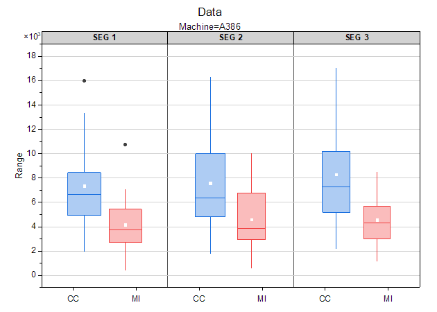
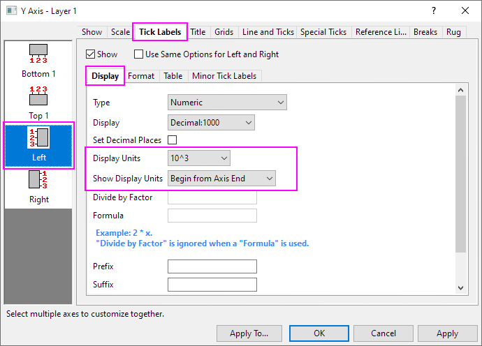
- Double click on the Y axis to open the Axis dialog. Then go to Tick Labels tab. Under Display subtab, set Display Units to 10^3 and set Show Display Units to Begin from Axis End.
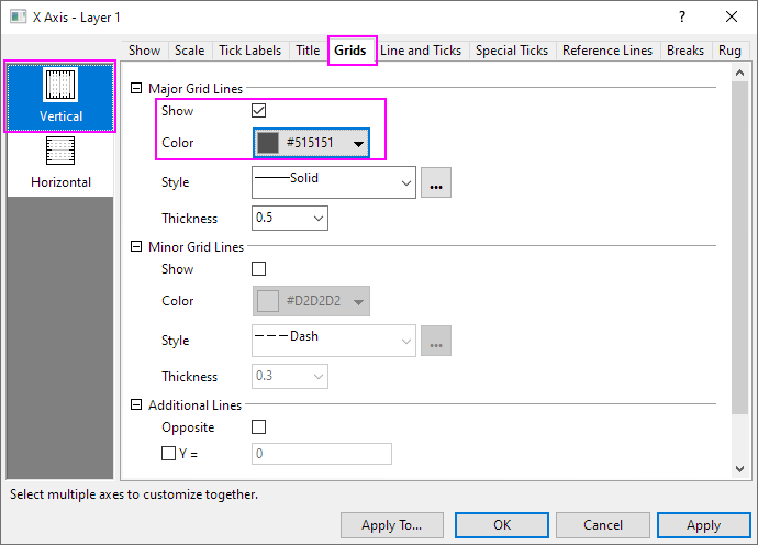
- Go to Grids tab. Click Vertical and check the Show option for Major Grid Lines, and customize the color.
- Click OK to apply the settings and close the Axis dialog. The final graph should appear as shown below:
|