提示:此部分只提供英文原文,敬请谅解!
6.1.11 Plotting Overlapping Data and Setting Transparency
Summary
In this tutorial, we will show you how to create overlapping column plots, and then set transparency to make the overlapping parts visible.
What you will learn
This tutorial will show you how to:
- Customize the grouped column plots
- Set Transparency
Steps
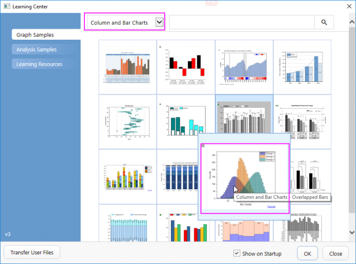
- Select Help:Learning Center menu to open Learning Center dialog. Select Graph Sample item in the left panel and then select Column and Bar Chart for Samples in drop-down list. Double-click on the thumbnail below to open the folder Overlapped Bars.
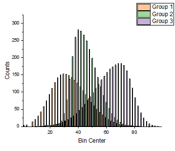
- Highlight all columns in the worksheet [Counts]Sheet1(The source data Counts.dat can also be imported from the folder <Origin Installation Directory>\Samples\Graphing\), and then from the menu, select Plot>Basic 2D: Column to create a column graph.
- Click on any bar in the graph, and in the popup mini toolbar, click the Fill Color button
 under the Group tab
  to expand the Color Chooser. In the Color Chooser, under the By Plots sub-tab, select or click the color list or color palette in the you desired to apply the bar colors.
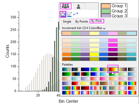

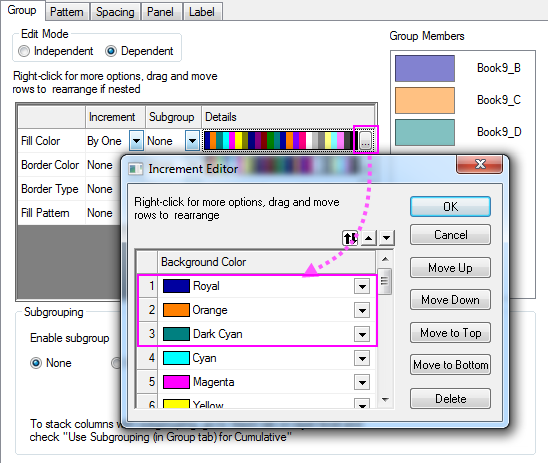
Besides, you can also double-click on the plot to open the Plot Details dialog. In the dialog, choose the Group tab. Click on the Details button in the Fill Color row to open the Increment Editor dialog. In this dialog, you can set the first three colors to be some specific colors such as Royal Blue, Orange, and Dark Cyan. Click OK to close the dialog.
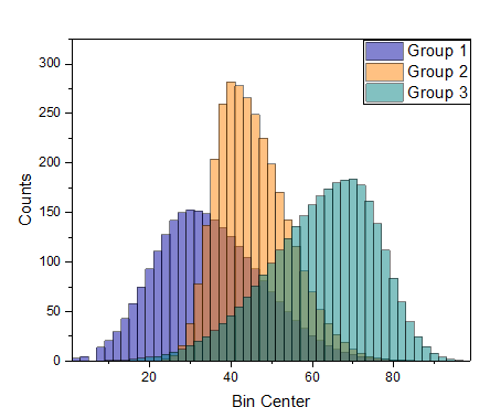
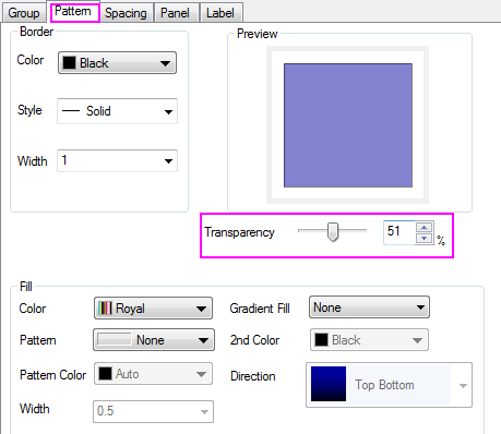
- Double-click on the plot to open the Plot Details dialog, go to the Pattern tab in Plot Details, and set the Transparency control to 51%.
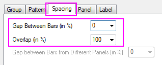
- Select the Spacing tab, and set Gas Between Bars to zero and Overlap to 100.
- Click the OK button to close the Plot Details dialog. Select View: Show: Frame to add the frame. The resulting graph should look like the image below: