提示:此部分只提供英文原文,敬请谅解!
6.8.4 Contour Graph with XY Data Points and Z Labels
Contents

|

|
Summary
This tutorial will show you how to create a contour from XYZ data and add Z value as label for each XY data point.
What will you learn
This tutorial will show you how to
- Create a Contour Plot from XYZ data.
- Customize levels, lines, and color mapping.
- Plot a scatter plot on a contour graph.
- Show the labels for scatter points.
Steps
- Start a new workbook and import the file Sample/Matrix_Conversion_and_Gridding/XYZ_Random_Gaussian.dat.
- Highlight col(C) and set it as Z. Then highlight all columns and select Plot > Contour : Contour - Color Fill from the main menu to plot a contour graph.
- Highlight col(B), and hover the mouse to the right edge of col(B). The drag-and-drop icon
 will appear. Press down the left mouse key to drag and drop the data into the contour graph layer as a scatter plot.
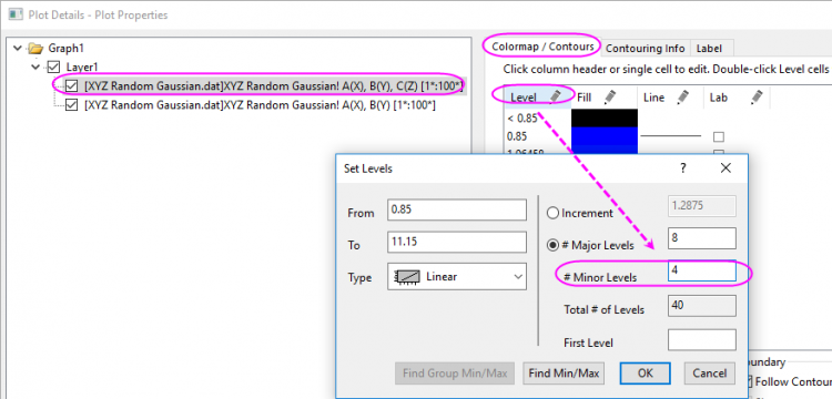
- Double-click the graph to open the Plot Details dialog. In this dialog, go to the Colormap/Contours tab, the contour plot in the left panel is selected. Click the Level... header to open the Set Levels dialog to set the Minor Levels as 4.
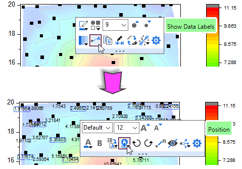
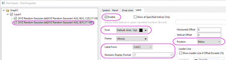
- Click the OK button to go back to the Plot Details dialog. Go to the Label tab while the scatter plot is selected in the left panel, check the Enable check box to activate this tab. Set the Size as 12, Position as Below, Label Form as Col(C) and Numeric Display Format as .1.
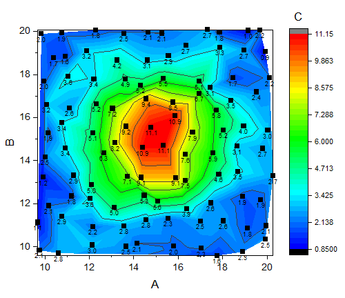
- Click the OK button to close this dialog. The Z values will be added as labels to the graph.
In Origin 2020 and later, you can click on the scatter points to select the scatter plot and Show Data Labels by clicking on a Mini Toolbar button. Once labels are enabled you can select them and use a second Mini Toolbar to format the labels, choose a label source, set position, etc. |