6.6.3 Column Graph with Error Bars
Contents

|

|
Summary
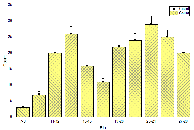
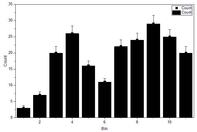
This customized graph shows an example of a bar graph with added error bars. The same Y data is plotted twice, once as a scatter plot and again as a column plot. The error bars are attached to the scatter plot in this case. Error bars can be included in the graph in both the Y and X dimensions.
Minimum Origin Version Required: 2015 SR0
What you will learn
- Create and customize a column graph
- Use the Plot Setup dialog to add a new data plot to your graph
Steps
This tutorial is associated with <Origin EXE Folder>\Samples\Tutorial Data.opj. (If you don't have the Project file, please download the data file from here)
- Open the Tutorial Data.opj and browse to the folder Column Graph with Error Bars. Activate the worksheet and make sure the column plot designations are set as X, Y, Y Error and Label accordingly.
- Highlight column B and C and select Plot > Basic 2D : Scatter to create a column graph.
- With the graph window activated, choose Insert: Plot to Layer: Column to select col(B) to add a column plot onto the graph window.
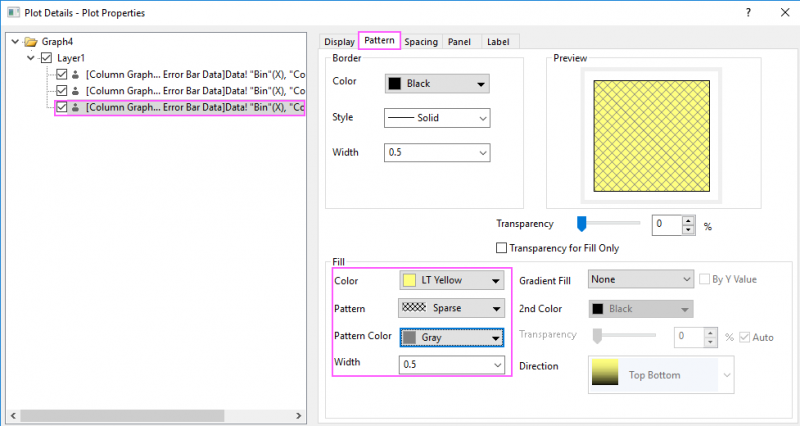
- Double-click the columns to bring up the Plot Details dialog box. Customize the graph using settings on the Pattern tab as shown below:
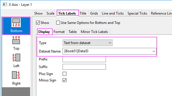
- Double-click on the X axis to open the Axis dialog box. Go to the Tick Labels tab to set X axis tick labels as shown in following screenshot:
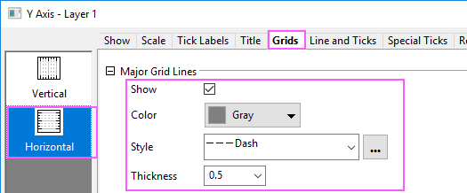
- Go to the Grids tab and click the Horizontal icon on the left panel to customize grids for Y Axis and turn on major grid lines by duplicating the settings in the image below:
- Click OK to apply settings and close the Axis dialog box. Finally, delete the legend object.