6.6.3 Column Graph with Error Bars
ColumnGraph-ErrorBar
Summary
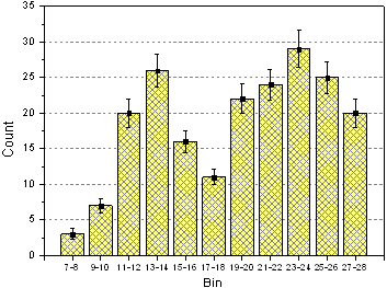
This customized graph shows an example of a bar graph with added error bars. The same Y data is plotted twice, once as a scatter plot and again as a column plot. The error bars are attached to the scatter plot in this case. Error bars can be included in the graph in both the Y and X dimensions.
Minimum Origin Version Required: 2015 SR0
What you will learn
- Create and customize a column graph
- Use the Plot Setup dialog to add a new data plot to your graph
Steps
This tutorial is associated with <Origin EXE Folder>\Samples\Tutorial Data.opj. (If you don't have the Project file, please download the data file from here)
- Open the Tutorial Data.opj and browse to the folder Column Graph with Error Bars. Activate the worksheet and make sure the column plot designations are set as X, Y, Y Error and Label accordingly.
- Highlight column 2 and select Plot > Bar, Pie, Area : Column to create a column graph.
- With the graph window active, select Graph: Plot Setup... to bring up the Plot Setup dialog box. Click the up-sided double triangle arrow icon to expand top two panels and we will add the scatter data and error bars from this dialog box, as shown below:
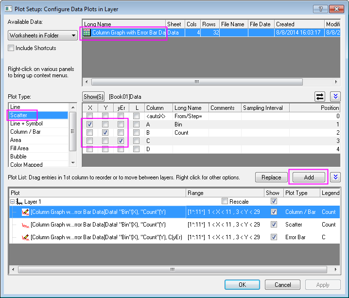
 | In order to show all three panels in Plot Setup dialog, please expand Plot Type panel by clicking  and expand Available Data panel by clicking again. and expand Available Data panel by clicking again.
Please refer to Plotting using Plot Setup for more information.
|
Click the Add button to add scatter data to the column plot. Then click OK to go back to column graph window.
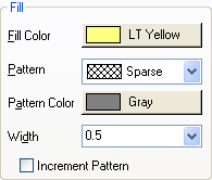
- Double-click the columns to bring up the Plot Details dialog box. Customize the graph using settings on the Pattern tab as shown below:
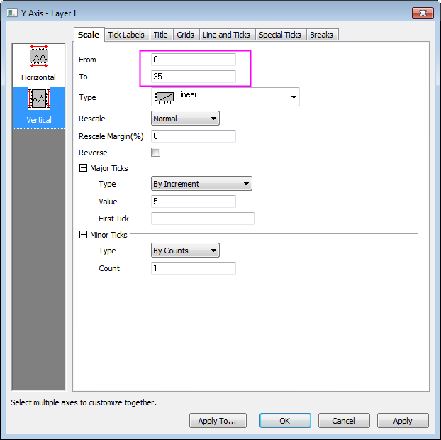
- Double-click on the Y axis to open the Axis dialog box. Set the Y axis scale as shown in the screenshot below:
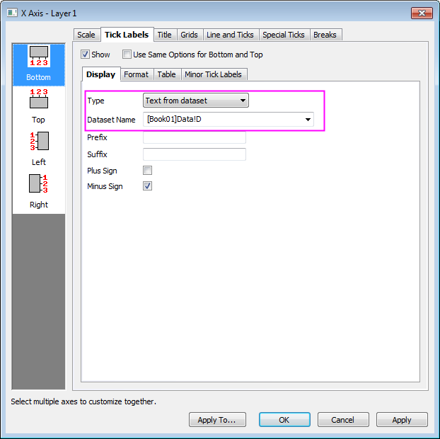
- Then go to the Tick Labels tab to set X axis tick labels as shown in following screenshot:
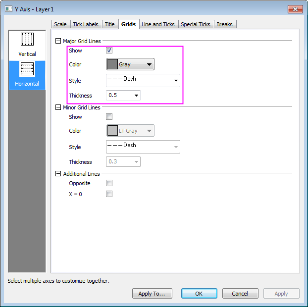
- Go to the Grids tab and click the Horizontal icon on the left panel to customize grids for Y Axis and turn on major grid lines by duplicating the settings in the image below:
- Click Apply first, and then hold Ctrl key to select both Vertical and Horizontal icons on the left panel and select the Opposite checkbox to turn on opposite additional lines for both X and Y axes.
- Click OK to apply settings and close the Axis dialog box. Finally, delete the legend object.