6.10.1 Box Plot
Box-Plot
Summary
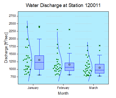
This tutorial demonstrates how to create the following box plot with the data points and distribution curves both.
Minimum Origin Version Required: Origin 2015 SR0
What you will learn
This tutorial will show you how to:
- Create a data overlapped box plot
- Customize box plot settings
- Change the layer background
Steps
This tutorial is associated with :<Origin EXE Folder>\Samples\Tutorial Data.opj.
- Open Tutorial Data.opj and browse to the Box Plot folder in Project Explorer (PE).
- Activate the first worksheet, select the January(Y), February(Y), and March(Y) columns and plot them as a Box Chart using Plot > Statistical: Box Chart.
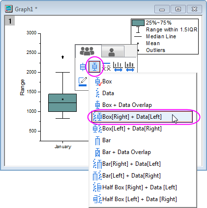
- Click on the plot, and the Mini Toolbar pops-up. Click on Box Type button and select Box[Right] + Data[Left] in the list.
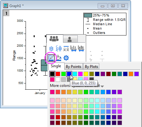
- Click on the Border Color button in the Mini Toolbar and select Blue.
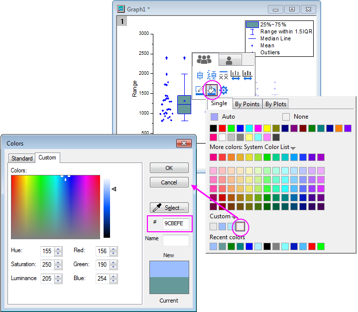
- Click on the Fill Color and create a custom color as below:
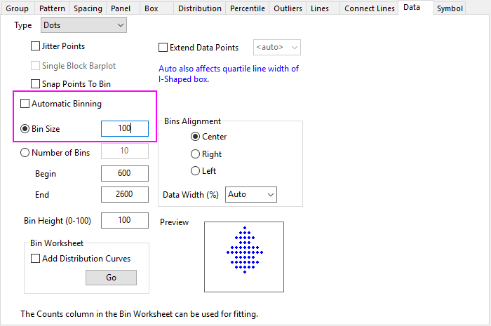
- Double-click on one of the box charts to bring up the Plot Details dialog. The Data tab shows up because data plot is also included in the plot. In this tab, change the settings as shown below to change the binning options.
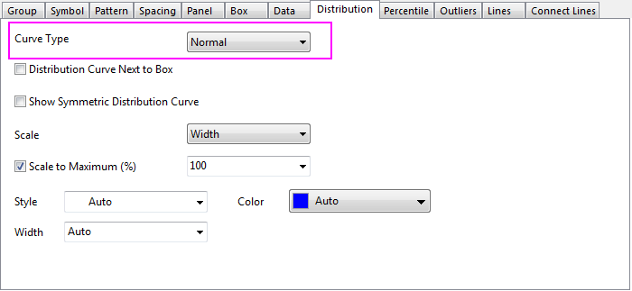
- Then, go to the Distribution tab to create a normal distribution curve.
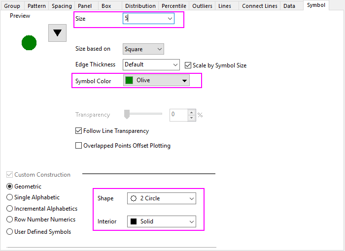
- The next step is to customize the data symbols in the Symbol tab:
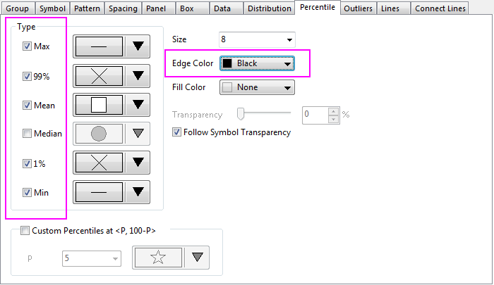
- The style of the Percentile points is also changed in the Percentile tab:
- The next step is to change the background color. In the same Plot Details dialog, select Layer 1 in the left panel to activate the tabs of layer level. If the left panel is not expanded use the
 button on the bottom left of the dialog to expand it. In the Background tab, expand the Color option, click the vacant color under the Custom controls to open the Colors dialog. In the Custom tab of this dialog box, enter the Red, Green and Blue values to define your favorite color. Here, let us make the color(R:177, G:237, B:254). Click OK to accept the setting and close the dialog.
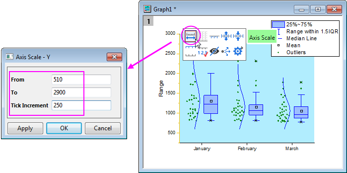
- Click on the Y Axis, and click on the Axis Scale button in the Mini Toolbar to open the dialog. In the Axis Scale - Y dialog, set the following axis scale specifications:
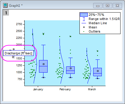
- Double click on the Title of Left Axis, and edit the title to Discharge [ft\+(3)/sec]:
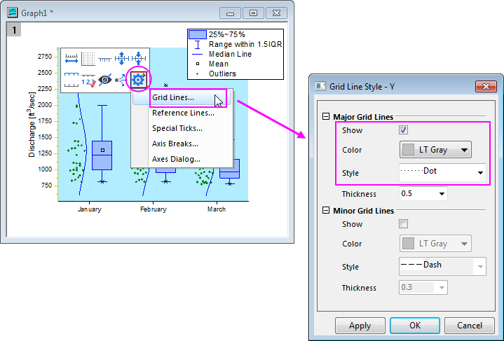
- Click on the Y Axis, and click on the Axis dialog button in the Mini Toolbar, then select Grid Lines.... In the dialog, enable the Major Grid Lines and set their styles as below, and click OK.
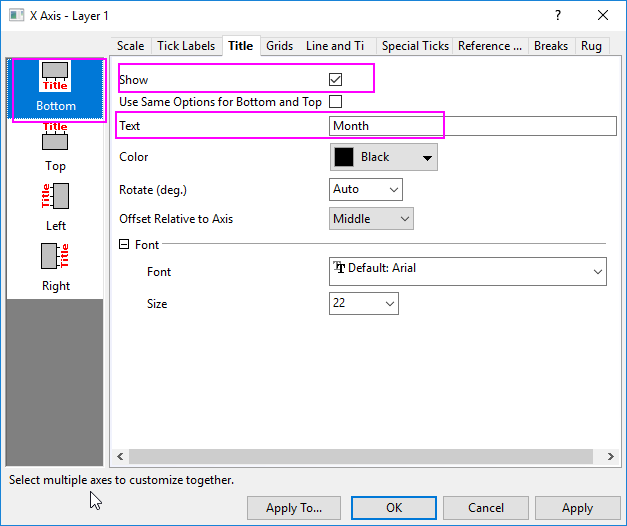
- Double-click on the X Axis to open a Axes dialog box. On the Title tab, check the Show check box, and change the X axis title to Month
- Go to Scale tab, and select Vertical, under Minor Ticks section set Count =0.
Click OK to save the settings and close the dialog.
- Select View: Show: Frame menu to add the frame to this graph.
- The legend can be deleted if desired by selecting it and pressing the delete key.
- Right-click the layer and select Add/Modify Layer Title from the menu that appears. Enter the text Water Discharge at Station 120011 in the edit box. Existing layer titles and axes titles can be modified by double clicking on them till the text cursor appears.