提示:此部分只提供英文原文,敬请谅解!
6.6.2 Bar and Scatter Plot with Error Bar
Contents

|

|
Summary
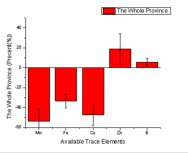
Below graph is made of bar chart and scatter plot.
Minimum Origin Version Required: Origin 8.0 SR0
What will you learn
- How to add a scatter plot to a bar graph
- How to set the Plus and Minus error bar
Steps
This tutorial is associated with the Tutorial Data project:<Origin EXE Folder>\Samples\Tutorial Data.opj.
- Open the Tutorial Data project and browse to folder Bar Plot with Errors in Project Explorer.
- Activate the workbook Book2N, right-click the col(C) to select Set as: Y Error from the context menu.
- Highlight Col(A), col(B) and col(C), select Plot > Bar, Pie, Area : Column from the main menu to plot a column graph with Y error bar.
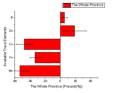
- Activate the graph window, and then select Graph: Exchange X-Y Axes.
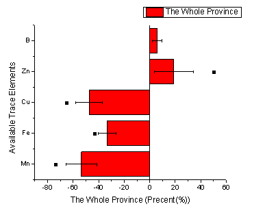
- Highlight the col(D) in the worksheet and then activate the graph window again. Select Insert: Plot to Layer: Scatter from the main menu to add the col(D) as scatter to the column graph.
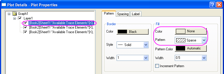
- Double-click the column graph to open the Plot Details dialog. Set the Color and Pattern options in the Fill group of Pattern Tab as below.
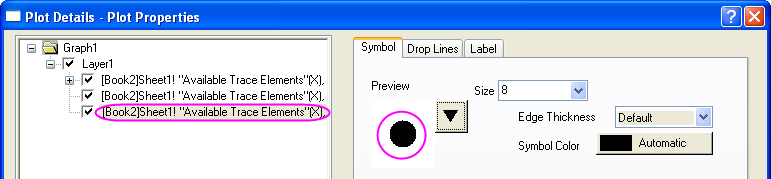
- Select the scatter plot in the left panel, then set the Symbol as below. Then click OK button to close the dialog.
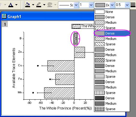
- Activate the graph window, hold the Ctrl key and select the first bar to set its pattern as Dense as below from the Style toolbar.
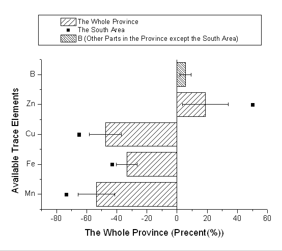
- Select Graph: Legend: Reconstruct Legend from the main menu to update the legend for graph.
- Right-click the legend to select Properties from the context menu to open the Objects Properties dialog. Set Background as Black Line. Then edit and move the legend as below.