6.12.3 3D Scatter Plot with Line Projections of Core Drilling Locations
3D-Scatter-LineProjection
Summary
This tutorial will demonstrate how to create a 3D scatter plot and show the projections of the plots.
Minimum Origin Version Required: Origin 2015 SR0
Steps
This tutorial is associated with the Tutorial Data.opj file under <Origin EXE Folder>\Samples\.
- Open the Tutorial Data.opj file and browse to the folder 3D Scatter with Line Projections, activate the workbook 3DScatterPlot.
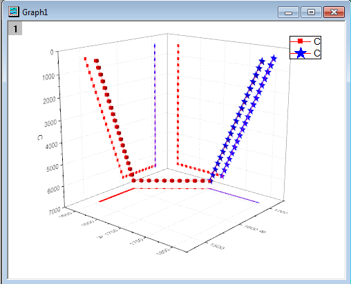
- Activate the The_First_Curve_of_3D_Scatter worksheet. The column designation for the three columns is already set as XYZ so you could directly create a 3D scatter plot. Highlight column C and select Plot > 3D: 3D Scatter to create the plot.
- Activate The Second Curve of 3D Scatter worksheet. Highlight column C. Move the mouse cursor to the right edge of the selection area until the shape of the cursor changes to
 . Hold down the left mouse button and drag the highlighted data into the newly created graph window. The resulting graph should appear as shown below:
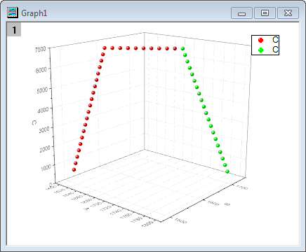
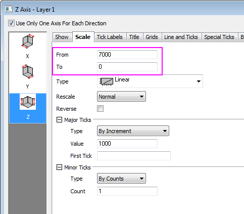
- Double-click on the Z axis to open the Axis dialog, go to the Scale tab with Z icon on left panel selected and reverse the Z axis by exchanging From and To values.
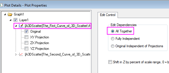
- Click OK to close dialog. Select Format: Layer from the main menu to open the Plot Details dialog. Alternatively you can double-click on the plot to bring up the dialog. If the left panel is not visible, use the
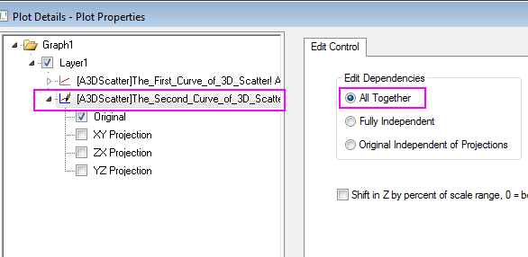
 button on the bottom left of the dialog box to open it up. Expand the Layer1 node. Choose the first plot and select All Together from the Edit Dependencies page. This applies the same settings to the original data and all the projections.
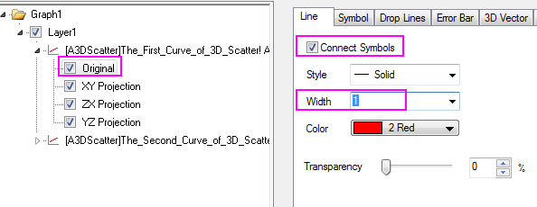
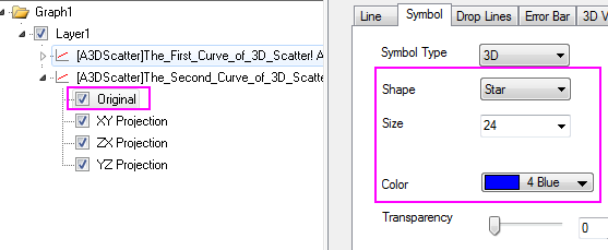
- Expand the first plot node and select Original and XY/XY/YZ Projection check box.
- Set the dialog options to those shown in the screenshot below. To set the color, click on the Color button and choose the desired option from the Individual Color drop down. Since the All Together radio button was selected in the previous step, these settings automatically apply to the projections as well.
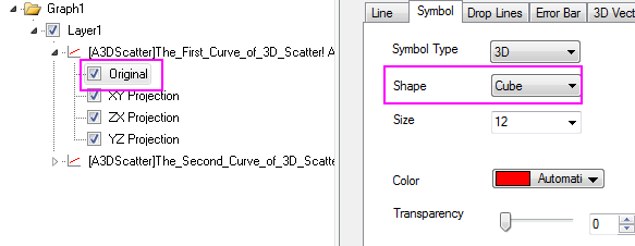
- Select the Symbol tab and change the Shape to Cube:
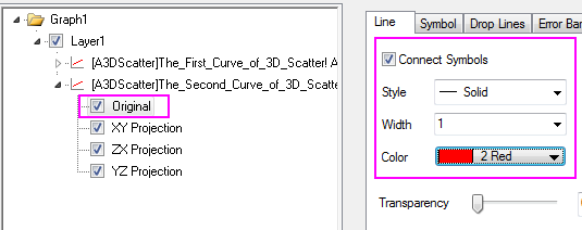
- In a similar fashion, select the second plot and set the dialog options to match those in the screenshots below:
- The final graph should appear as shown below: