6.12.8 Parametric Surface with Colormap from Data
3D-ParaSurf-DataColormap
Summary
This tutorial demonstrates how to create a 3D sphere using the data from three matrices. It also shows how the surface is filled to display the surface temperature contour using the data from a different matrix.
Minimum Origin Version Required: Origin 2015 SR0
What you will learn
This tutorial will show you how to:
- Create a parametric surface from matrix data
- Set contour fill from another matrix
- Customize the 3D parametric surface plot
Steps
This tutorial is associated with <Origin EXE Folder>\Samples\Tutorial Data.opj.
Also, you can refer to this graph in Learning Center. (Select Help: Learning Center menu or press F11 key , and then open Graph Sample: 3D Function Plots)
- Open Tutorial Data.opj and browse to the Parametric Surface with Colormap from Data folder in Project Explorer (PE).
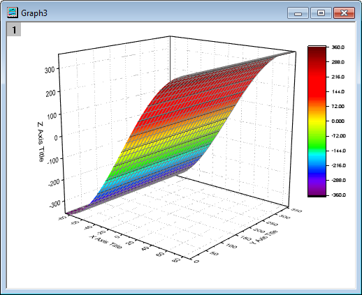
- Activate the matrix FUNCA:1/4, and highlight the data. Click the
 button on the 3D and Contour Graph toolbar to create a colormap surface as shown below. You can also create this colormap surface by selecting Plot > 3D : 3D Colormap Surface in the main menu.
- Double click on the plot to bring up the Plot Details dialog. In the Surface tab check the Parametric Surface box and set X Matrix, Y Matrix as Mat(2), Mat(3) respectively.
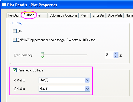
- Click OK to close the dialog.
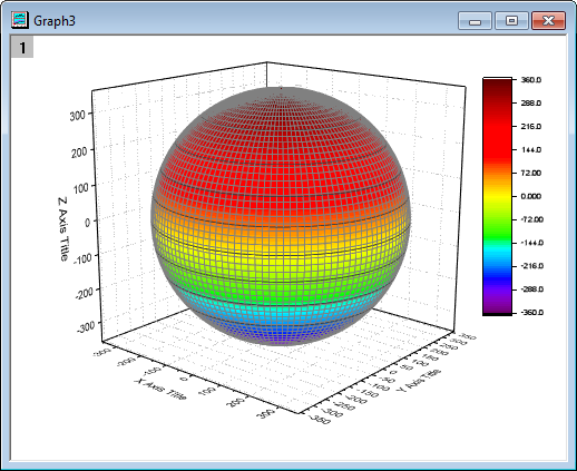
- In order to display the complete colormap surface in the axes area use the rescale
 button in the Graph toolbar. The colormap surface should appear as shown below:
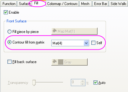
- Double click on the plot to open Plot Details dialog. This dialog box is used to customize the surface. In the Fill tab Front Surface section deselect the box before Self and set Contour fill from matrix as Mat(4). Click Apply.
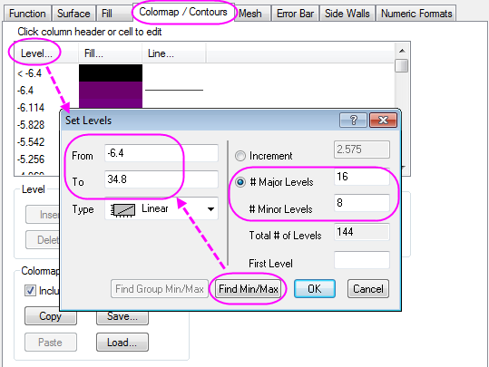
- Activate the Colormap / Contours tab. Click the Level heading to open the Set Levels dialog. Click Find Min/Max and set Major Levels, Minor Levels as 16, 8 respectively. Click OK.
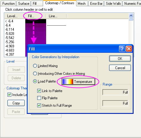
- Click Fill to open the Fill dialog. This dialog is used to customize the color scale. The Load Palette option allows the user to select from a list of possible palettes. Set Load Palette as Temperature. Click OK.
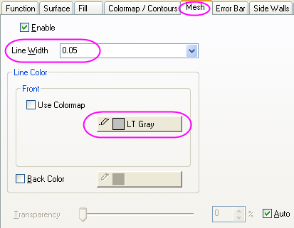
- Click on the Mesh tab. Set Line Width as 0.05 by clicking on the font box and typing the value instead of using the drop down menu. Set Line Color in the Front section as LT Gray. Click Apply.
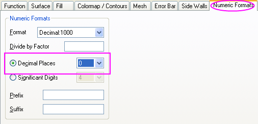
- In the Numeric Formats tab choose the Decimal Places radio button and set its value as 0.
- Click OK to apply the settings and close the Plot Details dialog. The graph should appear as shown below:
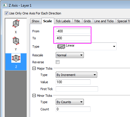
- The next step is to modify the axes. Double click on the Z axis to open the Axis Dialog. Go to the Scale tab, select Z icon. Set the value of From and To as -400 and 400 respectively.
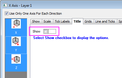
- Go to the Title tab, hold Ctrl key and click to select X, Y and Z together. Deselect the Show check box to hide the axis title for all axes and click OK to close the dialog.
- Double click on the XY Plane to open Plot Details - Layer Properties. In order to hide the axes, in the Display tab, deselect the X Axes, Y Axes, Z Axes boxes under the Show Elements section.
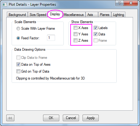
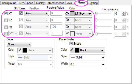
- To hide the YZ and ZX planes, click on the Planes tab, and deselect the boxes before YZ, ZX. Set the Color of the remaining XY plane as LT Gray. Click OK to close the dialog.
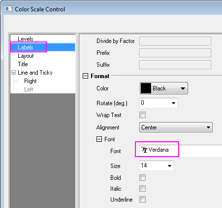
- The next step is to customize the color scale. Double click on it to open the Color Scale Control dialog, go to the Labels node and set the Font as Verdana.
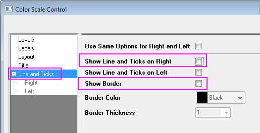
- Go to the Line and Ticks node and hide the border and ticks:
- Click OK to apply the setting and close the dialog. Select and drag to move the color scale object to the desired location.
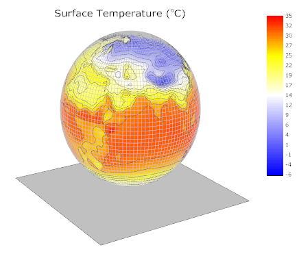
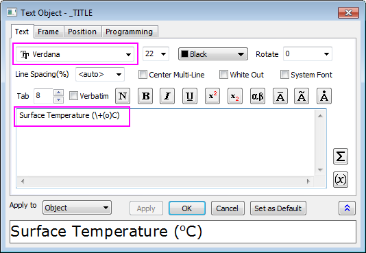
- Right click on the white area of the graph layer to bring up a context menu and choose Add/Modify Layer Title. Click else where to deselect the text box, then right-click on it and select Properties... from the shortcut menu to open the Object Properties dialog. Set the font as Verdana and type Surface Temperature (\+(o)C) in the content table. Click OK.
- Click on the graph layer within the 3D frame (not the data plot), and click the Rotate button as shown in the image below, to activate the rotation mode. Other ways to rotate the 3D plot include using the red rotate button in the Tools toolbar, the various buttons in the 3D Rotation toolbar or by selecting in the plot, pressing the R key and using the cursor.
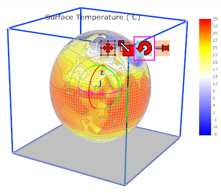
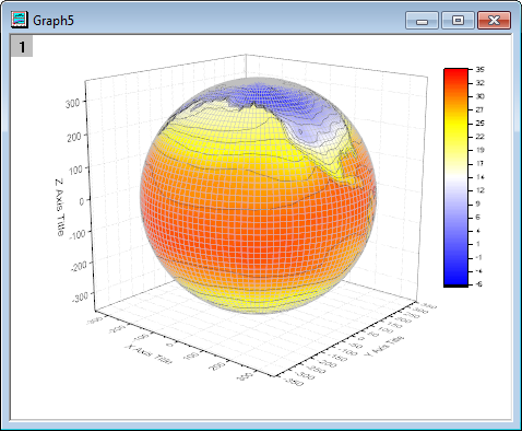
- Rotate the plot to get a better view. The graph should resemble the image shown below: