6.12.13 3D Bar with Labels
Contents

|

|
Summary
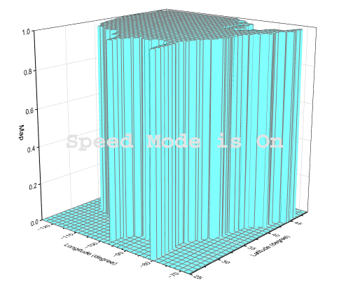
This tutorial will show you how to create the following graph:
Minimum Origin Version Required: 2015 SR0
What You will learn
This tutorial will demonstrate how to:
- Create and customize a flat Color Fill surface.
- Use Plot Setup to add a 3D bar plot to the original graph.
- Add and customize labels on the 3D bars.
Steps
This tutorial is associated with <Origin EXE Folder>\Samples\Tutorial Data.opj.
Creating a Flat Color Fill Surface from a Matrix
Open Tutorial Data.opj and browse to the folder 3D Bar with Labels.
- Activate the Matrix MBook1B.
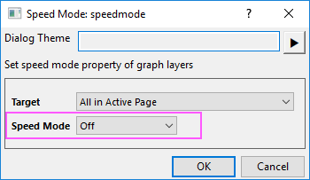
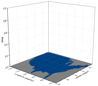
- From the Origin menu select Plot > 3D: 3D Color Fill Surface to create a 3D plot that will have Speed Mode turned on:
- With the graph window activated, choose the menu Graph: Speed Mode to open the Speed Mode dialog. Set Speed Mode to Off and click OK button to trun off the speed mode.
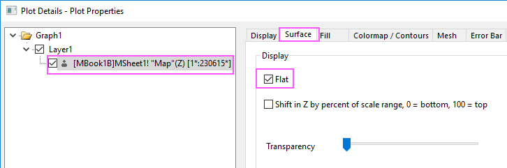
- Double-click on the graph to open the Plot Details dialog, go to Surface tab and enable the Flat option.
- On the Fill tab, click the Contour fill from matrix radio button to set the colors according to the matrix itself. Deselect the Fill back surface check box as well.
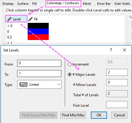
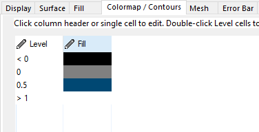
- Next click the Colormap/Contours tab to set the matrix colors and click Level.... In the Set levels dialog that opens, select the #Major Levels radio button and set it to 2. You can see the Total # of Levels will be set to 2 and click OK to close the dialog.
- Click on each color level under the Fill... heading to open the Fill dialog and choose the color. Set the three colors to Black, Gray and a customized blue with an RGB of 0, 64, 128 as shown below:
- On the Mesh tab, clear the Enable box and click OK to close the dialog box.
- The graph will resemble the image below:
Adding and Customizing 3D bars and labels
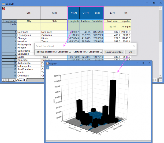
- With the graph active select Insert: Plot to Layer: 3D - Bars on the Origin menu. This opens the Select from Sheet dialog box.
- With the left key of mouse pressed to select columns A1, G1 and D in workbook Book2B. Click OK to add the plot to the current layer:
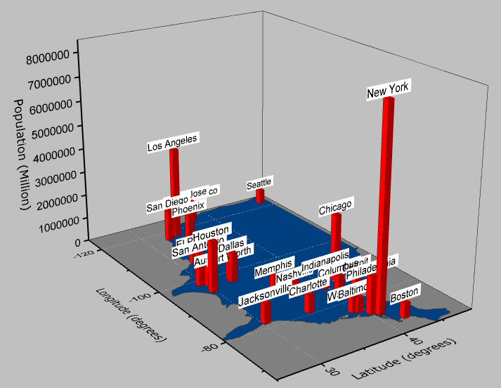
- To customize the 3-D bars, double-click on them to open the Plot Details dialog box. On the Pattern tab, set the border color to Wine and the fill color to Red. On the Outline tab set the Width (in %) to 10. Click Apply
- Next, select the Label tab and check the Enable box.
- Set the Label Form as Col(B):"City" so that labels display the city name located in Col(B) of the worksheet.
- Set the Position in Z as Top Outside with an Offset of 10 and set the Orientation in the YZ plane. Set the other controls as shown below and click OK to close dialog.

- Double-click one axis and go to the Scale tab, set From and To for all three axes as below. Click OK to exit.

- Double-click on the graph again and in the Plot Details dialog box, select the Graph1 option in the left panel. On the Display tab set the Color to LT Gray. Click OK to close dialog.
- Double-click the Z axis title and change it to Population (Million).
- The final graph should resemble the one shown below:
- Since this is a 3D OpenGL Graph, you can click on the graph and select Rotate Mode button on mini toolbar to use the mouse to rotate the graph.
