
|
|
|
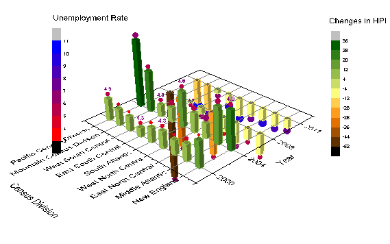
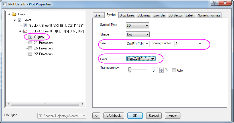
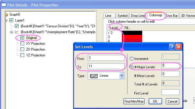
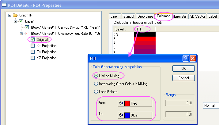
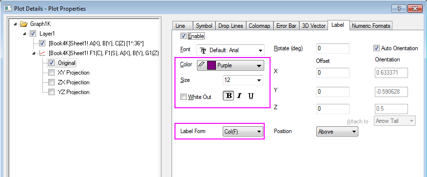
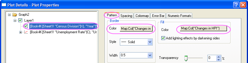
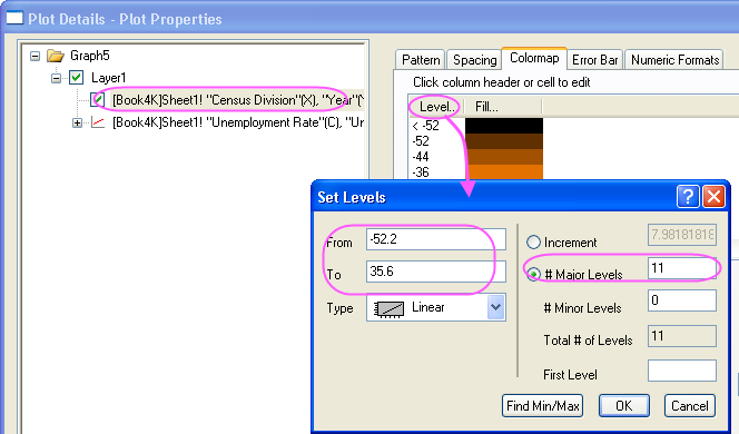
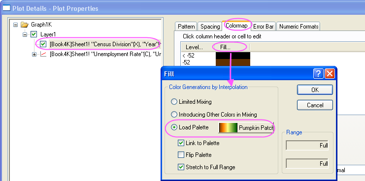
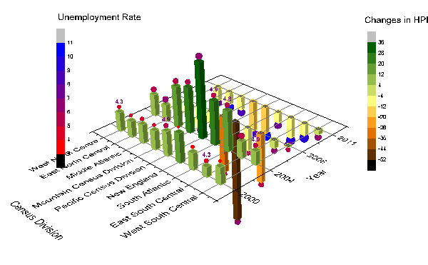
This graph is a combination of a 3D bar plot showing the changes in HPI (Home Price Index) and a 3D scatter plot showing the Unemployment Rate. The data is of several Census Divisions during different years. Colormapping is introduced to both plots based on the Z values.
Minimum Origin Version Required: Origin 2015 SR0
This tutorial will show you how to:
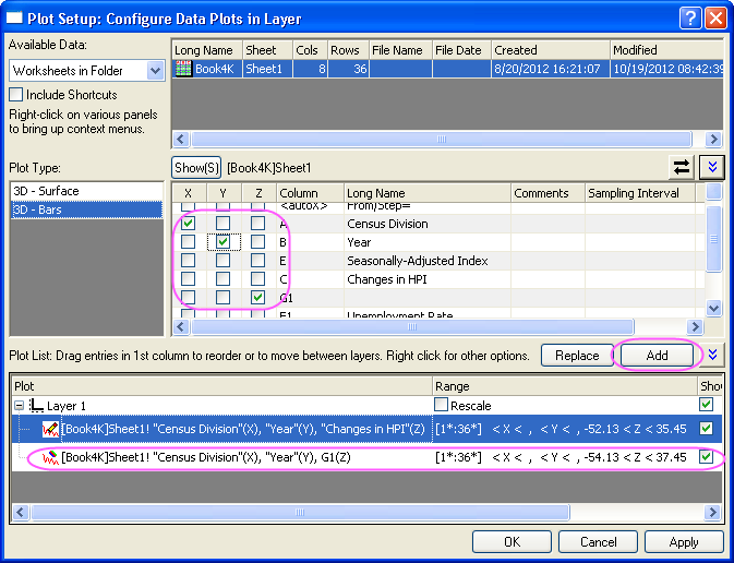

In order to show all three panels in Plot Setup dialog, please expand Plot Type panel by clicking Please refer to using Plot Setup for more information. |
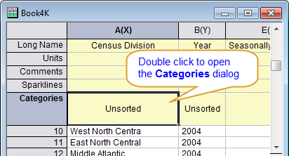
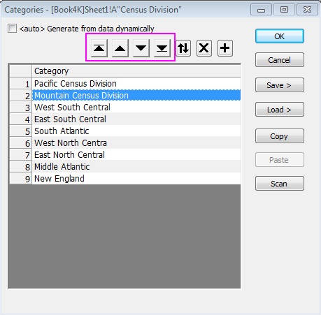
 buttons based on the order of census division shown in graph below: