1.69 FAQ-194 How do I create a double Y axis graph?
Last Update: 12/7/2022
Plot Double Y from Worksheet
- From the worksheet, select the Y columns you want to plot. Please make sure all X columns has been set to X if they exists.
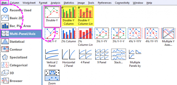
- Choose Plot: Multi-Panel/Axis: Double-Y.
- If you want to change plot type. With each layer active, click line, scatter, line+symbol or column button to change the plot type in the layer.
Note: Double Y plot with one column and one line, or Double Y with two column bars can be plotted directly from Plot menu.
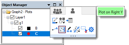
 | The single-layer, double-Y plot mechanism introduced in Origin 2023, makes it easy to convert a single vertical axis plot to a double-Y plot, using the Object Manager:
|
How to Add New Data to Right Y Axis in Existing Graph
- Firstly, we need add the new data into current graph layer. There are three methods:
- Go to the worksheet window, select the second dataset, return to the graph window, and choose Insert: Plot to Layer: Plot Type.
- Alternatively, data can be selected and dragged from the worksheet and dropped to the graph layer.
- Alternatively, you can double-click on either the layer 1 icon in the upper-left hand corner of the graph. The Layer Contents dialog will allow you to add or remove data into this layer.
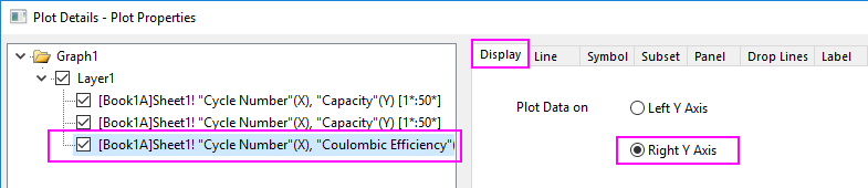
- Double-click on the plot you just added to open the Plot Details dialog. With this newly-added plot selected in left panel, go to Display tab, set Plot Data on to Right Y Axis, click OK button to close the dialog. You will see the right Y axis shows and rescales to adapt to the data range of second plot.
- You can use the mini toolbar to further customzie the style of the plots.
| The instructions above are all about double-Y graph in same layer. You can also plot 2 Ys Y-Y graph which contains two layers, directly from the Plot Menu. |
Keywords:second, two, double Y, multi Y, multi X, link axis