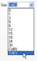
Color is not the only plot attribute that can be controlled by values in a dataset (see, Using a Dataset to Control Plot Color). Several other plot attributes can also be modified using values in an Origin workbook or Excel workbook. When this option is available for a plot attribute, a list of worksheet datasets will display as Col(Name) entries at the bottom of the drop-down list or combination box, where Name is the Origin or Excel workbook column name. Select a column of values to control display of the associated attribute.
| Note: You can copy and paste this attribute mapping to other graphs. Mapped column(s) can be identified by column Short Name, Long Name, Units, Comments,Units, Comments (built-in), Parameter(n) or User-defined Parameter. For more details, see the Match Modifiers by page. |
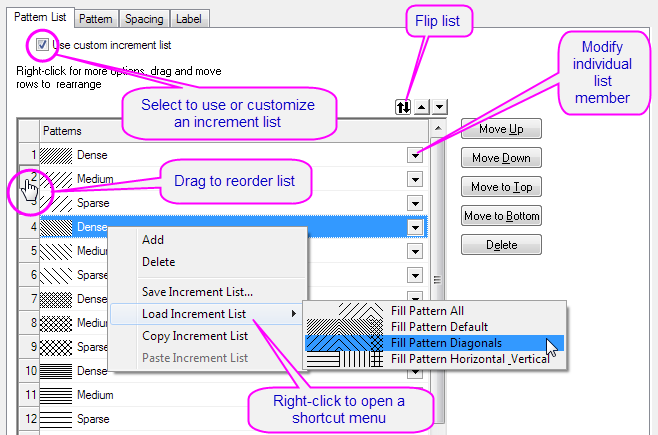
Some of the plot attributes listed below support use of a custom list of styles to modify data point display. Style variations are assigned to data points by:
In either case, you have the option of customizing, saving and reusing an increment list. Use and management of increment lists for these plot attributes is simpler than it is for color lists and for grouped plots.
When you elect to vary data point styles by incrementing or indexing, a tab is added to Plot Details that contains a list of possible styles. Once that list is enabled, you can edit, save or load previously saved lists and use them to control display of certain plot attributes.
To specify a column to control line style:
This procedure adds a Line Style List tab to Plot Details. Note that the default line style list will be followed unless you go to this tab, and check the Use Custom Increment List box; then customize the list as described above (see Customizing Increment Lists, above, for more information).
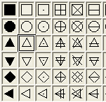
To specify a column to control symbol shape:
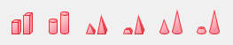
You have two shape lists to choose from -- one that is static and one that is customizable:
To customize symbol shape for grouped plots, see Plot Details Group tab Controls.
To specify a column to control symbol interior:
You have two interior lists to choose from -- one that is static and one that is customizable:
To customize symbol interior for grouped plots, see Plot Details Group tab Controls.
To specify a column to control symbol size:
When you select a column from the Size combination box, the dataset values are treated as point sizes (units = "points"). You can scale those dataset values by selecting or typing a value in the associated Scaling Factor combination box. For more information, see (Symbol) Size.
To specify a column to control fill pattern (e.g. column/bar charts):
To customize fill pattern for grouped plots, see Plot Details Group tab Controls.
To specify a column to control 3D bar shape:
You have two 3D bar shape lists to choose from -- one that is static and one that is customizable:
To customize symbol shape for grouped plots, see Plot Details Group tab Controls.
If you didn't set a column as Label before plotting, you can specify a column as labels for data points as below:
When you select a column for Label Form drop-down list, the values of this selected column will be added to the graph as labels for data points. The data points and labels are associated by the worksheet row index. You can only choose a column within current worksheet as labels with this Label Form drop-down list; if you want to use column in other worksheet, you need set Label Form as Custom and do further specifications with the sequential shown item Format String text box.
For more information, see the controls in the Plot Details -- Label tab for
To specify a dataset to control column/bar width:
When you select a column under the Width (in %) drop-down list, the values determine the relative column/bar(the data point in the same row) width, But the final performance will also be influenced by the Gap Between and Overlap settings, and the Scaling Factor will do contributions too.
For more information, see The Plot Details Spacing tab Controls
To specify a column to control angle:
When you select a column from the Angle drop-down list, the dataset values determine the vector angle for each data point in the associated row. The Angle Units combination box is used to change the units.
For more information, see The Plot Details Vector tab Controls.
To specify a column to control magnitude:
When you select a column from the Magnitude drop-down list, the dataset values determine the vector magnitude in units of points.
For more information, see The Plot Details Vector tab Controls.
|
Note: The X End and Y End lists on the Vector tab of the XYXY vector graph's Plot Details dialog box also list columns for control selection. However, the XYXY vector plot elements are only controllable by worksheet dataset selection. |
In this example, a line + symbol data plot is created. Subsequently, a dataset is designated to control symbol shape, with symbols alternating between squares and circles.
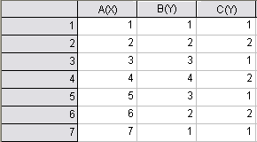
Note that the Line + Symbol plot now displays with two symbol shapes -- filled square and filled circle. What you have done is to use the C(Y) column values -- 1 and 2 -- to determine symbol shape.
How do these 1 and 2 values relate to symbol shape? If you clear the Custom Construction check box (Symbol tab of Plot Details), then click the down-arrow next to the (symbol) Preview, you will see that the first symbol shape in the symbol gallery is a filled square; the next down is a filled circle; the third down is a filled up-triangle, the fourth is a filled down-triangle, and so forth.
To Display Both Symbol Shapes in the Legend:
In the example, we used values in dataset to determine symbol shape for a single 2D line & symbol plot. The result was a plot where symbol type varied by data point. Without some adjustments, the plot symbol in the legend will not accurately represent the data plot.
To "fix" the legend, an empty D(Y) column will be added to the graph layer as a line + symbol data plot with circle symbols. Because the column contains no data, the data plot doesn't actually plot in the graph layer. However, we can use the dataset's plot attributes to customize the legend display.
To learn more about the default legend and how to customize it, see Graph Legends in the User Guide and Manual Control of the Graph Legend in the Origin Help file.