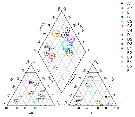
A piper (trilinear) diagram is a specialized graph type for charting the chemistry of a water samples.
Origin's piper diagram is created from worksheet data with column plot designations XYZXYZ. Each column contains the percentage value of each ion group. Column order is critical and should be:  The percentage value of each cation group is calculated based on the total concentration of calcium, magnesium, and sodium plus potassium cations; The percentage of each anion group is based on the total concentration of sulfate, chloride, and carbonate plus hydrogen carbonate anions.
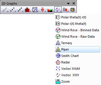
Highlight the source data and open the plotpiper dialog by either of the following:
OR
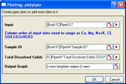
| Input | Specify the XYZXYZ input data range for the piper plot. |
|---|---|
| Sample ID | Specify the column used for the sample ID. This column will be used as the symbol color and shape indexing column in the piper plot, and this column will supply labels in the point by point legend. |
| Total Dissolved Solids | Specify the data range for the amount of total dissolved solid. This column will be used to control symbol size in Layer 1 (the "diamond") of the piper plot. |
| Output Graph | Specify where to output the graph. |
Three worksheet templates are provided to convert the original concentration data to percentage values and organize them according to data requirements for piper plot.
To open these three templates, you can
To control the gaps between each layer (i.e. each rhomb), you can
A user-defined dataset can be used to index the color/shape/interior of the symbols in the piper chart. You can also customize the increment list of color, shape and interior in the Increment Editor, Shape List and Interior List tabs in the Plot Details dialog.