29.9.15 Pareto Chart - Binned Data
ParetoChart-BinData
Data Requirements
Select one column (or data range) as the data range and another column (or data range) as the counts.
Creating the Graph
Select required data.
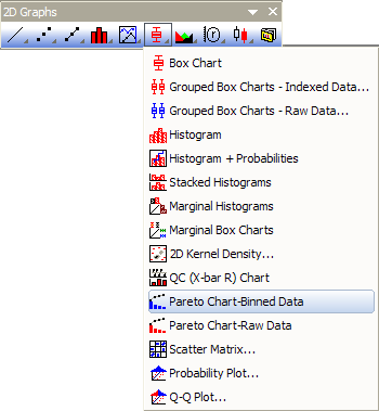
From the menu, select .
or
Click the Pareto Chart - Binned Data button on the 2D Graphs toolbar.
Template
PARETOBIN.otp (installed to the Origin program folder).
Notes
- You are allowed to select a grouping column to divide the input data by groups and plot them as pareto charts into different panels or graphs.
- You can decide whether show the symbol at right side of bar with the check box Show Symbol at Right Side of Bar. If you checked it, this line+scatter plot will start from the Origin(0,0) and put the scatter point at the right-side of bar; And, the first point and last point will not have labels.
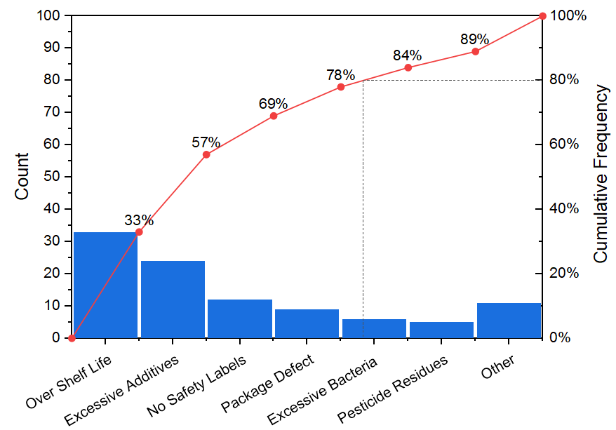
- The right Y axis scale is always 0~100. And there are horizontal drop line and vertical drop line at Y = 80.
Please see more details on creating and customizing in the Pareto Charts page.
Version Information
| Minimum Version: Origin 8.1
|
Last Update: Origin 2026
|