Select one or multiple Y column(s) with up to 4 factor columns.
To create a Multi-Vari Chart:
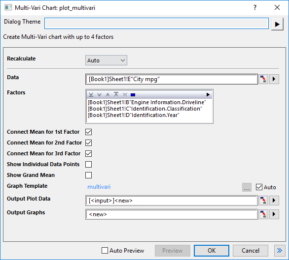
Select the input data column. Only allows to select one single column.
Select multiple factors in order. You can select multiple columns, but the number of column should be less than 4. The fly-out button will be disabled when there are already 4 columns selected.
Specify whether connect the mean points for first factor. It is selected by default.
Specify whether connect the mean points for second factor. It is selected by default. It is disabled when there is only 1 factor.
Specify whether connect the mean points for third factor. It is selected by default. It is disabled when there is only 2 factors.
Specify whether show the individual points. Checking it, Box Type for all box plots is set to Box+Data overlap and Box Style is set to No Box. This control is unchecked by default.
Specify whether show the grand mean value as a referece line at Mean(plotdata(*,y)). This control is unchecked by default.
By default, the built-in template "multivari" is used with Auto check box checked. You can uncheck the Auto check box to use the template you prepared in advanced.
Once you clicked OK button to create the graph, the plot data and result graphs can be outputed to the specified sheets. By default, two new sheets in current workbook will be created to store the plot data and result graphs, named as "MultiVariPlotData#" and "MultiVariGraph#".
multivari.optu (installed to the Origin program folder)
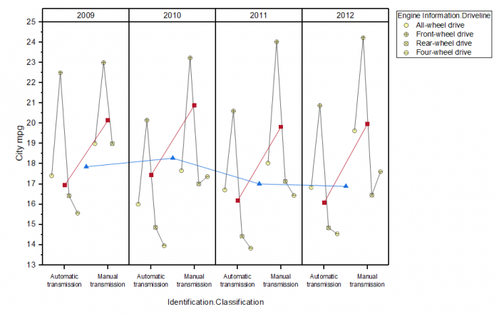
Multi-Vari chart displays the means at each factor level for every factor, it is a multi-box chart with connect lines of mean points and each box plot has box style=no box, whisker range=none, show mean percentile, connect means.
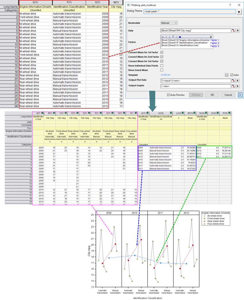
In this example, we select 3 factors: "Engine Information.Driveline", "Identification.Classification" and "Identification.Year"(marked with a red box) . Select them as Factor in the plot_multivari dialog.
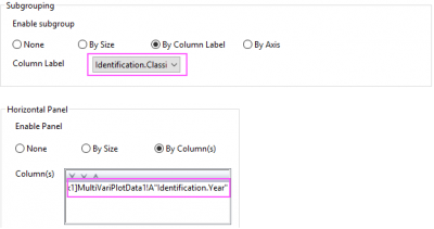
Unstack source data column with factor 1 and factor 2, including the column factor 3(marked with a pink box) ; with 8 unstacked columns, plot box plots only with connected mean points(Yellow-Filled scatter + black line). In the Plot Details dialog, set factor 2 as Subgrouping in Group tab and factor 3 as Horizontal Panel Column in Panel tab.
Calculate the mean values for subgroups(marked with a blue box) and different panels(marked with a green box) , plot them as line+scatter plots to present these mean values.
| Minimum Version: Origin 2025 | Last Update: Origin 2025b |