29.10.5 Grouped Box Charts-Raw Data
GroupedBoxCharts-RawData
Warning: Display title "Grouped Box Charts-Raw Data" overrides earlier display title "Grouped Box Charts Raw Data".
Data Requirements
The graph needs to be created from worksheet columns which are supposed to be grouped by one or more of the column label rows.
Creating the Graph
Select required data.
From the menu, select .
or
Click the Grouped Box Charts - Raw Data button  on the 2D Graphs toolbar.
In the plotgboxraw dialog that opens, specify the group number and the source for each group to create the grouped box chart from raw data. This dialog uses the plotgboxraw X-Function.
Please see more details on creating and customizing box charts in the Creating Box Charts page.
The plotgboxraw Dialog Box
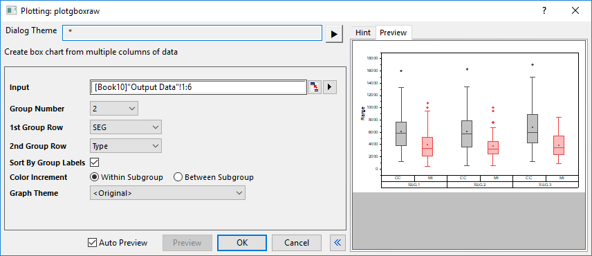
| Input
|
This box is used to specify the input data.
|
| Group Number
|
Specify the number of grouping ranges to be used. Can be 0 (no grouping), or an integer up to 5.
|
| nth Group Row
|
Choose from a list of column label rows to determine the grouping variable. The input columns will be grouped by the variable in the 1st Group Row first, then further grouped by the 2nd Group Row, the rest can be done in the same manner.
|
| Sort by Group Labels
|
Order plots by ascending order of group labels, performing a nested sort by order of the grouping rows. Does not reorder worksheet columns.
|
| Color Increment
|
Specify how to color the grouped boxes with the color increment list, within subgroup or between subgroup.
|
| Graph Theme
|
Choose from a list of box chart Themes, including a set of predefined Themes.
|
In addition, you can preview the final graph in this dialog.
Examples

|
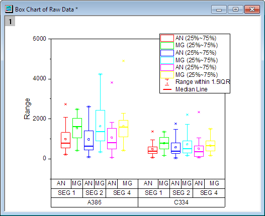
- Click File:Open Sample Projects:Tutorial Data to open the sample OPJ, in the Project Explorer, browse to Grouped Box Plot and Axis Ticks Table folder, activate the workbook Book3G.
- The data in the worksheet MG.AN are raw data, we will create a grouped box plot from it, so that each data column will be plotted as one box, and the boxes will be grouped based on the grouping by long name, comments and user defined parameter: machine.
- Highlight the columns through C to N and select Plot: Statistics: Grouped Box Charts - Raw Data from top menu to open the plotgboxraw dialog.
- Set Group Number to 3, and select Machine, Comments and Long Name for 1st Group Row, 2nd Group Row and 3rd Group Row respectively.
- If you want to sort groups/subgroups in the chart, in ascending order, enable Sort By Group Labels.
- Select Box_Dashed Whisker Thick Median for Graph Theme and click OK to generate the plot.
Note:
- To adjust box size and spacing, double-click on the plot to open Plot Details. Select the top data plot in the left panel (you may have to expand the Layer branch) then adjust settings on the Spacing tab.
- You can nudge tick labels, including those in tick label tables, by selecting the labels and using the keyboard arrow keys.
|
|
Template
BOX.OTP (installed to the EXE folder of Origin)
Notes
- If the Group Number is bigger than 1, the X axis tick label will be by default displayed as tables, you can control this format in the Table tree node in the Tick Labels page of the Axis dialog.
- As long as the Group Number is not 0, Subgrouping will be turned on in the Group tab based on the 1st Group Row, and you can then control the gap between or within subgroups separately in the Spacing tab.
- You can create/customize the legend specified for box chart components by selecting Graph:Legend:Box Chart Components... menu items when the box chart graph is active.
- It is also possible to create grouped box chart from indexed data.
- If you select Box_Column Scatter as Graph Theme, you can create a grouped column scatter plot.
- If you select Box_Connect Mean Line as Graph Theme, you can create a grouped box chart with a connect mean line.
- If you select Box_Interval Plot as Graph Theme, you can create a grouped interval plot.