17.1.5 Graphical Summary
Introduction
This tool creates a graphical summary report from data including group information. The statistical graphs includes histograms, box charts, and plots of confidence intervals, along with tables of key statistical quantities.

Performing Graphical Summary
- Select the input data columns on which you want to perform descriptive statistics.
- Choose Statistics: Descriptive Statistics: Graphical Summary to open the dialog.
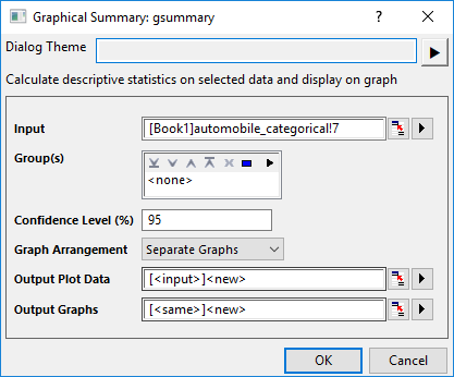
- Select grouping column(s) for Group(s), enter the desired confidence level in the Confidence Level(%) edit box, and then specify the graph layout from the Graph Arrangement drop-down list.
- Click OK to perfrom the descriptive statistics and create the graphs.
Dialog Controls
| Input
|
Choose the input column(s). Note that Data Table is also supported.
|
| Groups
|
Choose the column(s) to divide the input data into multiple groups.
|
| Confidence Interval(%)
|
Specify the confidence level.
|
| Graph Arrangement
|
Specify how to arrange the statistical graphs.
- Each variable for each group will be plotted into a separate graph. Each graph includes 3 plots - a histogram with distribution curve, a plot of confidence intervals plot and a probability plot, and 3 tables - "Description Statistics", "##% Confidence Intervals" and "Normality Test". The graph title shows the variable and group information.
- Each Variable will be plotted into a separate graph. The groups will be plotted into different veritical panels. Each variable includes 3 plots - histogram with distribution curve, a box chart with outliers, and a plot of confidence intervals - and a table summarizing the results by row, showing statistics for each group.
- Each group will be plotted into a separate graph. The variables will be plotted into different veritical panels. Each group includes 3 plots - a histogram with distribution curve, a box chart with outliers, and a plot of confidence intervals - and a table summarizing the results by row, showing statistics for each variable.
- All variables and all groups will be plotted into one graph. Each subset(Group*Variable) will be plotted into different veritical panels. This graph includes histograms with distribution curve, box charts with outliers, plot s of confidence intervals, and a table summarizing the results by row, showing statistics for each subset.
|