29.3 Plotting in Data Table
Data Table access to Origin's powerful graphing capabilities via Plot menu, which provides hundreds of templates and let you plot a fully customized graph in one-click. Easy-to-use GUI also supports interactive editing after the graph is created.
Unlike the Free Form worksheet, Data Table can not only plot from raw data but also from summary data (e.g., Mean, Mean + SD). During the latter, a "Summary Stats" sheet is auto-generated and graph is then plotted from this intermediate sheet.
Plot menu varies dynamically according to the current table type. This page lists the supported graph types for each table type. Use it as a reference - click any URL link to jump to the detailed documentation page for more information.
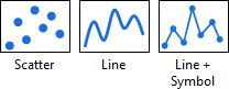
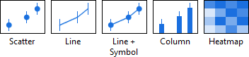
XY Table
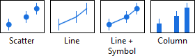
| Individual Data
|
|
|
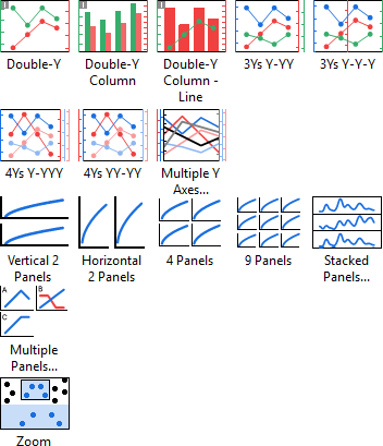
| Multi-Panel, Multi-Axis
|
|
- Double-Y, 3Ys Y-YY, 3Ys Y-Y-Y, 4Ys Y-YYY, 4Ys YY-YY, Multiple Y Axes
- Double-Y Column, Double-Y Column - Line
- Vertical 2 Panels, Horizontal 2 Panels, 4Panels, 9 Panels, Stacked Panels, Multiple Panels
- Zoom
|
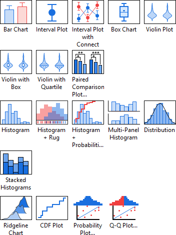
| Summary Data
|
|
A "Summary Stats" sheet is auto-generated to calcluate stats quantities (e.g., Mean, SD), and graph is then plotted from this intermediate sheet.
|
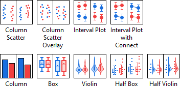
Column Table
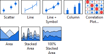
| Individual Data
|
|
|
| Statistical
|
|
|
| Summary Data
|
|
A "Summary Stats" sheet is auto-generated to calcluate stats quantities (e.g., Mean, SD), and graph is then plotted from this intermediate sheet.
|
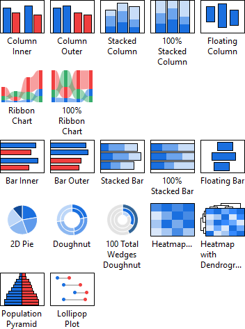
Grouped Table
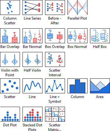
| Individual Data
|
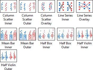
|
|
| Statistical
|
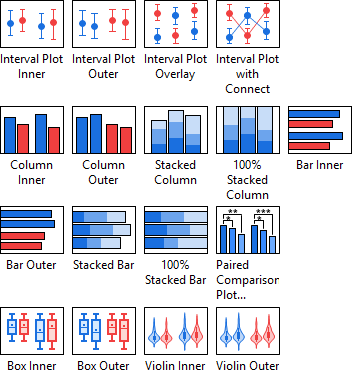
|
- Interval Plot Inner, Interval Plot Outer, Interval Plot Overlay, Interval Plot with Connect: variances of Grouped Interval Plot-Indexed Data.
- Column Inner, Column Outer, Bar Inner, Bar Outer: variances of Grouped Column/Bar Chart-Index Data.
- Stacked Column, 100% Stacked Column, Stacked Bar, 100% Stacked Bar
- Paired Comparison Plot: open Paired Comparison Plot App. Refer to this tutorial to get started.
- Box Inner, Box Outer: variances of Grouped Box Charts-Indexed Data
- Violin Inner, Violin Outer: variances of Grouped Violin Plot-Indexed Data
|
| Summary Data
|
|
A "Summary Stats" sheet is auto-generated to calcluate stats quantities (e.g., Mean, SD), and graph is then plotted from this intermediate sheet.
|
| Three way
|
|
|
Contingency Table
| Contingency
|
|
|
Survival Table
| Basic 2D
|
|
|
|