2.75.6.1 Tutorial for Control Charts
Contents
Notes for Starting
- Download the sample project file from here and open it in Origin.
- Start this tutorial with the app Statistical Process Control installed. If you have not installed the app, see Apps for Origin to find and install the app.
 | Topics for Further Reading: |
Variables Charts for Subgroups: Xbar-R
Background
A manufacturer produces high-quality screw nuts that must equal 21 millimeters in diameter.
The quality control department drew 4 nuts from the finished products of two machines per day for 20 days, measured the diameters for each.
They want check whether the mean diameter to the nuts is equal to 21 and the different of their diameter can not vary more than 0.05 (20.95, 21.05), and monitor the operation of the two machines.
Steps in Origin
- Open folder 1. Normal, activate the workbook Diameter
- Click the Statistical Process Control icon
 in the Apps Gallery window.
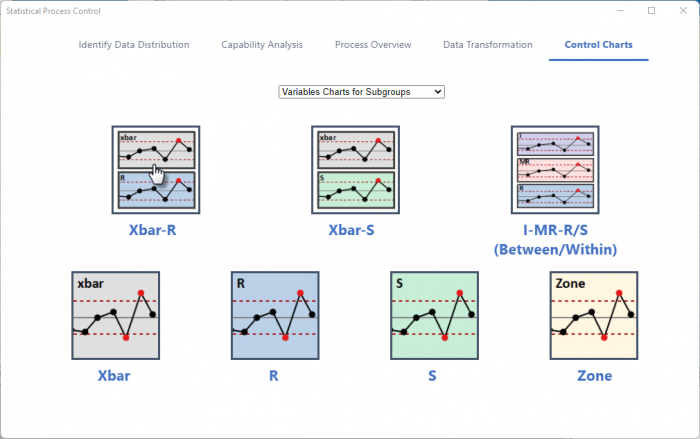
 - Select the Control Charts tab, select Variables Charts for Subgroups from the dropdown list, select Xbar-R
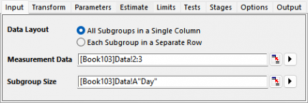
- In the Input tab of the opened dialog, select column B and C to be Measurement Data. Set the Subgroup Size to be Column A
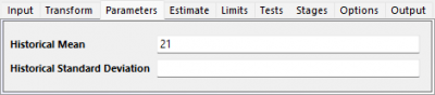
- In the Parameters tab, set Historical Mean to be 21
-
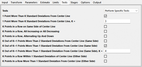
- In the Tests tab, select following Tests
- 1 Point More Than K Standard Deviation From Center Line, K=3
- K Out of K+1 Points More Than 1 Standard Deviation From Center Line (Sample Side), K=4
- Click OK button. A graph with report tables will be created
Interpreting the Results
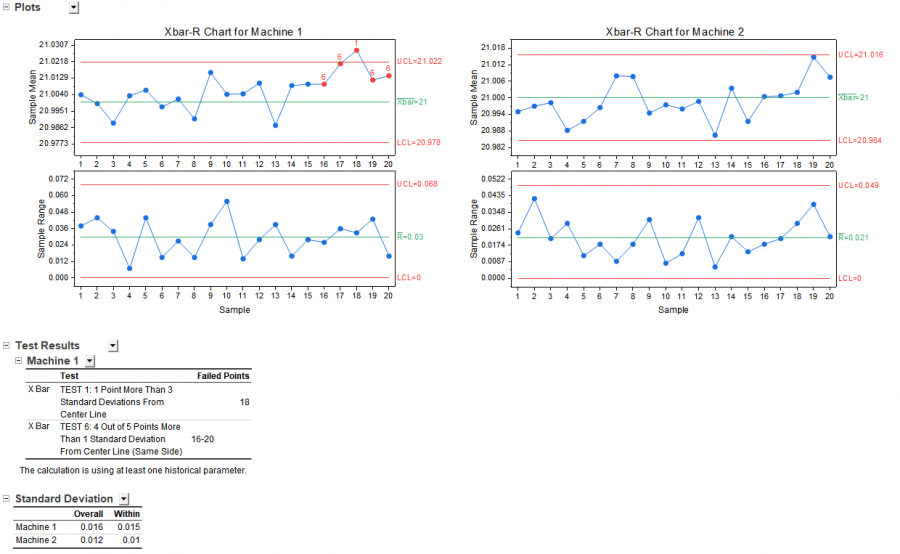
Examine the R chart first, if the process variations are not in control, the Xbar Chart may be inaccurate. All the points are within the control limits in the R chart of the two machines, the process variation of the two machines are in control.
Machine 1 is out of statistical control due to a upward process shift, while Machine 2 is operating stably and in control with lower overall variation.
Machine 1 Analysis(Out of Control)
- Xbar Chart (Process Average)
- Test 1 Failure (Sample 18): Sample 18 falls beyond the Upper Control Limit (UCL = 21.022). This indicates a major special cause of variation.
- Test 6 Failure (Samples 16–20): Points 16 through 20 fail Test 6 (4 out of 5 consecutive points are more than 1-sigma above the center line on the same side). This confirms a sustained upward shift/drift in the process mean starting around sample 16.
Machine 2 Analysis (In Control)
- Xbar Chart (Process Average)
- All 20 sample means fall within the control limits (LCL = 20.984, UCL = 21.016) and center around Xbar = 21.000. No special-cause rules were triggered.
- R Chart (Process Variation)
- Fully in control with an average range (R = 0.021) lower than Machine 1, indicating higher consistency.
Variables Chart for Individuals: I-MR
Background
A quality engineer wants to evaluate the pipe production process. He collected data for height (feet) of pipe at 150 samples. He wants to know whether the height of pipe is still in control.
Steps in Origin
- Open folder 1. Normal. Activate the workbook Height of Pipe.
- Highlight column A in worksheet. Click the Statistical Process Control icon in the Apps Gallery window.
- Select the Control Charts tab, select Variables Charts for Individuals from the dropdown list, select I-MR
- In the Input tab of the opened dialog, column A is selected automatically as Measurement Data.
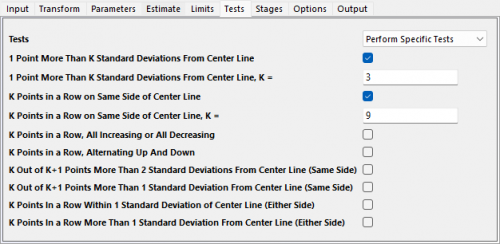
- In the Tests tab, select following Tests
- 1 Point More Than K Standard Deviation From Center Line
- K Points in a Row on Same Side of Center Line
Interpreting the Results
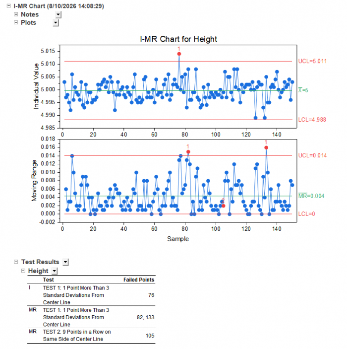
Check the MR chart first. In addition the notes says point 82 and 133 failed Test 1, and point 105 failed Test 2. The process variation may be not so stable.
Attributes Charts: P Chart Diagnostic and P
Background
The manager of a shop performs service satisfaction survey every day for 25 days and mark down the number of unsatisfied users.
He wants to know how well the service meets specifications.
Steps in Origin
- Open folder 4. Binomial, activate the workbook Survey
- Click the Statistical Process Control icon in the Apps Gallery window.
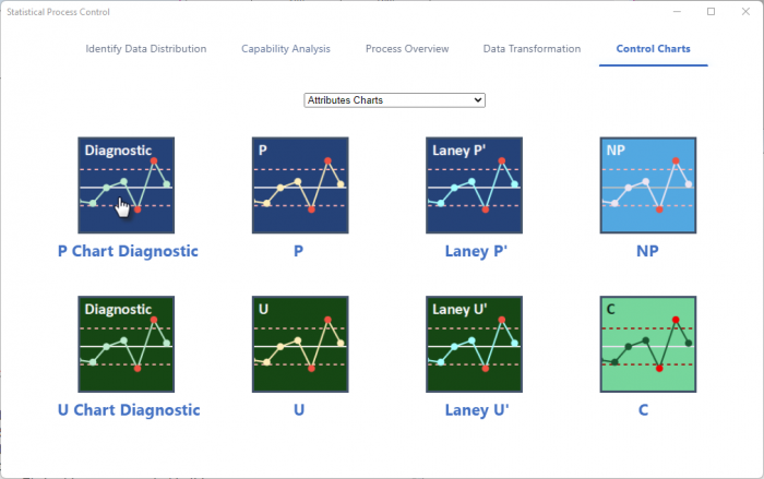
- Keep in the Control Charts tab, select Attribute Charts from the dropdown list, select P-Chart Diagnostic
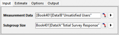
- In the Input tab of the opened dialog, set Measurement Data to be column B. Set the Subgroup Size to be Column A
- Click OK button. A graph is created
-
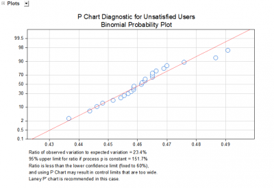
- As mentioned in the notes of the P Diagnostic chart. Laney P' chart should be used. Click the Statistical Process Control icon in the Apps Gallery window.
-
- Keep in the Control Charts tab, select Laney P'
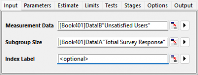
- In the Input tab of the opened dialog, set Measurement Data to be column B. Set the Subgroup Size to be Column A
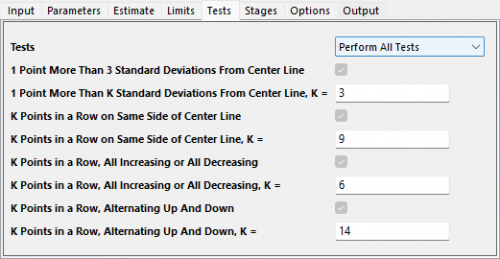
- In the Tests tab, select Perform All Tests from the Tests drop-down list
Interpreting the Results
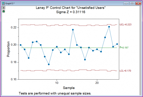
All data points fall within the control limits. while the note has no content for points failed, which means all tests are passed. The process are in control
Time-Weighted Charts: CUSUM
Background
A manufacturer produces high-quality screw nuts that must equal 21 millimeters in diameter.
The quality control department drew 4 nuts from the finished products of two machines per day for 20 days, measured the diameters for each.
They want check whether the mean diameter to the nuts is equal to 21 and the different of their diameter can not vary more than 0.05 (20.95, 21.05), and monitor the operation of the two machines.
The quality control department has already created X-Bar chart in X-Bar chart part. However, they also want to monitor the machine wear of these machines
Steps in Origin
- Open folder 1. Normal, activate the workbook Diameter
- Click the Statistical Process Control icon in the Apps Gallery window.
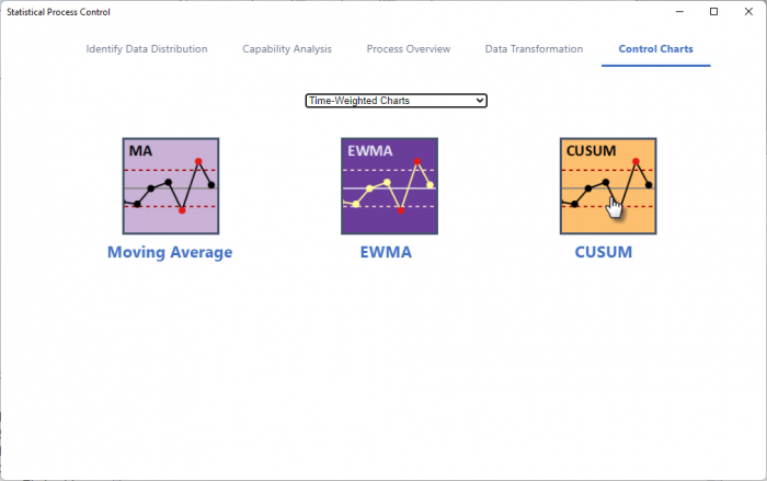
- Select the Control Charts tab, select Time-Weighted Charts from the dropdown list, select CUSUM
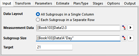
- In the Input tab of the opened dialog, select column B and C to be Measurement Data.Set the Subgroup Size to be Column A. Set Target to be 21
- Click OK button. A graph is created
Interpreting the Results
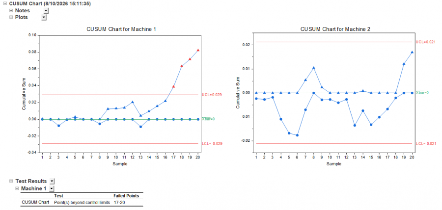
For machine 2, all points are in control in the CUSUM chart.
For machine 1, the process starts to have small shift from points 17. The manufacturer should check whether machine 1 is worn out during time.
Multivariate Charts: T²-Generalized Variance
Background
A precision injection molding process monitors three correlated dimensions (length, width, height) of plastic housings to detect process drift
Steps in Origin
- Open folder 6. Multivariate, activate the workbook PlasticHousings
- Click the Statistical Process Control icon in the Apps Gallery window.
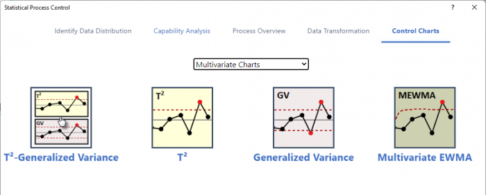
- Select the Control Charts tab, select Multivariate Charts from the dropdown list, select T²-Generalized Variance
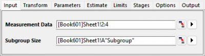
- In the Input tab of the opened dialog, select column B,C, D to be Measurement Data. Set the Subgroup Size to be Column A.
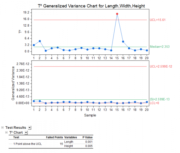
- Click OK button. A report sheet is generated
Interpreting the Results
The chart pattern indicates a temporary shift in the process mean vector at Subgroup 19, while the variability (covariance structure) remained stable throughout the entire monitoring period.