2.42.3.3.2 The Plots for Analyze Design
Contents
Fitted Plot
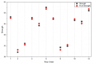
The Fitted Plot compares the model's predicted values against the actual observed response values. It provides a direct visual check of how well the fitted model tracks the experimental data.
Residual Plot
Residual plots evaluate model assumptions. It cludes 4 plots
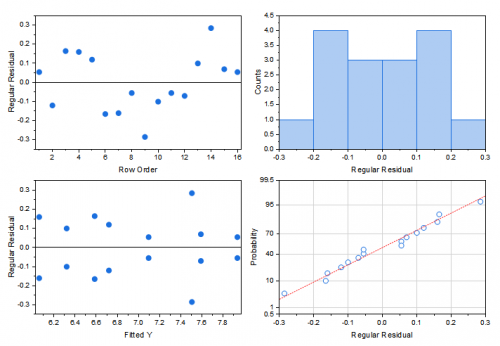
- Residuals vs Order
- Random distribution indicates no time-related effects. Trends suggest process drift.
- Residuals vs Fits
- Random scatter indicates constant variance. Patterns suggest model inadequacy.
- Histogram
- Should resemble a normal distribution.
- Normal Probability Plot
- Points should follow a straight line. Deviation indicates non-normal residuals.
Effect Plot
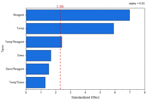
The effect plot ranks the magnitude of factor effects. Large effects indicate influential factors. Effects crossing the significance line are statistically significant.
 | Note: The default alpha level for the Effect Plot is 0.05. If a stepwise method is used, the Effect Plot uses the corresponding alpha level specified for the stepwise procedure: alpha to remove for Stepwise and Backward methods, and alpha to add for the Forward method. When no stepwise method is used, α is calculated as 1 − confidence level. |
Main Effect Plot
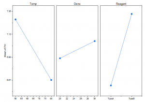
The main effect plot illustrates how changing each factor individually affects the response. steep slope indicates strong effect, flat line indicates little or no effect.
Interaction Plot
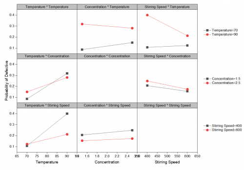
The Interaction Plot shows how the effect of one factor on the response changes depending on the level of another factor. It is used to identify and interpret interaction effects between two factors
- Parallel lines: Little or no interaction between the two factors.
- Non-parallel lines: Possible interaction between the two factors.
- Intersecting lines: Strong interaction; the effect of one factor depends substantially on the level of the other factor.
- Lines that diverge or converge: The magnitude of one factor's effect changes with the level of the other factor.
Scatter Plots with Fitted Lines
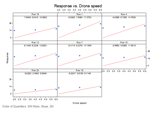
The graph displays the response data together with fitted lines, providing a visual assessment of the relationship between the response and the relevant factor or signal.
Cube Plot
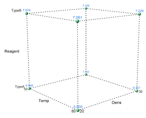
The cube plot displays predicted responses at every combination of factor settings for three-factor experiments. Highest response corner identifies optimal settings.
Contour Plot
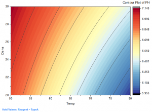
The contour plot shows response values across two continuous factors while holding other factors constant. Closely spaced contours indicate rapid response changes, while widely spaced contours indicate gradual changes
Surface Plot
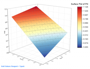
The surface plot displays a three-dimensional relationship between two factors and the response.