1.29 Marginal Abatement Cost Curve
Summary
The Marginal Abatement Cost Curve App is used to create a marginal abatement curve from worksheet columns.
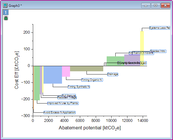
The Marginal Abatement Cost Curve (MACC) is a visual tool used by economists, researchers and policy-makers to prioritize and develop pollution reduction and mitigation strategies.
Tutorial
Create Graph
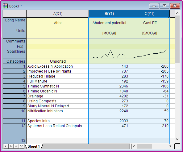
- Download this Blog_MACC_OriginPro2020.zip file. Open the Blog_MACC_OriginPro2020.opju in this zip file. Active Book1.
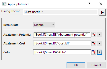
- Highlight Columns B and C and click the Marginal Abatement Cost Curve App icon
 in the Apps Gallery window to open the dialog.
- In the dialog, you will find the Abatement Potential is Column B and Abatement Cost is Column C. Then set Column A to Mitigation.
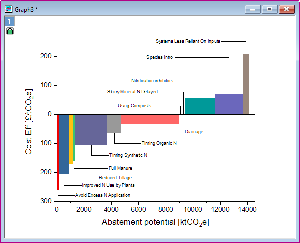
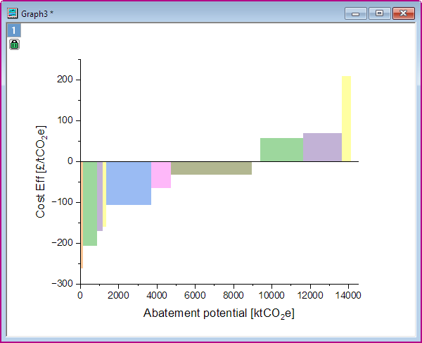
- Click OK. You will get the Marginal Abatement Cost Curve graph.
Add Labels
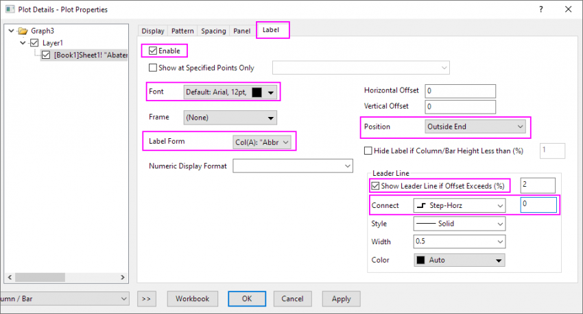
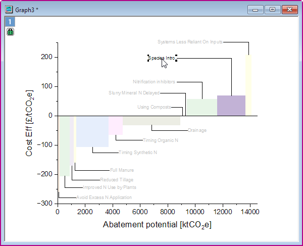
- To add the labels for the bar, double click on the plot to open Plot Details dialog
- Go to the Label tab of plot level and check Enable option.
- Set Font Size = 12, set Label Form =Col(A):"Mitigation" and Position = Outside End.
- Check Show Leader Line if Offset Exceeds(%), then set Connect = Step-Horz and in the right-side text box change value to 0
- Click OK. New labels are added in the graph.
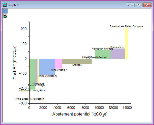
- Now, you will manually drag the plot labels to position them. Click on a label to with your mouse to drag all labels.
Or press CTRL key and click on a label to only select this label, then drag it to suitable position. Note that as you move the label, an L-shaped leader line follows.
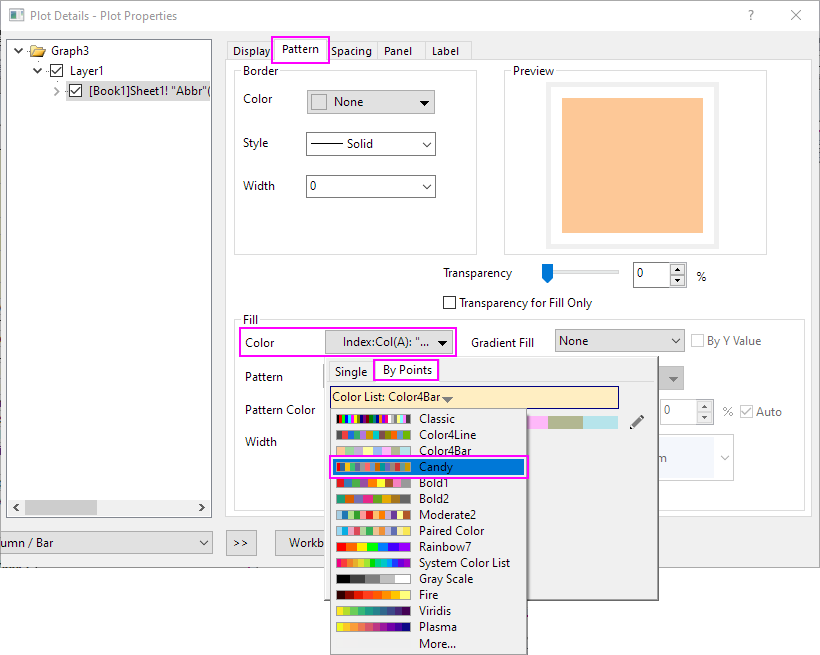
Customization Graph Color
- To modify plot colors, double-click on the plot to open Plot Details dialog.
- Go to the Pattern tab of plot level.
- In the Fill group, click the Color drop-down and click the Color List to select Candy as new color list.
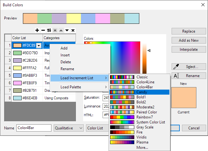
 on the right of the color bar to open the Build Color dialog. In the Increment Editor, right-click on the current color list, choose Load Increment List and pick a color list.
- Click OK to save the setting and update the graph color.