1.22 Graph Maker

|
Summary
Origin provides a large selection of built-in templates for creating graphs quickly from your data. However, what if you want to interactively create a graph by assigning columns for plotting and attributes such as panels and colors in a flexible way. With this in mind we have created a Graph Maker app.
To open Graph Maker app, you can
- select menu Plot: Graph Maker, or
- click Graph Maker icon
 in the Apps Gallery.
Tutorial
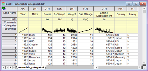
- With a new workbook active, select menu Data: Connect to File: Test/CSV. Browse to Origin’s sample folder and select data file
\Samples\Statistics\automobile_categorical.dat. Import with default settings.Here is automobile data of numeric and categorical columns.
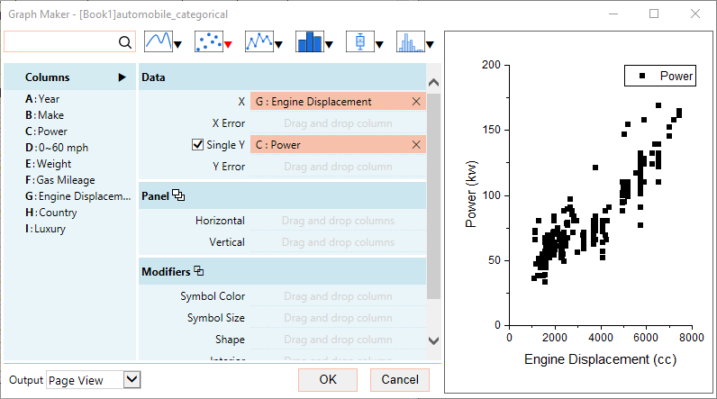
- Activate the worksheet and then select menu Plot: Graph Maker to launch the app's dialog box.
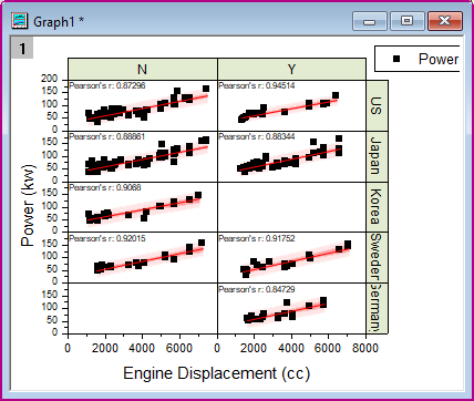
- In the Graph Maker app, plotting is as easy as dragging and dropping columns to the assigned variable. We will first select Power and drop it to Single Y, and Engine Displacement to X. In the preview panel on the right, Power is plotted as a function of Engine Displacement and there is a correlation between the two.
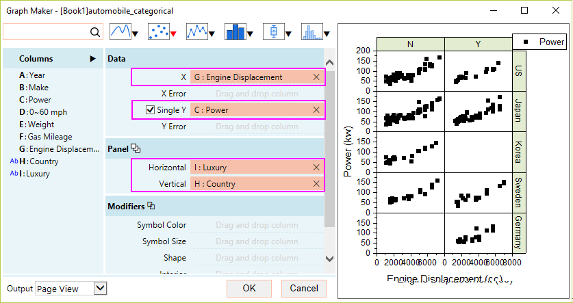
- Now let’s assign other columns for splitting the data into panels. Drag Country to Panel > Vertical and Luxury to Horizontal.
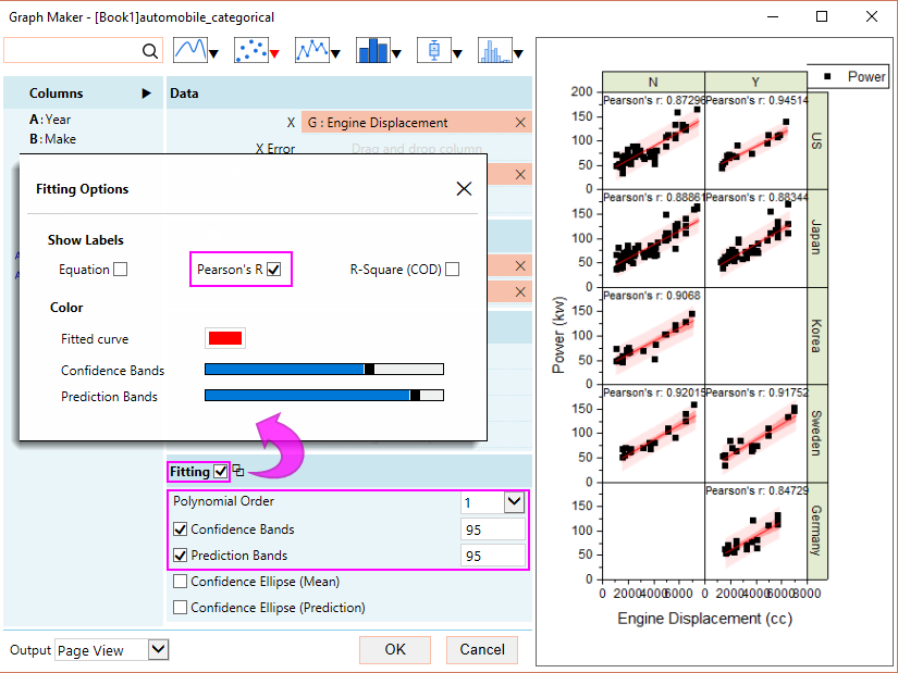
- Now let’s quantify the correlation. Select Fitting checkbox. Several options are then available.
- Leave the Polynomial Order as 1.
- Turn on Confidence Bands and Prediction Bands.
- Click on the icon
 next to Fitting for further customizations. In the dialog that opens, select Person’s R as a label.
- Save the graph as Window View so that you can dynamically resize the panels by simply dragging the graph to the desired aspect ratio. On the other hand, Page View is a fixed width.
- Click OK to create the graph.
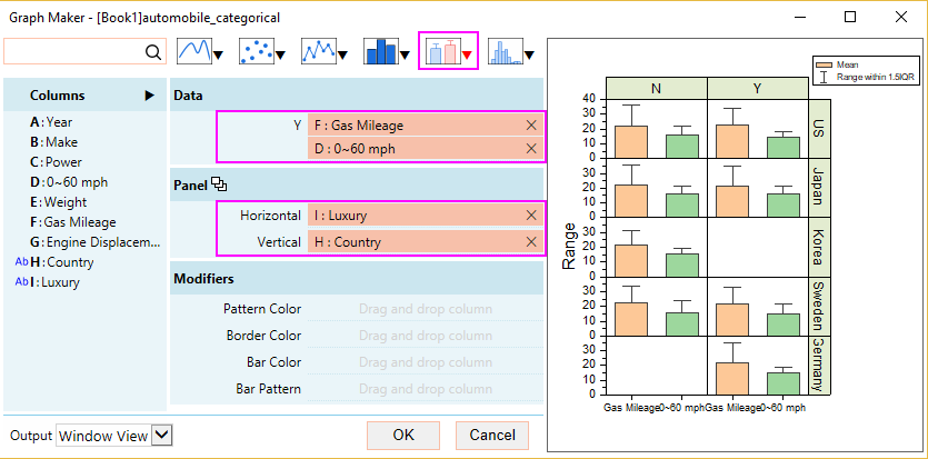
- Let’s take a look at another example with the same data. With the workbook active, select menu Plot: Graph Maker to launch the app again. This time set as following:
- Uncheck Single Y. Drag 0 – 60 mph and Gas Mileage to Y.
- Change the plot type to bar chart by clicking the box chart icon
 on the top, and then choose Bar Chart from the list. This plots the mean and deviation of the data.
 - Choose Country as the Vertical panel and Luxury as the Horizontal panel.
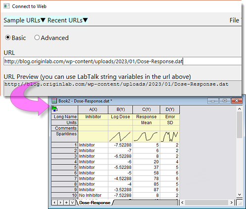
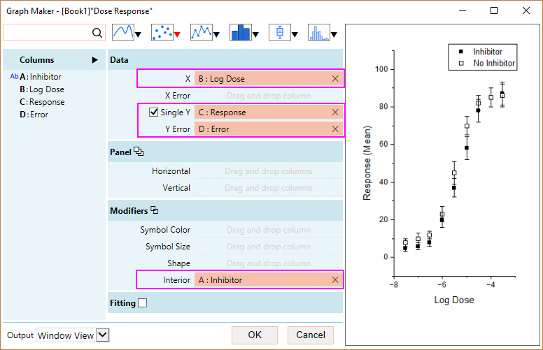
- Let’s do one more example. With a new workbook active, select menu Data: Connect to Web. Enter following URL
https://blog.originlab.com/wp-content/uploads/2023/01/Dose-Response.dat
. Import with default settings.This is dose response data with XY and error bar, and two different categories, inhibitor and no inhibitor.
- With the workbook active, select menu Plot: Graph Maker to launch the app again. This time set as following:
- Drag Log Dose as X and Response as Y.
- Drag Error to Y Error.
- To distinguish between the inhibitor and non inhibitor, drag this inhibitor column and assign it to the Interior shape of the symbol. inhibitor is now plotted as closed symbol and no inhibitor is plotted as open symbol.