1.38 Color Spectrum Plot
Contents
Summary
The Color Spectrum Plot app can be used to create a spectrum curve with filled colors defined by wavelength in x data.
Tutorial
- Right-click on the Color Spectrum Plot icon
 from the Apps panel, and select Show Sample Folder to open the sample folder.
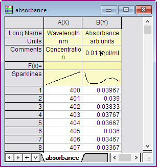
- Open ColorSpecPlotEx.opju in the sample folder.
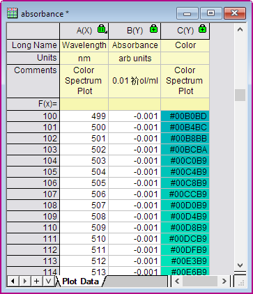
- Highlight Column A, B in the absorbance Workbook. (Note: the spectrum data's x should represent wavelength and its unit must be nm.) Click the Color Spectrum Plot icon in the Apps panel again to open the dialog.
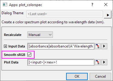
- In the dialog, check Smooth sRGB check box, colors for wavelength will be smoothed.
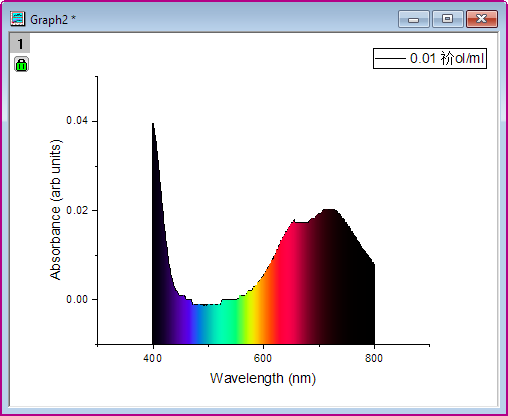
- Click OK button. A color spectrum plot will be created. Area between spectrum curve and x axis will be filled by colors defined by wavelength in x axis.
And three columns for plot data are created in a worksheet. The third column includes RGB values for its wavelength in x data. Colors will be set missing values for wavelength outside the range 360nm to 830nm.