Last Update: 11/15/2018
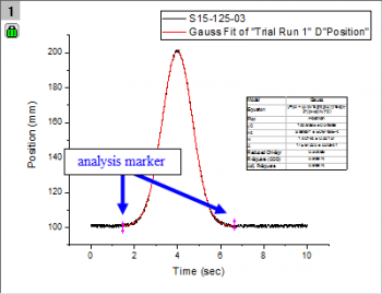
Arrows or markers on your graph are called analysis range markers. They mark the range of data that the analysis was performed on. They only appear when you select a sub-range of your data and perform an analysis in either Manual or Auto mode. If you choose None, then you will not see these markers on your graph.
If you double-click on these markers, the analysis dialog will open allowing you to make any changes and re-run the analysis. These markers will not print or be exported. If you select the Data: Analysis Markers menu option you can choose from a number of display options. These options are template settings, so you can resave the template to change the default behavior.
The lock ![]() is an indicator of an operation that links source data with a result. A green lock indicates that results are up-to-date (i.e. the result is generated using the source data).
is an indicator of an operation that links source data with a result. A green lock indicates that results are up-to-date (i.e. the result is generated using the source data).
If a lock icon appears dark gray in color |
Hide Locks: Starting with 2019, you can hide lock icons on your graph window by clicking on the graph and, from the main menu, choosing View: Show and clearing the check mark beside Lock Icons. This does not remove associated operations from the graph window. To re-display the icons, repeat the procedure. To control lock display via LabTalk script, set: page.lock=; // 0 = hide, 1 = show |
Keywords:plots, data, nonlinear, regression, arrow, magenta, pink, range, analysis, green, range