2.76 FAQ-827 How to mask data points in a box chart?
how-to-mask-data-points-on-box-chart
Last Update: 12/9/2020
Origin 2020b and later
To mask data points in a box chart, you must have some box variation that shows individual points -- either in the form of outliers or as a distribution of points.
- Select either the Mask Points on Active Plot
 or Mask Points on All Plots
  button on the Tools toolbar, then hover on your graph.
- Use the spacebar, as needed, to toggle the selection mode.
- Drag your mouse to capture the point(s) that you want to mask. The masked points are removed from the box plot(s) and box statistics are recalculated. Additionally, the associated data are masked and marked with the current mask color in the original worksheet (raw data arrangement) or output worksheet (indexed data arrangement).
- To display the masked points you can toggle the Disable Masking button
 on the Mask toolbar; or to remove the mask entirely, display masked points with Disable Masking, then choose Unmask Points on Active Plot
  or Unmask Points on All Plots
  (Tools toolbar) and drag to capture masked points. Alternately, you can highlight the masked point(s) in the worksheet and click the Unmask Range
  button.
Origin 2020 and earlier
Previous versions did not support direct application of a data mask but you can use the following workaround:
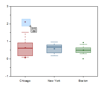
- Having a box chart with data points, select Data Reader tool
 in the Tools toolbar.
- Point and click the data point you want to mask, and then Data Info window showing the X and Y coordinates of the selected data point will appear.
- On Data Info window, right-click and choose Go To Worksheet in the flyout menu.
- The row of the selected point in the worksheet is highlighted.
- Reselect only the targeted data cell of the dataset, right-click the cell, and choose Mask: Apply in the flyout menu.
Keywords:mask, box chart, data point
Minimum Origin Version Required: Origin 2015 SR0