1.183 FAQ-874 How to color regions in a line plot?
Color-Regions-of-Line
Last Update: 7/31/2023
To color some regions in a line plot, you can use
to group the regions into categories and then color-map line plot by the categorical data.
| Note: the Cluster gadget is for Pro only.
|
Cluster Gadget
For example, to highlight peak A and B with different colors in the following line plot,

- With the graph active, select Gadgets: Cluster.
- In the dialog, select Circle for Shape on ROI Box tab since a circle ROI is more flexible to cover the peak region. Click OK and a ROI circle is put to the graph.
- Move the ROI area peak A. Drag the 8 anchors to adjust the size and shape of the ROI so it can cover the region of peak A as desired.
- Click the Create Categories button
 on the Cluster Gadget: Editing Inner Points dialog.
- In the Create Categorical Value dialog, name your category group and give a categrocial value to the data points in the ROI region. Check Color Data by Category checkbox, then this categrocial value will be set as the data plot color index.
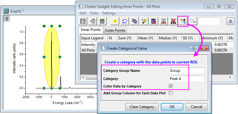
- Repeat steps 3 to 5 to select region of Peak B and set the categorical value.
- You can click the Go to Source Worksheet button
 to go to the source data. A "Group" column is added, containing the categorical values you just specified.
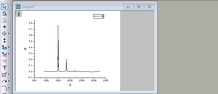
Finally we get the following plot.

Data Highlighter
Above tutorial can also be done by Data Higlighter. That is,
- With the graph active, select Data Highlighter button
 from Tools toolbar at the left side.
The mouse cursor will then change to "data higlight" mode and a Data Highlighter mini toolbar will pop up at the top-right corner of the Graph window.
- Drag a rectangle area to fully cover the region of peak A as desired. Data points inside this region will be highlighted.
- Click the Create Categories button
 from the mini toolbar. This will open the Create Categorical Value dialog.
- Name your category group and give a categrocial value to the highlighted data points. Check Color Data by Category checkbox, then this categrocial value will be set as the data plot color index.
- Repeat steps 2 to 4 to select region of Peak B and set the categorical value.
- If you go to the source data worksheet, a "Group" column is added, containing the categorical values you just specified.
Keywords:line curve, colormap, region of plot, color peaks